
Reviews
7 reviews

Well done Salma! Beautiful design.
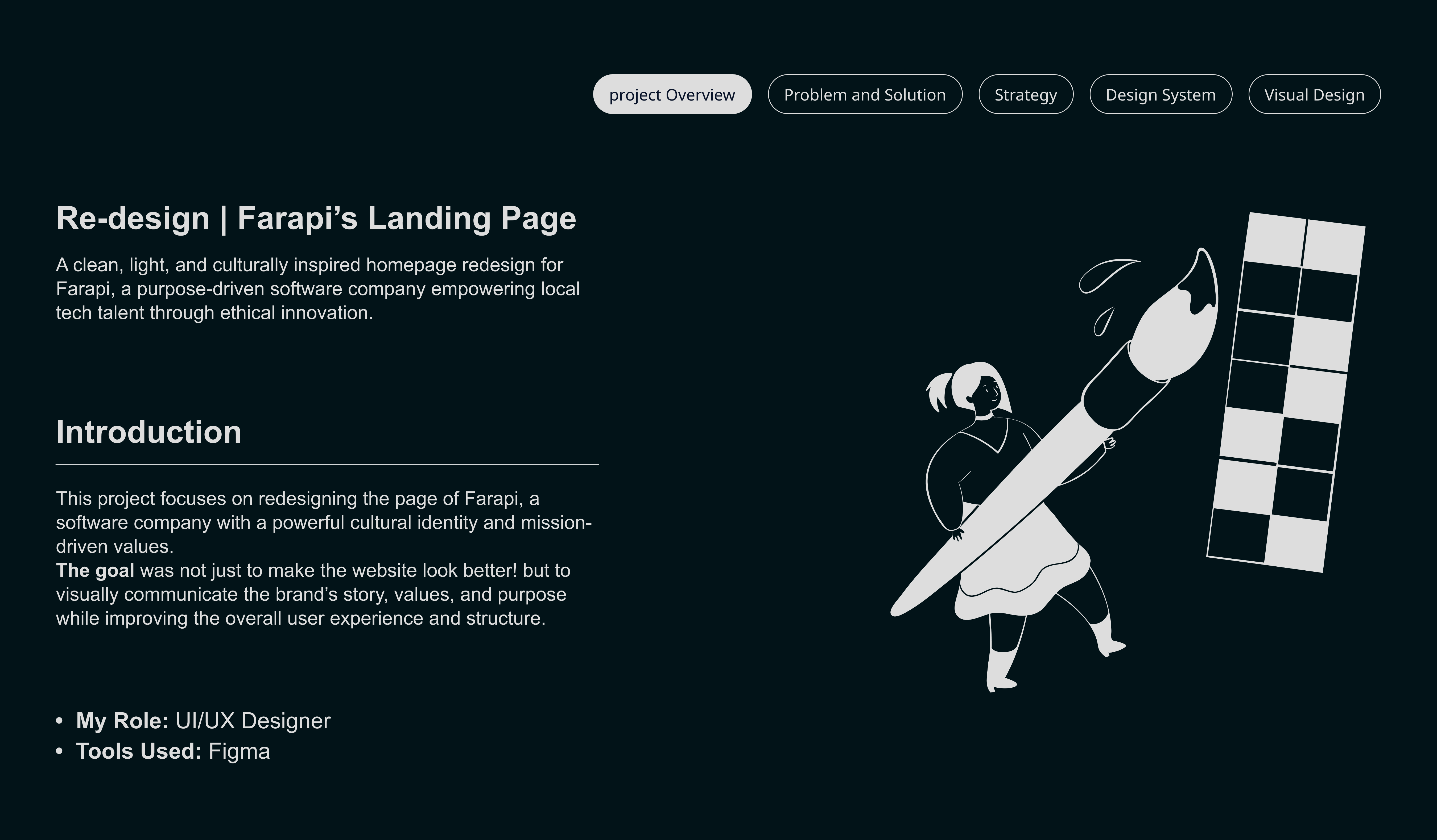
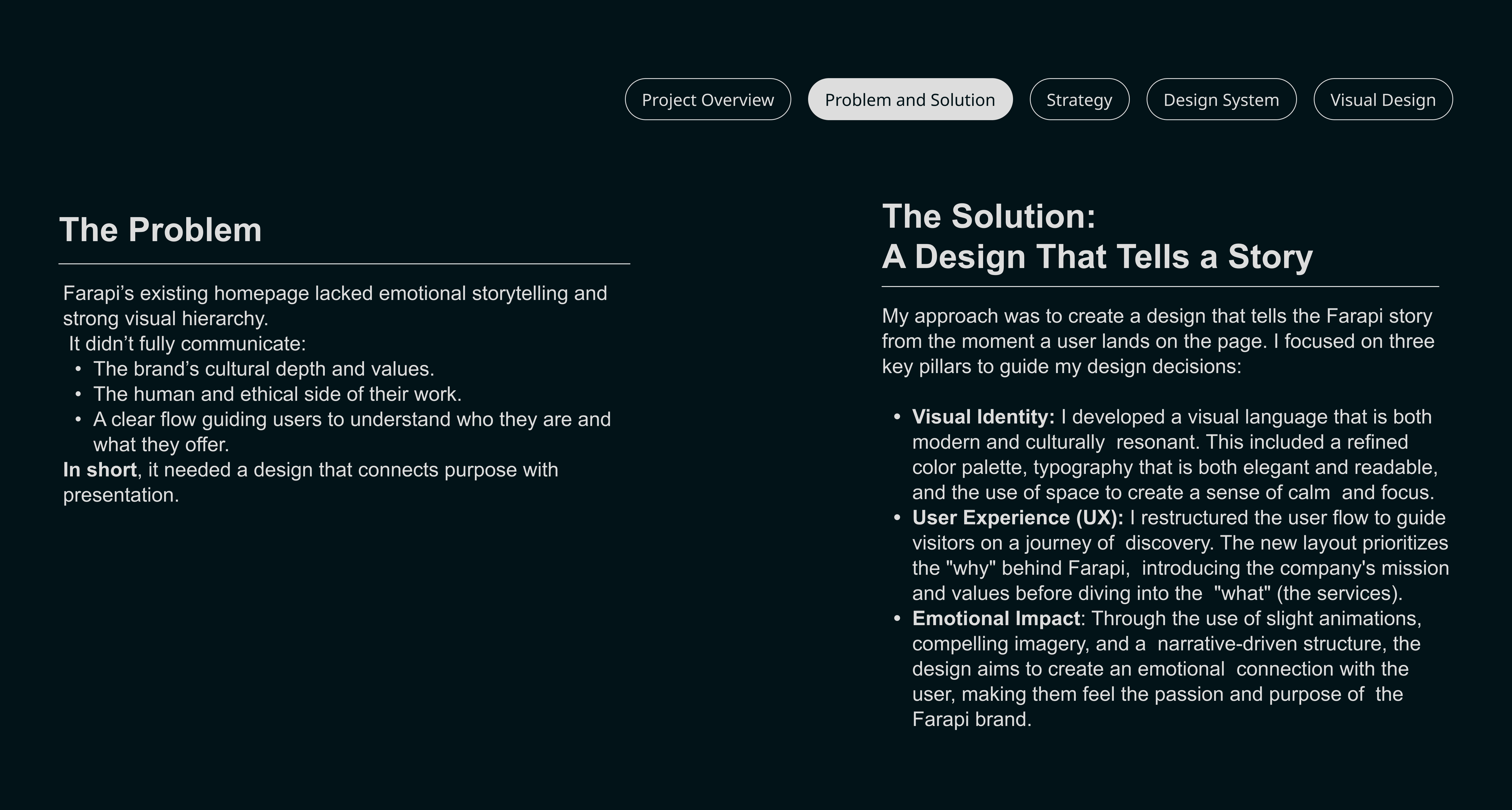
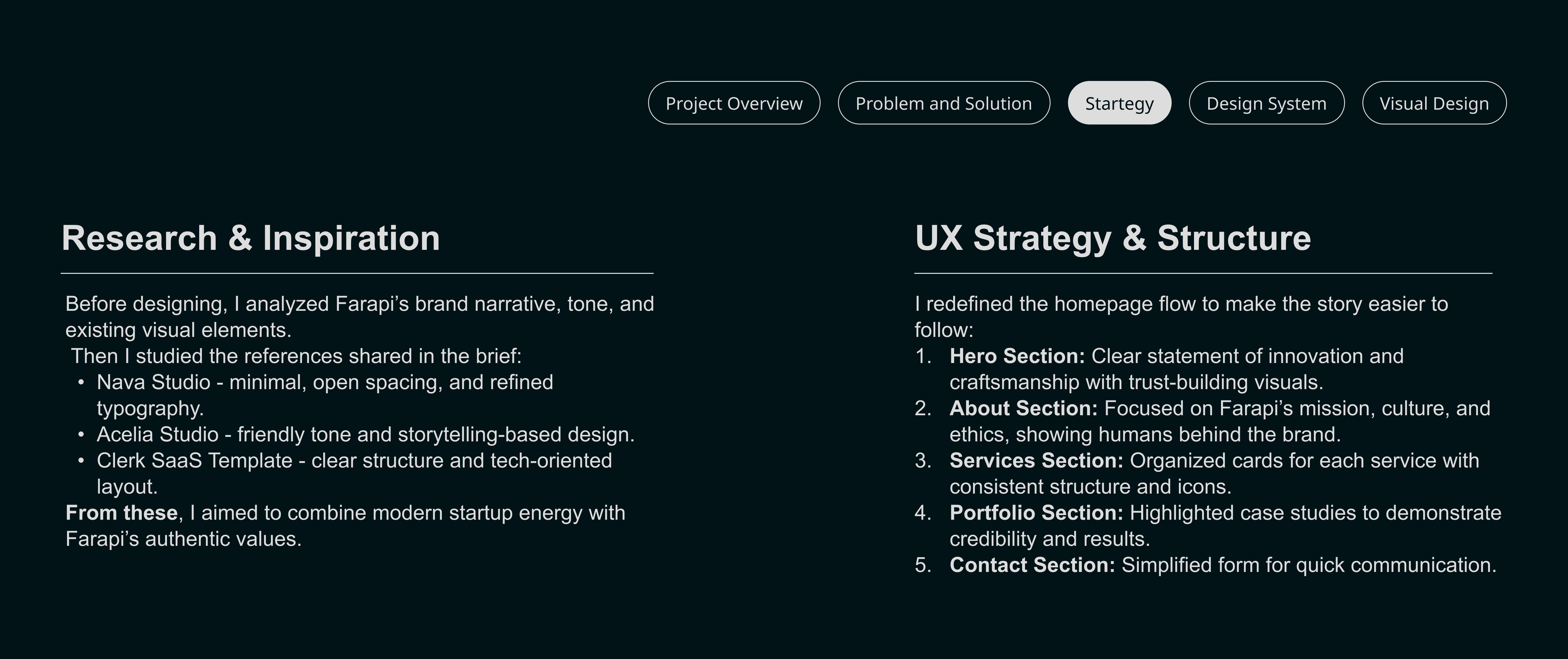
Contrary to other reviews, I do find explanations easy to read and in the project I'm looking at, there are sections on research, the problem, and users, maybe something you added after?
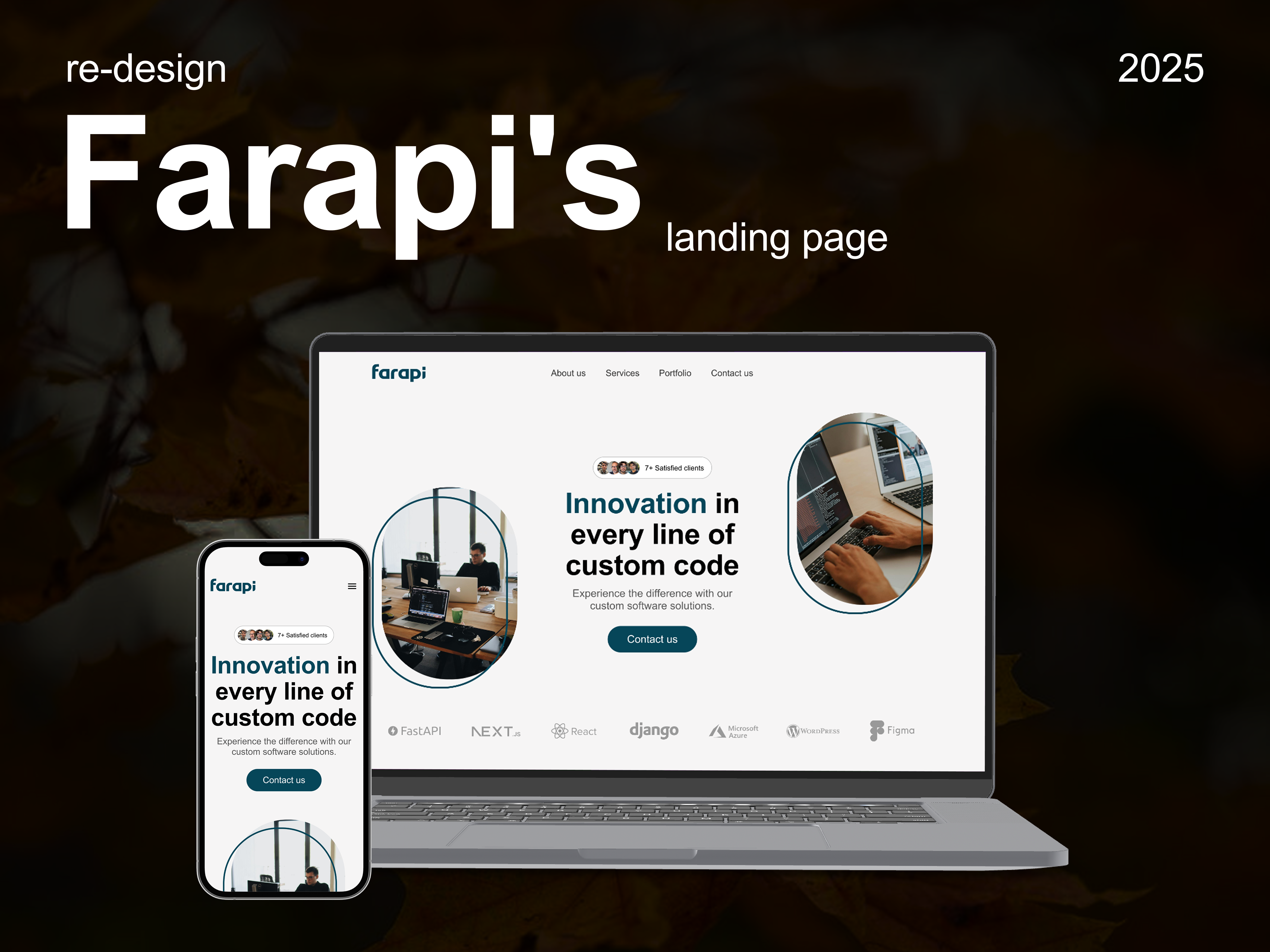
If anything, because this is a re-design project, I would love to see what the website looked like before.
Finally, the mobile version at the end was a great addition.

Really nice looking presentation and clean UI in the high fidelity wireframes! Good job setting up the problem you were wanting to fix and explaining your design rationale.
My only concern is a lot of the copy is pretty small in your explanations and might prove difficult to read. I also would have liked to see some of the research you did and sketches / lofi wireframes for the full process.
Keep up the good work!

Nice work! The visual hierarchy, spacing, and typography make the new landing page feel much clearer and more modern 👏🏽😍
To take this case study to the next level, try adding a short section about the problem, target users, and key UX decisions (with metrics or goals if possible) so viewers can better understand the strategy behind your redesign.

Congratulations on the redesign Salma.
The project feels fresh and easy to navigate. It would be interesting to see the previous version of the website so the improvements and results of the new design could be compared more directly.
I am also curious about how the form validation works at the bottom of the page. Right now the button is always active. Will an error appear if the user clicks the button without entering anything. A common best practice is to disable the button until the required fields are filled. This helps prevent unnecessary user frustration and makes the flow more intuitive.

Really great project, Salma! The website feels clean, flows nicely and builds a strong sense of trust. Good job :)

Great project Salma. Keep it up!

Thats very good Salma, - do you have started great actually. Some micro things that you need to take care of and I can help you as a mentor.
- Icon should never be complicated. It should be as simple one line or be totally filled. If it is detailed and it's small. It's hard to recognise from far away so recognizable UX law is necessary because human trust more which they are familiar to.
- When it comes to logo, try to use real logos rather than their line, icon variant. Showing brand and trust always, will build a real genuine connection because your goal is to sell a product not just created the senior people only have one mindset. Can this product be trustworthy and sellable to people?
- Start the conversation from business mind and explain the details like you have entered the logo in grey, but what does this logo mean? Are you tie up with that or this are the customers or this are your connection to be very clear
- In the Mobile version image should be at the top and I would suggest to add a video maybe edited from YouTube and showing the agency life of how they are working their daily life rather than the photos because in the days of Instagram reels, people don't trust photos, they trust human connection. Their enjoyment, the struggle, their working, how they are working their office.
And there many things needs Improvements -
I can help you - check my uxcel profile & for mentorship connect me there, will be happy to help
You might also like

Nestra from homepage to checkout process


Islamic E-Learning Platfrom Dashboard


Pulse — Music Streaming App with Accessible Light & Dark Mode

SiteScope - Progress Tracking App


Mobile Button System


FlexPay

Popular Courses

UX Design Foundations


Introduction to Figma

Design Terminology
