QuillPath Colour System
Overview
This project was all about creating a fresh, functional, and accessible colour system for a digital work management tool.
The goal wasn’t just to pick nice colours, it was to build a system that helps users feel confident, focused, and in control while also making the brand feel distinct from the competition.
Brand Personality
QuillPath is a new desktop-first digital work management tool. QuillPath’s personality is grounded in clarity, creativity, and quiet confidence. To reflect that, I chose:
- Blue (Q-Blue) as the primary colour is clear, calm, and dependable. It drives the core experience, from primary buttons to key actions.
- Purple (Stellar Purple) as the secondary brings a touch of energy and imagination, helping to support creative flows and elevate secondary elements.
- Teal (Horizon Teal) as a tertiary accent is used sparingly to highlight or soften moments, keeping things approachable and modern.
Each of these colours was extended into a full range of shades so that they could flex across backgrounds, borders, and states.
Emotional & Psychological Alignment
Every colour choice was intentional. I mapped each colour back to the emotion or feeling it should evoke:
- Q-Blue: Clarity, reliability, momentum
- Stellar Purple: Richness, creativity, distinction
- Horizon Teal: Freshness, lightness
System colours (Success, Warning, Error, and Info) were chosen to feel aligned with universally established emotional principles, alerting users without overwhelming them.
Accessibility
I tested contrast ratios using WCAG guidelines and made sure all critical pairings met at least AA standards. When some didn’t (like Horizon Teal on white), I adjusted usage guidance, for example, using that colour only in icons, graphics, or backgrounds, not body text.
Light and Dark UI Support
Both light and dark mode variants are included in the project screens, and the colour system was carefully designed to support both. Brand colours like Q-Blue and Stellar Purple were tested on dark surfaces to ensure they retain their vibrancy and contrast. Neutrals were inverted appropriately (e.g., light backgrounds to dark, dark text to light) to maintain legibility and emotional tone in both modes, without compromising accessibility.
Tools used
From brief
Topics
Share
Reviews
3 reviews
Really nice Quillpath Colour System! The palette feels balanced and versatile, with good contrast between primary and secondary tones. Would love to see how these colors apply across different UI components or themes, but as a base system—it’s clean and well thought out!
Awesome work. Your design rationales are well-elaborated. And the color systems for both light and dark theme look great in your UI examples.
One consideration: would be nicer to understand how your design differentiate from competitors of similar platform referring to the project brief.
Hi Mir,
I really appreciate the thoughtfulness and (I feel like saying) courage in comprehensively using color to liven up the UI and guide the eye through it! I know that was probably not your main intention, as you've carefully chosen the colors to serve a well-considered function... but do take this additional win!
Your solution also caught my attention because you've made it your own and went beyond the brief.
Keep it up and good luck with all the other assignments and projects!
You might also like
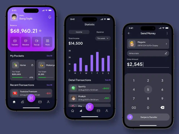
eWallet App Development Project
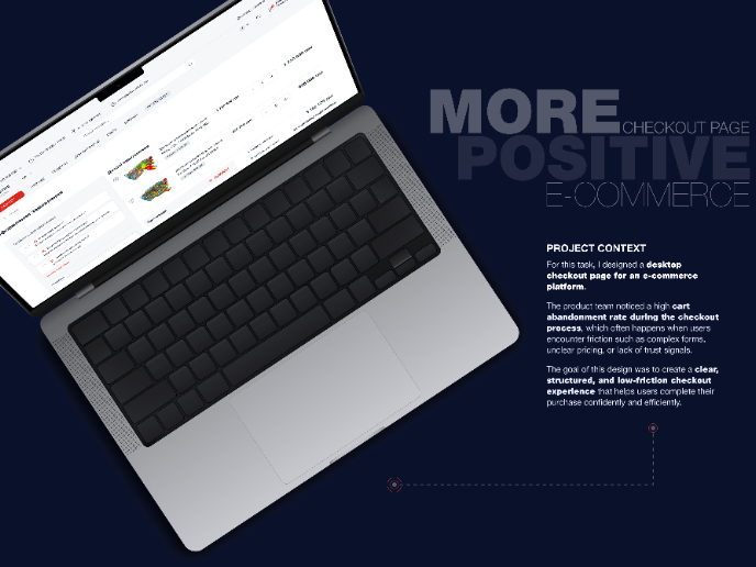
🖥 Desktop Checkout Flow Design

Website CRM Dashboard
Helpful 404 Error Page for a Fintech Mobile App
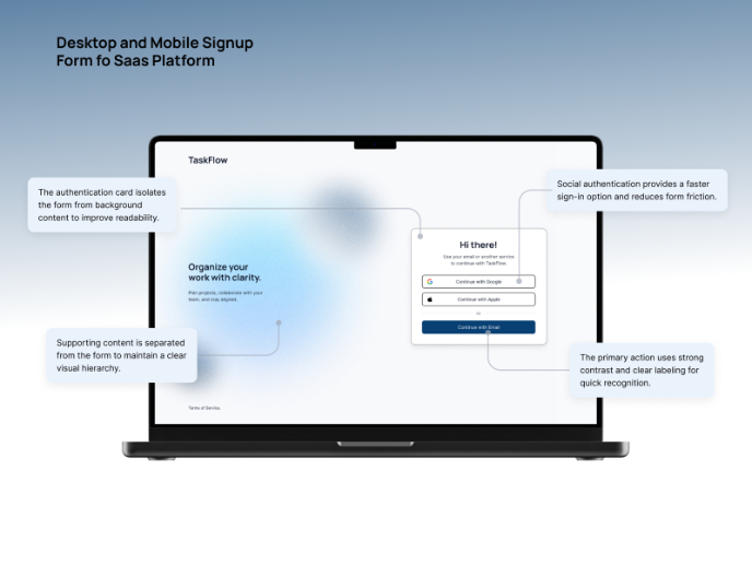
TaskFlow Authentication Flow
Pebble Accessible SAAS Signup Flow
Visual Design Courses

UX Design Foundations

Introduction to Figma


