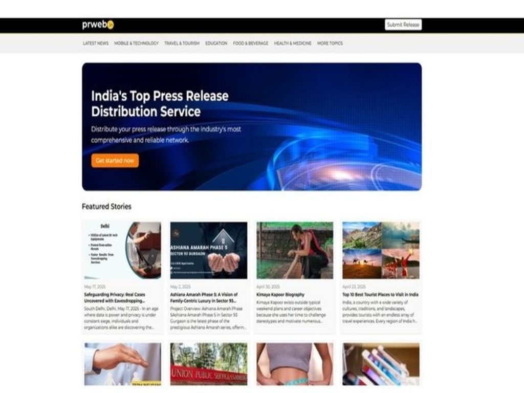
PRWeb Homepage Redesign Concept
Overview
This project stands for the PRWeb homepage redesign conceptualized. With all functionalities present in the current layout, it visually brings together a lot of elements in certain spots and is missing a clear content hierarchy. Consequently, users might not be able to grasp the platform value at a glance or find their way through press releases and featured stories easily.
This redesign wanted to convey not only more tidiness and order but also a more user-friendly and intuitive homepage while enhancing user understanding and browsing efficiency.
1. Understanding the Problem
The very first inspection of the homepage brought to mind a few problems that I later outlined.
- The oversized main banner is grabbing major visual attention, and therefore, the most relevant content is pushed down the page.
- Although featured stories are presented, the user layout does not effectively guide user attention.
- Navigation may be more intuitive for new visitors.
- The homepage is not adequately clear in presenting PRWeb’s goals and benefits.
2. Research and Insights
After taking a look at local press release distributors and electronic media distributing platforms, I came to the conclusion that:
- Users like simple homepages with a concise value proposition of the service.
- Press release websites have to implement strong categorization so that users can scan stories very quickly.
- The user's behavior in terms of engagement and scrolling is largely influenced by visual hierarchy.
- Trust-building features (badges, testimonials, footprints) serve to clarify credibility.
These insights got me thinking about the layout design that better serves the users.
3. Design Goals
After discoveries, I drafted the redesign goals as follows.
- First of all, the visual hierarchy should be clearer and more balanced.
- The immediate value proposition should be visible without user overwhelm.
- The Featured Stories section layout should be changed for users to scan it easily.
- By outlining the categories and sections, users will be able to navigate more effortlessly.
- Keep a professional, news-like style, which is expected from a press release platform.
4. Key Design Decisions
Improved Hero Section
The hero banner was refashioned to communicate the platform's main idea in a more concise way. The call to action remains visible, but it is not the focus of too much attention.
Refined Navigation Bar
The navigation bar is stripped and sorted out to highlight leading categories like Latest News, Technology, Travel, Education, Food, and Health. This makes it easier for users to quickly grasp the site's structure.
Reimagined Featured Stories Layout
The featured stories are presented in a grid that focuses on readability. Each card contains a publication date, an image, and a brief title, thus facilitating quick reading.
More Consistent Visual Style
I brought in uniform spacing, better typography, and a cleaner color balance, which together give the homepage a modern and trustworthy appearance.
5. Outcome and Reflection
The remodeled homepage concept provides a more hospitable and informative experience. It is now possible for users to grasp the platform's purpose at a glance, and they can also find the stories in a more efficient way. Navigation becomes easier, and the overall look is more professional and neat.
In case this was a real implementation, the following step would be conducting usability testing in order to confirm if the new layout enhances engagement and user satisfaction.
Tools used
From brief
Topics
Share
Reviews
3 reviews
Hi Max, I cannot see what the design looked like before but your analysis tells me you focused on making the value proposition clear and navigation easier and these are good things to focus on but... This is not the design for a SaaS pricing page. It doesn't matter how much work you put into something if you're putting work into the wrong things.
Maybe you uploaded the project to the wrong brief but these are small details that in a real work environment matter.
Thanks for your ideas and the concept! I appreciate your approach, and I agree with most of your outcomes. You’re absolutely right about the clear goal and the user’s behavior. I’d just add one nuance to your point about “users liking simple homepages with a concise value proposition.” Simplicity works well, but only when users first understand what the page does and how it solves their problem. For platforms like PRWeb, clarity and hierarchy might matter even more than simplicity, because users need initial context before they start exploring. This would be especially valuable to validate during user research.
Overall, great reasoning! I think your concept is on the right track, and this point could make the argument even stronger.
Max – I'm not sure what to say here. You didn't want every Developer do – directly put to court 😆. If this is what you have made, you are still still very far apart, and you need a lot of learning in terms of design details and UX scalability growth design Mindset.
If you want to enter the Design world, it's all about the small small micro details. The curiosity of human reaction, what's gonna happen if you change the button colour or added a fomo section… making more homo actions and testing it - curiosity of Design needs to be present.
You can definitely improve that, but starting your brief was to make pricing page upload this with that.
And if you want to see some coded templates, go for Water things and look across how their developers are actually developing. See their text back and also learn as a developer while making more real Design.
Check my uxcel profile if you want personal help and mentorship – I can help you 1:1
You might also like

Smartwatch Design for Messenger App

Bridge: UI/UX Rebrand of a Blockchain SCM Product

Pulse Music App - Light/Dark Mode

Monetization Strategy

Designing A Better Co-Working Experience Through CJM

Design a Settings Page for Mobile
Visual Design Courses

UX Design Foundations

Introduction to Figma


