Product Solo

Welcome to Product Solo – Your Path to Mastering Product Management
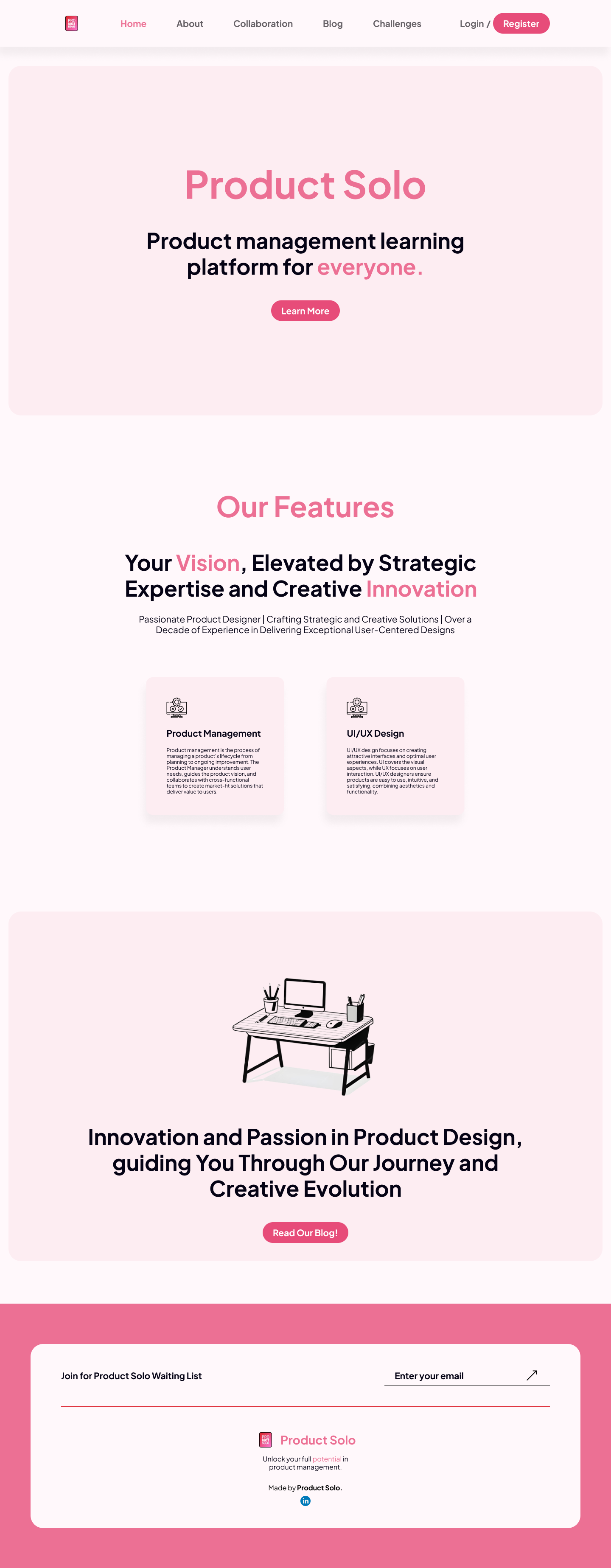
At Product Solo, we’re dedicated to helping you thrive in the dynamic world of product management. Whether you're just beginning or looking to advance your expertise, our platform provides a comprehensive learning experience tailored to your journey.
Why Product Solo?
We offer diverse learning resources to suit your style:
- Articles: Explore expert insights and the latest trends in product management.
- Resources (Coming Soon): Gain access to key materials on product management, project management, and UI/UX design.
Learn at your own pace, anytime, anywhere.
Our Core Values
- Confident: Empowering self-confidence in every step of your learning.
- Hearty: Fostering a supportive and collaborative environment.
- Actionable: Focused on delivering impactful, practical content.
- Result-Oriented: Driven by measurable outcomes for accelerated growth.
- Mindful: Cultivating responsibility and effective collaboration.
Join Us Today
Boost your product management skills with Product Solo. Whether you're just starting or advancing your career, we're here to support your growth. Explore our resources and start your journey today!
Reviews
3 reviews

Hey, Moch! Great job!
I like the colors and how you combined the shades. I am a fan of pink, and this page would get my attention and make me unconsciously like the product because of the colors. However, pink is still a color associated with femininity, and I'm not sure if you intended to target female users, did you?
Some points of improvement:
- Increase the line height for better readability.
- Increase the font size of the text inside the blocks (PM, UI/UX...).
- Use a darker pink or bold in the word "potential" on the footer. Currently, it is looking faded.
Keep up the good work!

Hi Moch! Well done on the design! The color palette is vibrant, and I appreciate how the shades of pink create an engaging atmosphere. A few suggestions: consider adjusting the line height for improved readability and increasing the font size in the category blocks for better visibility. Keep pushing forward with your great work!

First of all, nice work. I like the pink, I think it's brave, yet needs the copy to match the vibe.
Also:
The slash in the header doesn't make sense, it's used when two elements look the same. Replace it with a pipe | or just some whitespace.
Increase the line-height of paragraph text.
Improve contrast in some places like the footer.
The newsletter in the footer is spread too widely, the headline sits on its own, but should be right next to the form (don't just squish them together, think of something nice)
You might also like

Nestra from homepage to checkout process


Islamic E-Learning Platfrom Dashboard


Pulse — Music Streaming App with Accessible Light & Dark Mode

SiteScope - Progress Tracking App


Mobile Button System


FlexPay

Popular Courses

UX Design Foundations


Introduction to Figma

Design Terminology
