PAWS & PREEN PET SALON


Chosen Device Sizes & Justification:
Mobile: 375px (iPhone SE)
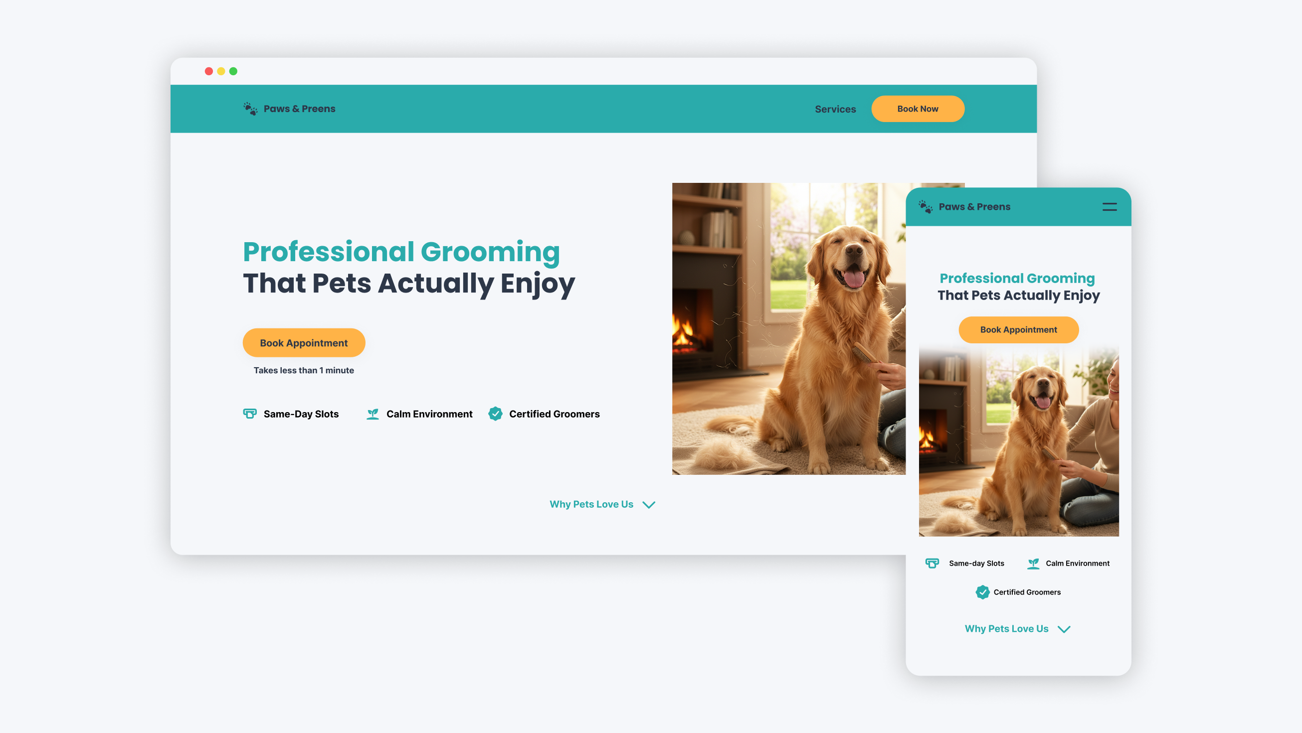
Why: The most constrained screen size forces clean content prioritization. Pet owners frequently search and book appointments while mobile, making mobile-first design essential for conversion.
Tablet: 768px (iPad Portrait)
Why: Represents the mid-point between mobile and desktop. Allows testing of hybrid layouts and ensures the design works well on popular tablet devices used at home.
Desktop: 1440px
Why: 1440px is a common modern desktop resolution. The 1200px centered container prevents overly long text lines (improving readability) while maintaining consistent content width across large screens.
Grid System:
- Mobile: 4 columns, 16px gutter, 20px margin
- Tablet: 8 columns, 24px gutter, 40px margin
- Desktop: 12 columns, 24px gutter, 120px margin (centered)
Responsive Adaptation
Key Decisions & Rationale:
| Component | Mobile | Adaptation | Desktop | Adaptation | Reasoning | |||
| Navigation | Hamburger menu only | Full visible navigation | Mobile: Reduces clutter. Desktop: Provides immediate access |
| Hero Section | Stacked (text → image) | Side-by-side (6-col text, 6-col image) | Mobile: Ensures CTA is visible without scrolling. Desktop: Utilizes horizontal space efficiently |
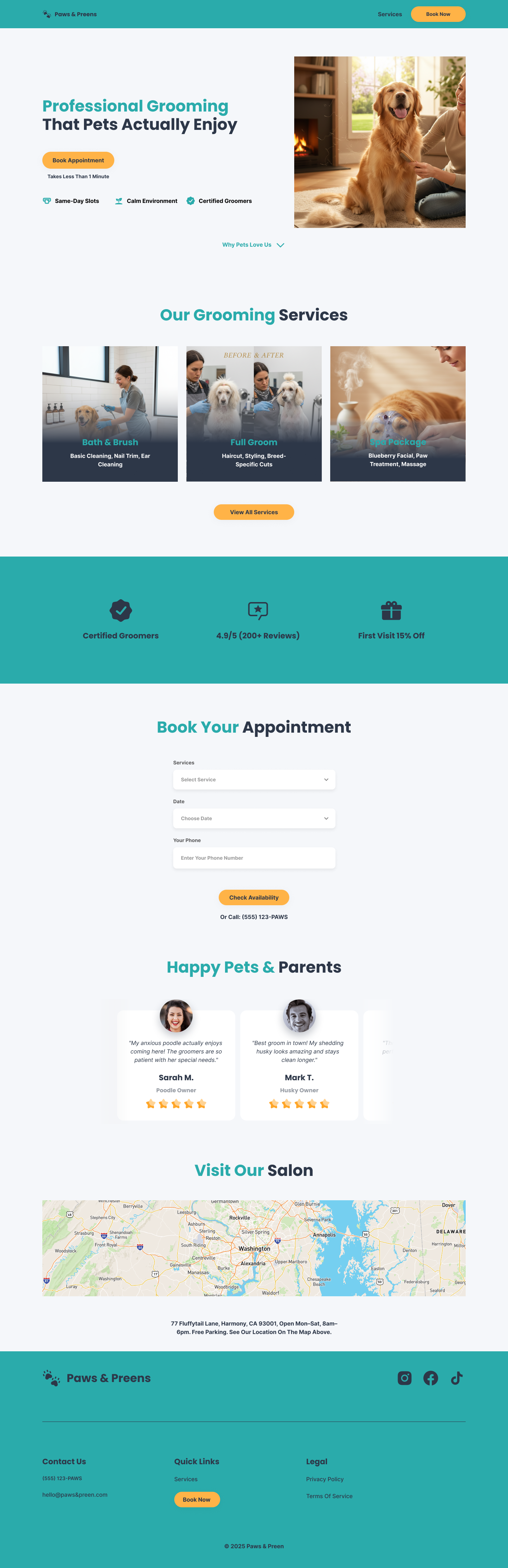
| Services | Vertical list | 4-column grid | Mobile: Easy thumb scrolling. Desktop: Quick scanning comparison |
| Booking Form | Full-width, simple 3 fields | Integrated with the trust signals section | Mobile: Reduces cognitive load. Desktop: Combines persuasion with action |
| Testimonials | Single card with swipe | Carousel showing 2-3 at once | Mobile: Focused reading. Desktop: Social proof visibility |
Visual Design System
- Color Psychology: Teal (#2AA8A8) for trust/cleanliness, Apricot (#FFB347) exclusively for CTAs to drive action.
- Typography: Poppins (friendly yet professional) for headings, Inter (highly readable) for body text.
- Imagery: Contextual photos showing happy pets and professional grooming environments.
- Accessibility: 44×44px minimum touch targets, WCAG AA contrast ratios maintained
ADDRESSING EVALUATION CRITERIA
Content (Criterion 1)
- Purpose-Driven: Every section supports booking conversion (services → trust → 3-step booking form → Testimonial → Location → footer)
- High Quality: Jargon-free copy, benefit-focused headlines, clear value proposition
- Full Functionality: Complete information hierarchy (what, why, how, who, where) while maintaining focus
INFORMATION HIERARCHY BREAKDOWN:
1. WHAT? (The Offering)
What do you do? What services/products?
Our Answer: "Pet grooming services: Bath & Brush, Full Groom, Spa Package."
Where in design: Services section, clear headlines
2. WHY? (The Value/Problem Solved)
Why should I choose you? What problem do you solve?
Our Answer: "Stress-free grooming for anxious pets. Certified professionals, calming environment."
Where in design: Hero headline + value prop, Trust section
3. HOW? (The Process)
How does it work? How do I engage?
Our Answer: "Book online in 3 steps: Select service → Choose date → Phone number → Submit."
Where in design: Booking form, clear CTA path
4. WHO? (The Credibility)
Who are you? Why should I trust you?
Our Answer: "10+ certified groomers, 4.9★ rating, fear-free certified"
Where in design: Trust badges, testimonials with real names
5. WHERE/WHEN? (The Logistics)
Where are you? When are you open?
Our Answer: "77 Fluffytail Lane, Harmony, CA 93001, Mon-Fri 8 am-6 pm, Sat 9 am-4 pm"
Where in design: Location section, footer contact info
Usability (Criterion 2)
- Safety: Form includes only essential fields, transparent pricing in the service dropdown
- Effectiveness: Booking path requires minimal steps (3 fields → submit)
- Efficiency: Critical actions (booking) accessible within 2 taps/clicks
- Enjoyable: Calming color palette, happy pet imagery, clear progress indicators
Visual Design (Criterion 3)
- Color Strategy: Teal establishes brand trust, apricot directs to conversion points
- Typography Hierarchy: Clear heading levels, comfortable reading line lengths
- Imagery: Supports content (happy pets = positive outcomes), not decorative
- Consistency: Design system applied uniformly across all breakpoints
Presentation (Criterion 4)
- Templates Used: Desktop design presented in the provided Uxcel template format
- Formatting: Clear section headers, consistent spacing, professional typography
- Rationale: This document provides explicit reasoning for every design decision.
For the header/Navigation, I chose a minimal approach that only includes the key link needed.
1. Services is the only secondary page users might need
2. BOOK NOW is the primary action
3. Contact, Location, Reviews** are all on the landing page already (as sections)
4. Follows best practice: "Remove navigation that doesn't support conversion."
ITERATION: Navigation Approach
Version 1: Full navigation (Home, Services, About, Contact, Book)
Problem: Too cluttered for landing page
Version 2 (Final): Minimal (Logo, Services, Book Now)
Why: Follows landing page best practices, reduces distraction
Here's the link to the full case study: https://www.behance.net/gallery/241372535/Paws-Preen-Responsive-Pet-Salon-Landing-Page
Tools used
From brief

Topics
Share
Reviews
2 reviews

Good start, good job talking about your process. However, I would prefer if you would show more of the process / deliverables alongside talking about them. Show sketches, ideation, etc. in the case study to demonstrate process and show the design system you created as well. Also, in your view full project, a lot of your designs are cut off in the mobile view, only showing the bottom of the design and only seeing a portion of the desktop design on a mobile mockup.
Keep going! This just needs some more polish before you consider it a solid part of your portfolio.

Hi David
From a branding perspective, Paws & Preen feels aligned with its category. Pet service products benefit from warmth and approachability, and if the design communicates trust and friendliness, that’s already a strong strategic move.
What stands out in service-based concepts like this is clarity of action. For a pet salon, users likely want quick answers: services offered, pricing, booking flow. If the structure makes those decisions effortless, then the experience is doing its job effectively.
To refine it further, I’d explore how emotional storytelling can be amplified testimonials, before-and-after visuals, or trust indicators that reassure pet owners. In this space, credibility and care matter deeply. Overall, this feels on-brand and purposeful, with good foundational UX instincts.
You might also like

Smartwatch Design for Messenger App


Bridge: UI/UX Rebrand of a Blockchain SCM Product


Pulse Music App - Light/Dark Mode


Monetization Strategy


Designing A Better Co-Working Experience Through CJM


Design a Settings Page for Mobile
Visual Design Courses

UX Design Foundations


Introduction to Figma

Design Terminology
