Onboarding flow for Starbucks
Reviews
2 reviews

Good work on the redesign!
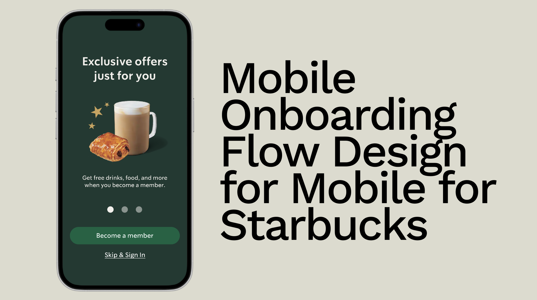
In the redesign, the "Sign In" and "Join Now" buttons might be a bit confusing, as they don’t clearly communicate what happens next. Additionally, the visual styling makes one appear as a primary button and the other as a secondary, but the labels themselves have similar meanings, which could cause uncertainty for users.
If the flow is centered around membership, the primary button label could align more directly with the action—something like "Become a Member"—while the secondary button could be adjusted to "Skip" to provide a clearer alternative.
In this case, "Sign Up" and "Log In" may not need as much prominence. These actions could be introduced later in the journey when they are essential, such as during checkout or when a user adds an item to the cart.
Suggestions:
- Considering when users truly need to sign up or log in can help refine the flow further.
- Grouping related actions to reduce confusion and delaying certain steps to minimize interaction costs can contribute to a smoother user experience.
Overall, great effort on the redesign, and these refinements can help make the experience even more intuitive for users!

Great job on the onboarding flow! I can clearly see your design thinking behind each decision, and I appreciate how you've structured the experience to be both engaging and informative.
One area that could use refinement is the “Skip” button behavior. At first, I thought that clicking it would close the onboarding flow and take me directly to the home screen of the app. However, after reading your case study, I realized that skipping still leads the user to a sign-in screen.
This creates a potential disconnect between expectation and reality, especially when considering the difference between “Becoming a Member” and “Signing In.” The potential confusion stems from users expecting to jump straight into the app after skipping, rather than encountering another decision point between "Sign In" and "Register"
If skipping the onboarding doesn’t grant immediate access, consider renaming the button to "Skip & Sign In" to set the right expectation. This small tweak removes ambiguity.
Your onboarding flow is already strong, but refining this aspect will make it even smoother and more intuitive. Keep up the great work!
You might also like
SiteScope - Progress Tracking App


FlexPay


Mobile Button System


CJM for Co-Working Space - WeWork


Ubani Design System


Accessible Signup Form for SaaS Platform
Popular Courses

UX Design Foundations


Introduction to Figma

Design Terminology
