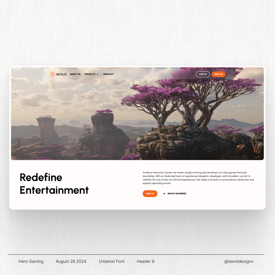
Nexus – Gaming Studio

Today I've posted after a long long time to just get more into social media again.
I work as a freelancer and want to try out designing for game studios. This is my first attempt with it. I used my standard workflow with the Relume library and ChatGPT in copywriting. The image is created with Midjourney.
Overall I'm pretty happy, but this was only like 2h of work. You could definetly do more. Just to create a foundation with it.
Reviews
2 reviews

Thank you for your submission, David! This looks fresh and clean. The only thing I would have in mind is:
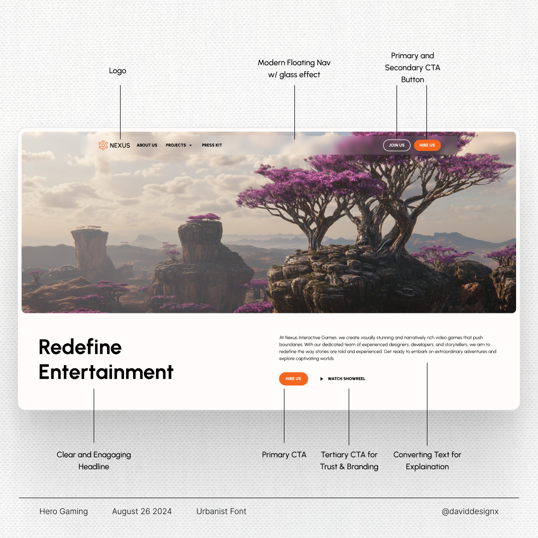
- Have you considered the right orientation of the container with the CTAs?
I would love to see a responsive mobile version!
Great vibes!
Thanks for the feedback, Cristian!
Unfortunately I cannot add another image after publishing, but the mobile variant is fairly simple. The only downside on having a floating nav is, that it will lay on top of the image and hides some of the content.
Can you explain your question about the orientation a bit further? Do you mean why I changed the sequence of the buttons compared to the navbar?
Maybe some explanation why I chose this layout:
In my research I saw, that most studios use a big image in their header about their latest game. I saw many carousels, but thought for a smaller studio with less projects might want to showcase their main MVP. In the beginning I was planning on having a video instead and having too much text on with a video in the background would feel too busy.
With this layout every piece of content can breath. That's why I chose it :)
If you have additional questions, you can always ask. Thanks again for the review!
By that, I meant that aligning elements like CTAs on the right side of the screen—a position naturally perceived as “next” or “proceed”—can subtly guide users toward conversion. It’s these small but intentional adjustments that can transform user experience and drive sales growth.
We can debate on this! :D

I love your work it looks really interesting. Well done! It is very clear and clean. Keep up the good work!
Thank you for your kind words, Robert!
You too. We are in this together :)
Your welcome! Good luck on your journey!
13 Claps
Average 4.3 by 3 people
You might also like

Project
Smartwatch Design for Messenger App

Practice your interaction design skills and design experience optimized for smartwatches.

Project
Bridge: UI/UX Rebrand of a Blockchain SCM Product

A UI/UX overhaul project of Bridge, a blockchain-based enterprise supply chain management web app originally called BSCM. This short case st

Project
Pulse Music App - Light/Dark Mode

This project presents a mobile music streaming interface designed in both light and dark modes. The visual direction combines Japandi minima

Project
Monetization Strategy

This project evaluates two monetization models (freemium and paid) for a new mobile point-and-click adventure game. It compares their streng

Project
Designing A Better Co-Working Experience Through CJM

Project ContextThis project focuses on improving the experience of individuals using co-working spaces. The objective is to identify key pai

Project
Design a Settings Page for Mobile
Showcase your information architecture and content strategy skills by crafting a settings page for mobile.
Popular Courses

Course
UX Design Foundations

Learn UX design fundamentals and principles that create better products. Build foundational knowledge in design concepts, visual fundamentals, and workflows.

Course
Introduction to Figma
Learn essential Figma tools like layers, styling, typography, and images. Master the basics to create clean, user-friendly designs

Course
Design Terminology

Learn UX terminology and key UX/UI terms that boost collaboration between designers, developers, and stakeholders for smoother, clearer communication.