National Art Gallery Home Page
Reviews
1 review
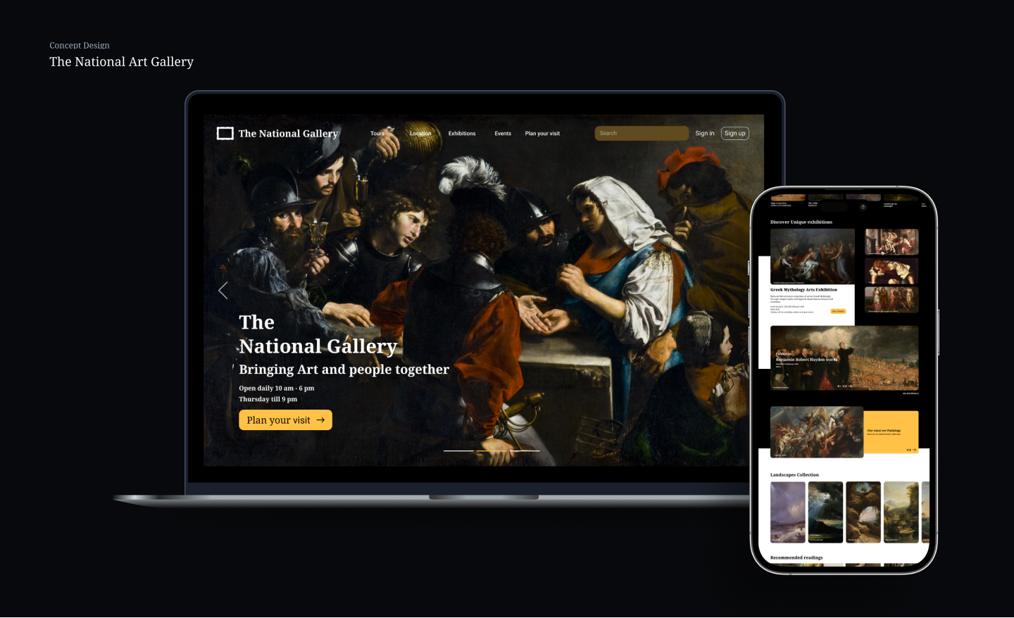
The National Art Gallery homepage is visually engaging, well-structured, and effectively highlights exhibitions and events. The design does a great job of maintaining a premium, artistic feel with strong imagery, clear navigation, and well-placed CTAs. However, some areas could be improved to enhance readability, usability, and performance. Issues like text blending into images, low-contrast buttons, heavy image loading, and the lack of event filtering make the experience slightly less seamless. Addressing these will improve accessibility, speed, and overall user interaction without compromising the aesthetic.
What Works Well
1. Strong Visual Hierarchy
- The large hero image effectively captures attention and establishes the artistic theme.
- The bold typography for section headings makes it easy to scan content.
- Good use of spacing ensures readability and flow between sections.
2. Well-Organized Navigation
- The top navigation bar provides access to key sections (Exhibitions, Events, Workshops, etc.).
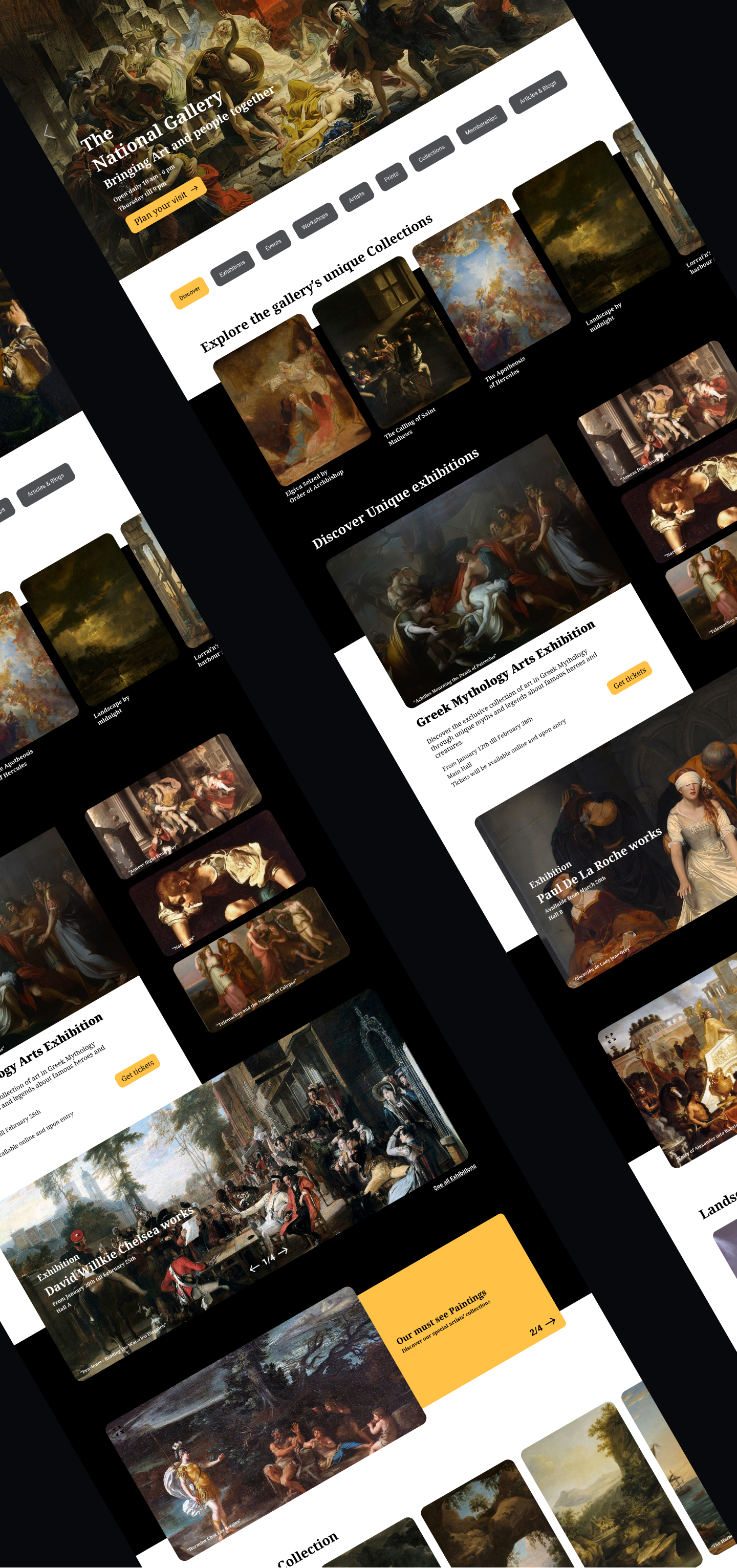
- The category tags (Discover, Exhibitions, Events, etc.) allow users to filter content easily.
3. Engaging Content & CTA Placement
- The "Plan Your Visit" CTA in the hero section is prominent and effectively encourages action.
- Event and Exhibition sections provide clear CTAs like "Get Tickets" and "Explore Guided Tours."
4. Consistent Aesthetic
- The dark and gold colour scheme gives a premium, elegant feel.
- The grid layout for collections and events maintains visual consistency.
Areas for Improvement (Based on Observations)
1. Readability Issues with Text Over Images
❌ Issue: Some text appears over detailed paintings, making it hard to read (e.g., "Greek Mythology Arts Exhibition" section).
- White text on light or complex backgrounds reduces legibility.
📊 Research: According to Web Content Accessibility Guidelines (WCAG), text contrast should be at least 4.5:1 for readability.
✅ Solution:
- Add a semi-transparent overlay behind the text to improve contrast.
- Use darker background shading on busy artwork sections.
2. Call-to-Action (CTA) Visibility
❌ Issue: Some CTA buttons blend into the design and don't stand out enough, reducing their effectiveness.
- For example, the "Get Tickets" button in the Greek Mythology section is too similar to the background.
📊 Research: The Von Restorff Effect (Isolation Effect) states that elements that stand out are more likely to be noticed and clicked.
✅ Solution:
- Use a brighter or more contrasting colour for CTAs.
- Consider adding a slight shadow or border to make buttons pop.
3. Image Loading & Performance Considerations
❌ Issue: The design relies heavily on high-resolution images, which might slow down page loading times.
📊 Research: Google studies show that 53% of users leave if a page takes more than 3 seconds to load.
✅ Solution:
- Implement lazy loading so images load only when needed.
- Convert images to WebP format, reducing file sizes by 30-40% while maintaining quality.
4. Event & Exhibition Discovery Could Be More User-Friendly
❌ Issue: The listings for events and exhibitions are static, meaning users have to scroll without filtering options.
📊 Research: According to Hick’s Law, the more choices users face without organization, the longer it takes for them to decide.
✅ Solution:
- Introduce filters for events and exhibitions, such as:
- Date-based: Upcoming, Ongoing, Past.
- Category-based: Paintings, Sculpture, Digital Art.
This will help users find relevant exhibitions faster.
5. Footer Feels Overcrowded
❌ Issue: The footer contains too many links and options, making it visually dense.
- Too much text in a compact area can feel overwhelming.
📊 Research: Studies show that users scan, rather than read, and crowded footers reduce engagement.
✅ Solution:
- Use collapsible sections for detailed links (e.g., “Support,” “Membership”).
- Reduce repetitive links and group related items together.
The design is already a strong and engaging gallery homepage, but these refinements would improve readability, usability, and performance while keeping the elegant aesthetic.
You might also like

PLANTIST

Lumen

NORTHSIDE - Coworking space Customer Journey Map

Accessible Signup Form for Monkey Survey

Crave Corner - Bakery App Design
Uxcel Halloween Icon Pack
Popular Courses

UX Design Foundations

Introduction to Figma


