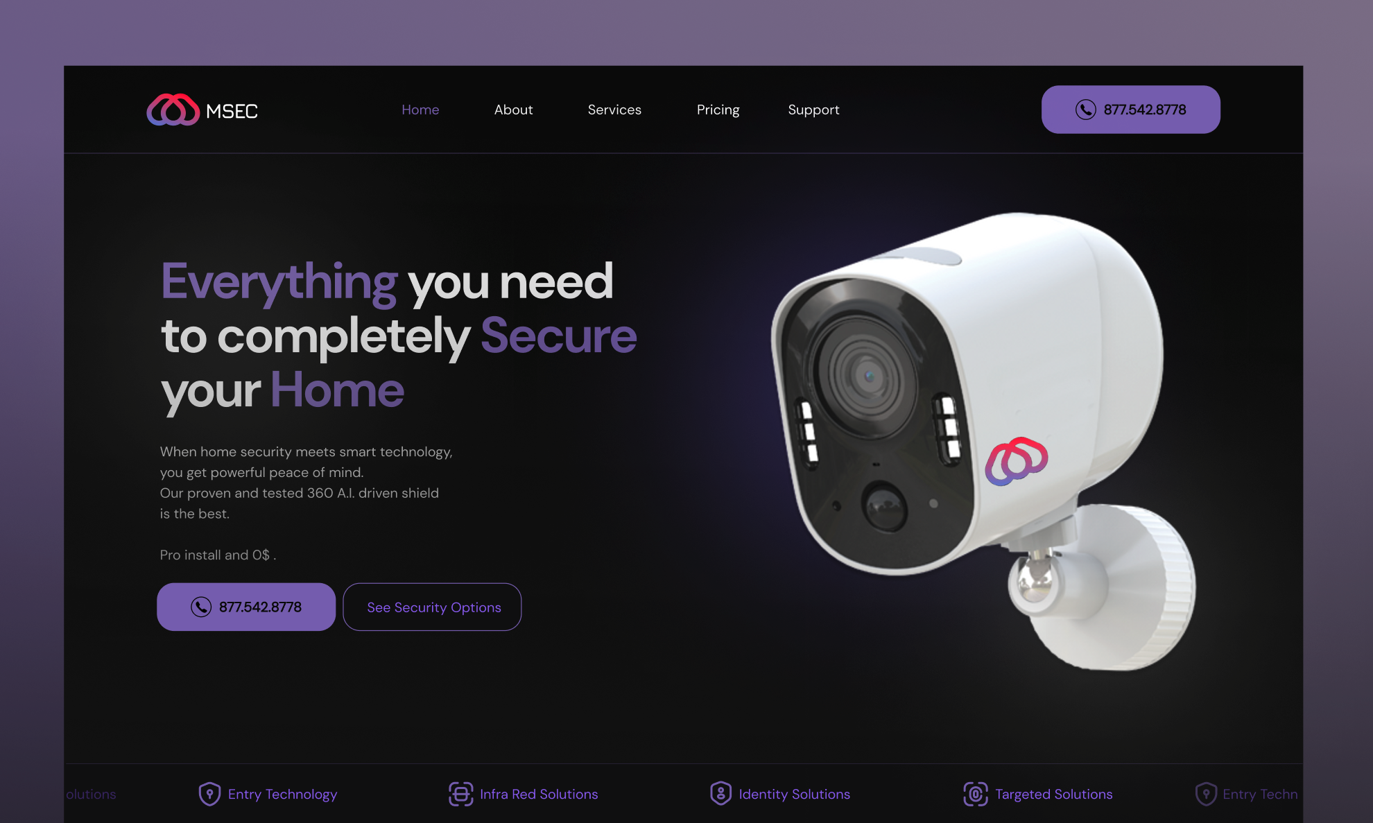
MSEC smart home security

Hello everyone!
I am presenting to you the MSEC smart home security website part 1.
I wanted to keep the design minimal thinking of my target audience and to keep the objective clear. I really like my color choices, the exploration was really fun, my competitive research was also fun.
Thank you for viewingAlways Learning, Always Growing!!!
Feedback greatly encouraged and appreciated
Thank You
Julian
Reviews
1 review

Hi Justin,
First off, great job on your submission! I really like your color choices and overall structure.
Here are some points of feedback to consider that will elevate your already strong work.
Design Feedback:
- With a layout like this, high-resolution images are crucial since they take up so much visual space. If finding high-quality product images is challenging, custom product photography may be needed.
- I like the feature highlight slider, but be mindful that users might miss out on key features since they’re not always visible.
- A short walkthrough of the concept, design choices, and your process will give readers more insight into how you achieved your final design.
Copy Feedback:
- Clarity & Readability: "Everything you need to completely Secure Your Home" has inconsistent capitalization and could flow better. Consider "Everything You Need to Fully Secure Your Home."
- Messaging Strength: "Powerful peace of mind" is a bit vague. Strengthen it by clearly explaining what makes this system unique.
- "Proven and tested" is redundant—one strong descriptor is enough.
- "Is the best" feels generic—consider stating what sets it apart (e.g., "delivers unmatched protection.")
- "Pro install and 0$." is unclear—does it mean free installation or a trial?
- Highlighted Words: The words "Everything," "Secure," and "Home" are in different colors, but three highlights feel excessive and may not be the best choices. "Secure" is a strong keyword, but "Everything" is vague, and "Home" might not be as impactful as something like "AI-driven" or "Protection." Consider reducing the number of highlights and focusing on terms that reinforce security and innovation.
Refining these areas will enhance clarity, credibility, and user impact.
Keep up the great work! 🚀
4 Claps
Average 4.0 by 1 person
You might also like
Project
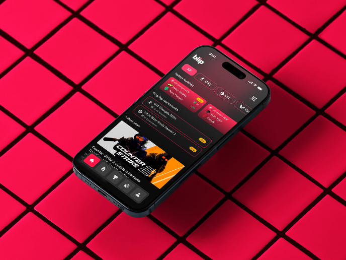
Blip - Esport app design (Light & Dark UI)

Bonjour, comrades! Today I present the case of Blip - an esports hub app for gamers where you can check esports news, learn about upcoming t

Project
Reimagining Asana's Color System

I created a color system based on Asana's current project management tool. Accessibility and the emotions the colors evoke were the primary

Project
Customer Journey Map for a Co-Working Space

In this project, I made a Customer Journey Map (CJM) for a co-working space. The goal of this project is to understand how customers feel an
Project
Responsive Main Screen


Project
Latios - Free Portfolio Template for UX/UI Designers

Overview I built Latios because I kept seeing the same problem: designers with solid experience getting stuck trying to launch their portfol
Project
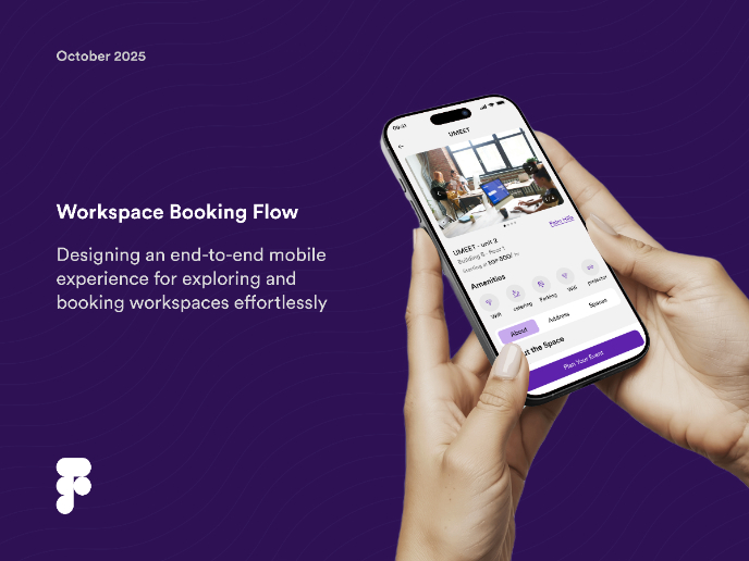
Workspace Booking Flow - UI/UX Design

Popular Courses

Course
UX Design Foundations

Learn the essentials of UX design to build a strong foundation in core principles. Gain practical skills to support product development and create better user experiences.

Course
Introduction to Figma
Learn essential Figma tools like layers, styling, typography, and images. Master the basics to create clean, user-friendly designs

Course
Design Terminology

Learn UX terminology and key UX/UI terms that boost collaboration between designers, developers, and stakeholders for smoother, clearer communication.