Marketing Email for A/B Testing
As a Strategic Designer on the XSpacy project, I faced a common challenge: creating an email that truly got people to engage.
At first, our dev team decided to design the email themselves to test if the content alone could get people to click. The result? A lot of people opened the email — which was a good sign — but almost no one clicked or interacted after that.
That’s when I stepped in with a more analytical approach. I took over the tests and created A/B versions focused entirely on the reader's experience. I simplified the text, made the message more human and direct, and cleaned up the layout — making it easier for anyone to read and understand.
The result was impressive: the new version got much better responses. People started replying, clicking, and most importantly, understanding the message clearly.
The best part? It was fast, low-cost, and had a big impact.
This template I’m sharing here comes from that — a strategy designed to communicate, test, and deliver real value.
Reviews
1 review
Hi Vitor, congrats!
I'm glad that your analytical approach had a big impact! Since this is an A/B test, I think it would be great if you could also provide the previous design, showing the before and after, so we can see the visual comparison and learn from your experience. Your description conveys the message, but the visuals will probably be easier to digest.
You might also like
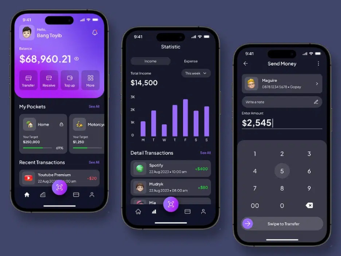
eWallet App Development Project
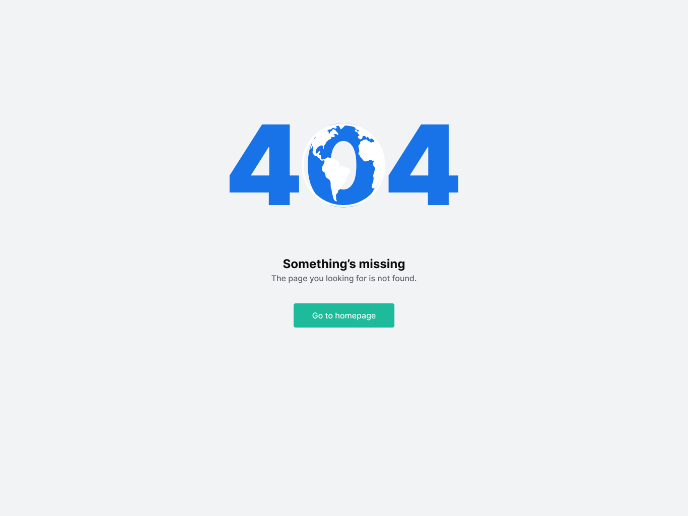
Design a 404 Error Page
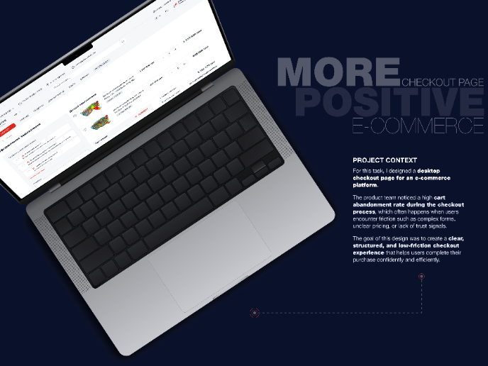
🖥 Desktop Checkout Flow Design
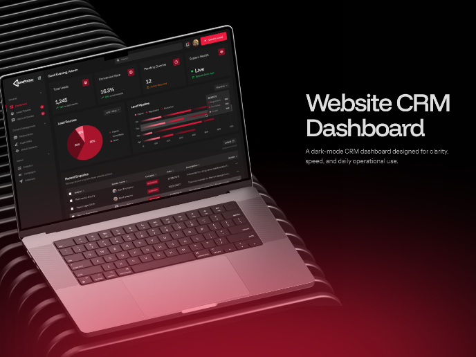
Website CRM Dashboard
TaskFlow Authentication Flow
Helpful 404 Error Page for a Fintech Mobile App
Popular Courses

UX Design Foundations

Introduction to Figma


