Littlekind - Silicone Dinnerware Set

Reviews
1 review

Nice work on this landing page design Sandip! You've done a great job at keeping a simple yet effective colour palette that works well for the style of product and target audience.
You've also shown a good understanding of landing page design principles, incorporating features to drive higher performance from the page such as social proof elements above the fold and the inclusion of bundles within the buy box to boost average order values.
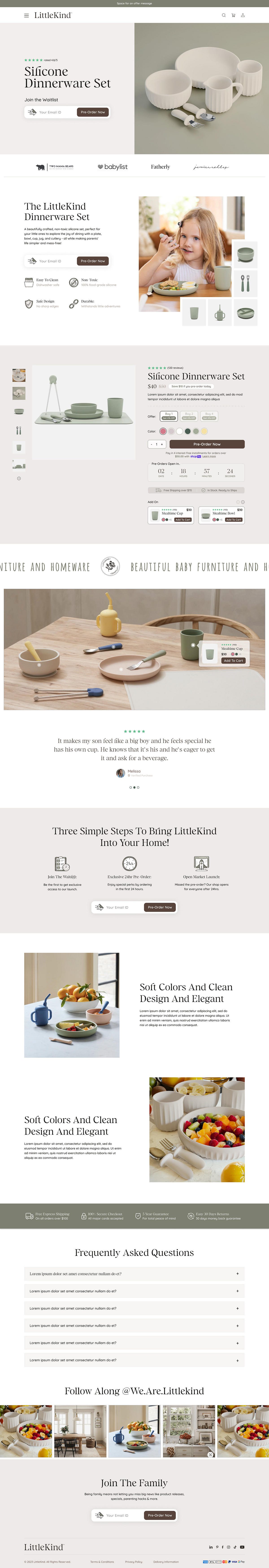
One overarching concern is that it seems like there is a conflict in the action you want users to take, due to the presence of both a "Join The Waitlist" call-to-action and a "Pre-order now" call-to-action in the product buy box.
This may cause confusion and unnecessary friction. I would therefore recommend aligning on a primary action to remove any doubt and prioritise the most important goal you want users to take when visiting the page.
Some additional points of improvement I'd recommend:
- Specificity: Above the fold you could increase the impact of the social proof stars by mentioning a quantifiable number instead of a plain rating. For example, "Rated 4.5/5 By 1000+ Happy Customers"
- Headline: The headline simply states what the product is, performance would likely be improved by crafting a headline that speaks directly to the target audiences pain points or alludes to the transformation the product will help facilitate
- Supporting Bullets: Including several icons + benefits below the headline to further highlight how the product will help the user would aid scanability and comprehension for new visitors
- Call To Actions: Call to action labels are inconsistent with the action being taken. For example in the above-the-fold section it says "Join the waitlist" whereas the button label says "Pre-order now" which may be confusing or misleading to users as it suggests two separate actions. The waitlist CTA could be clarified with "Join Waitlist". Additionally, the buy box shows "Pre-Order Now" indicating users can proceed to checkout which seems contradictory to the waitlist.
Hopefully these tips make sense and help you out, any questions let me know!
You might also like

Solar system Dashboard Utility


Signup page for a SaaS website


ASOS - Push Notifications


PLANTIST


Pulse - Inventory Management System Design

Uxcel Halloween Icon Pack

Popular Courses

UX Design Foundations


Introduction to Figma

Design Terminology
