Landing Page Uniqlo

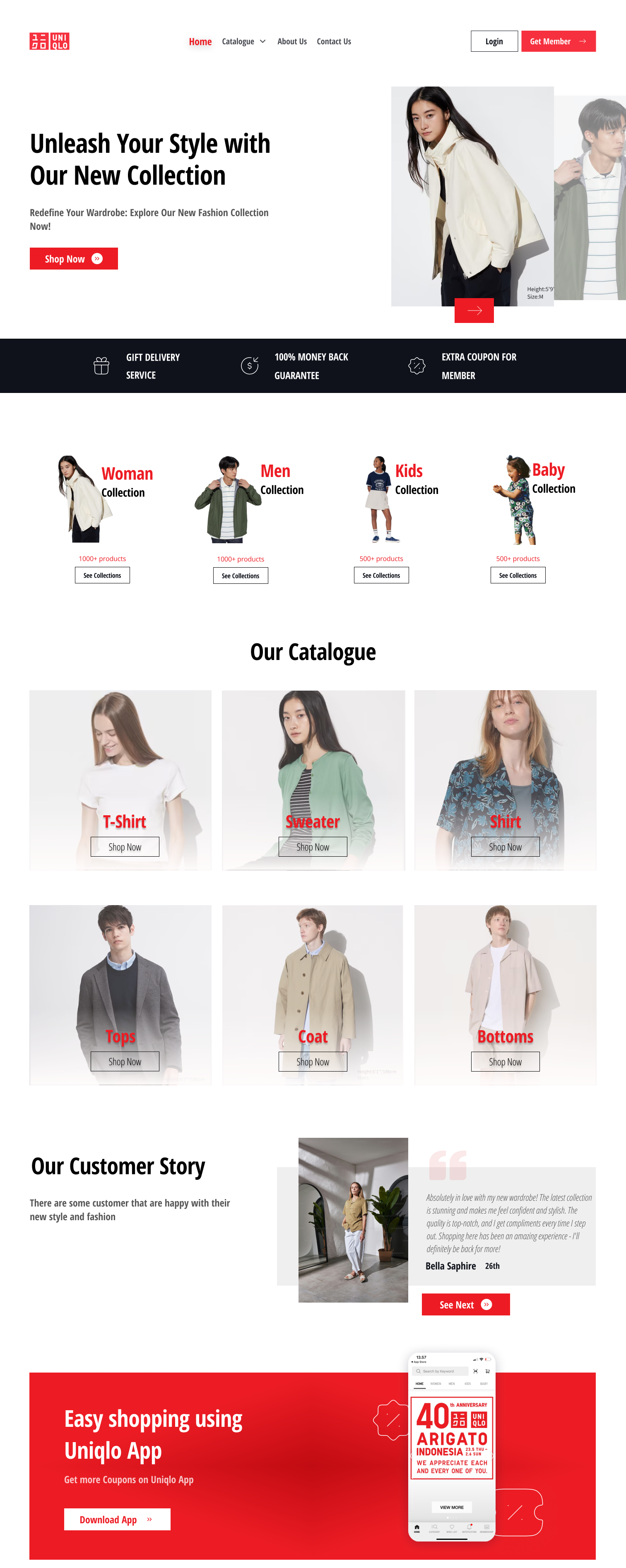
I choose Uniqlo because it has simple, look elegant, and fashionable style.
At first, I start with see the Uniqlo Website Official. And the I start wireframing with selected content that primary to explain what is Uniqlo and their services.
Tools used
From brief

Topics
Share
Reviews
1 review

Hey Linda!
I like your composition and image choices for this redesign of the Uniqlo website!
I left some feedback directly on your Figma file for you to consider :)
For the benefit of other readers, here is a short breakdown of my feedback for your UI design specifically:
- Consider having someone proofread your copy for grammar and spelling. I also am not exempt from this. :)
- Be mindful of spacing and try to keep it uniform across similar elements. Too much spacing can make similar elements feel too distinct, while too like can crowd your visual space.
- Make sure product images do not have any cut off text or artefacts in the background. Ensure that any cropped images don't cut off any hands or feet as that could look strange to the viewer - this is a photography tip from my time as photographer / editor.
- Ensure that you have the right amount of text contrast, especially for buttons that overlay an image.
My last bit of feedback will be about the design rationale:
- Give the reader some information about why you picked this company - what problem did you want to solve
- Did you do any competitive research? If so, what did you learn?
- Did you do some user research? What did you learn and apply to your design?
- Anything else that can explain your thought process worked through the design would be great to include! :)
Keep on learning and designing! Good work!
3 Claps
Average 3.0 by 1 person
You might also like

Project
Pulse — Music Streaming App with Accessible Light & Dark Mode

Platform & DeviceFor this project, I designed Pulse, a mobile music streaming application for iOS devices (using the provided mobile templat

Project
Islamic E-Learning Platfrom Dashboard

Visual Language & Color I wanted the interface to feel like a quiet room you'd actually want to sit in and study. The warm neutrals - off-wh
Project
SiteScope - Progress Tracking App

🧩 Project OverviewThis project showcases the design of a mobile login and sign up experience for a construction progress tracking app. The

Project
Mobile Button System

As my first ever ux design attempt, I tried to go with a simplified approach with only a few button types and states. I kept the color palle

Project
FlexPay

The onboarding was designed to reduce financial anxiety, create a sense of instant reward, and encourage early action. Instead of overwhelmi

Project
CJM for Co-Working Space - WeWork

This project presents a customer journey map for WeWork, created to understand the end-to-end experience of a remote professional using a co
Content Strategy Courses

Course
UX Writing

Learn to write microcopy that communicates clearly and concisely to improve user experience, build trust, and boost conversions across digital products.

Course
Common UX/UI Design Patterns & Flows

Learn how to use tried and tested UX/UI design patterns and flows to solve recurring design problems faster and build interfaces that feel intuitive

Course
Building Content Design Systems

Master systematic approaches to creating consistent, reusable content across your entire product ecosystem