Landing Page for Fashion Service

At NMMO, we specialize in sustainable outdoor clothing with a unique twist – storytelling. Our aim is simple yet profound: to offer ethically sourced, sustainable clothing while inviting you to understand the entire production process. From the organic raw materials and the dedicated farmers who cultivate them to the individuals who proudly wear our garments, we provide an ethical journey from farm to wardrobe.
"NMMO" stands for N-methylmorpholine-N-oxide, a chemical compound used in the production of Lyocell fibers. These eco-friendly and biodegradable materials are a testament to our commitment to sustainable practices and innovation within the textile industry. By choosing NMMO, you join us in embracing eco-friendly practices and supporting a sustainable future.

Reviews
2 reviews
Thank you for your effort! I appreciated the unique approach to developing a website for ethically sourced, sustainable clothing. The choice of colors nicely contributes to the overall idea, and I liked the concept of building eco farms and funding schools from the income. However, there are a few areas that I believe could be improved.
The header gave me the impression of something related to nature and its protection rather than eco-clothing, which might impact the initial perception of visitors.
Furthermore, the call-to-action (CTA) texts, while beautiful, may not be effective in driving sales as people tend to skim through web content rather than thoroughly read it. It's important to ensure that the essential information is clear and easily accessible, considering that users often visit websites to gather information, make purchases, or explore, and they may do so while on the go.
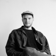
Additionally, it's not immediately clear whether the clothing is exclusively for men or if women can also find something suitable. The imagery featuring only men adds to the confusion.
Finally, it would be great to see more details about your design process and project intentions. It's important to provide insights and detail the design process in a case study format. You may want to familiarize yourself with best practices for posting a project here.
Thank you!

Good job Curtis, a lot of effort has clearly gone into this project. The colours capture the essence of the brand well and you've done a good job of conveying positive impact from the purchase of their items. Based on the brief here are some tips to help further refine your design. When optimising design, the first viewport is the most viewed so the tips below are focused around improving this first impression since this directly translates into more website engagement from your users.
Main Menu Header:
- looks cluttered, partly due to the inclusion of text labels with the key action icons (cart, search & account). As these are widely recognised symbols, the microcopy isn't necessary to convey the action. Removing the micro copy and grouping the icons in the right hand side would definitely clean this view up while following common design patterns.
- If you think the site is content / product heavy you can also consider exposing the search feature directly in the header to aid search engagement - searchers typically convert @ 3x regular visitors (Amazon has a huge search bar for this reason).
- Consider prioritising the most important actions in the menu item list to drive more meaningful site engagement in alignment with the goals of the store. I would lean towards having a "Shop" product link prioritised over stories.
Hero section:
- For the hero section, it's unclear through the imagery chosen and the accompanying copy what the product/offer/brand is. New users should be able to discern the offering within a few seconds of landing on the page.
- No supporting subheadline with the headline above the fold weakens the messaging impact further.
- Opt for a "functional" headline vs a general platitude wherever possible so you can avoid ambiguity and create more impactful messaging. Highlighting or describing exclusivity factors is a great way to do this. E.g: Sustainable Outdoor Clothing For Every Adventure" would be a very simplified example.
Hope these tips help you!
You might also like

Islamic E-Learning Platfrom Dashboard


Pulse — Music Streaming App with Accessible Light & Dark Mode

SiteScope - Progress Tracking App


Mobile Button System


FlexPay


May.Da.Ma Candles & more

Content Strategy Courses

UX Writing


Common UX/UI Design Patterns & Flows


Building Content Design Systems
