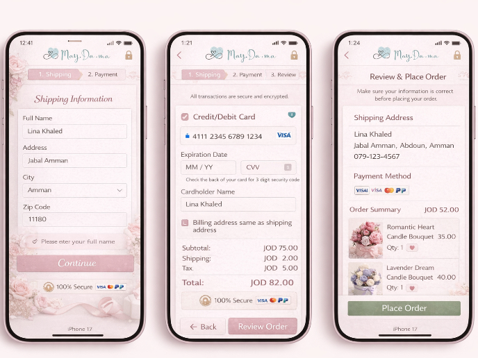
Landing Page Design
Reviews
3 reviews
Love the simplicity, color selection and amount of white space used. In overall, the landing page creates a good impression.
A few things to improve:
- More actionable CTA. I had to read through headline + description couple times to understand what CTA means
- Consistent CTA (the mail CTA in the hero block is looks like secondary)
- Improved hero layout. Currently hero image would take up entire screen, and visitor would need to scroll a fair bit to get to the content that matters
- Consistent spacing. Noticed that section headlines are not always spaces consistently and they break the spacing rhythm.
- Overall typographic consistency. Noticed that some text blocks that suppose to be the same style/type — have unique font size.
Excellent work! You've struck a wonderful balance between aesthetic appeal and functional clarity. This landing page isn't just visually stunning but also richly informative.
Your choice of typography, colors, imagery, and spacing is spot on. These elements work together and create a visual harmony.
You've done an excellent job in structuring the content. The design guides users through the site, gives a solid value proposition, brings up testimonials at the right time, and generally breaks down how everything works in a way that's super easy to get.
I find it a fantastic work!
An e-commerce website that doesn't overwhelm the user. Well done.
You might also like

Islamic E-Learning Platfrom Dashboard

Pulse — Music Streaming App with Accessible Light & Dark Mode
SiteScope - Progress Tracking App

Mobile Button System

FlexPay

May.Da.Ma Candles & more
Content Strategy Courses

UX Writing

Common UX/UI Design Patterns & Flows


