Invoice To Business 2022

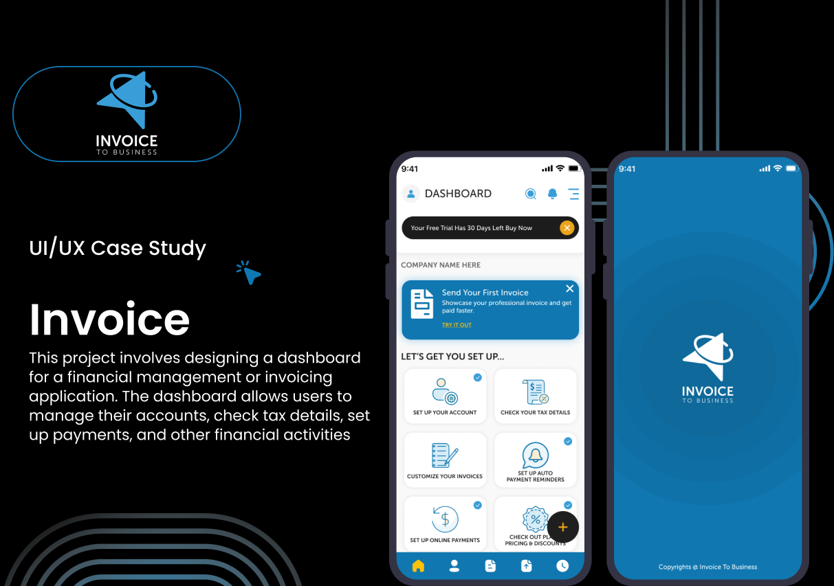
Small business owners, freelancers, and individuals managing finances often struggle with complex, time-consuming invoicing and financial management processes. They face challenges such as cumbersome navigation, limited customization, a lack of automation, and concerns about the security of online transactions. These issues result in inefficiencies, missed payments, and frustration when handling financial tasks. A solution is needed to provide a streamlined, intuitive, and secure financial dashboard that simplifies invoicing, automates payment reminders, and offers quick access to critical financial data.
Reviews
3 reviews
Well-structured design case study. You have presented well the real-world problem, solutions, user research data, user persona and UI screens. Well done!
Would be nicer if you have time to consider the following:
- create a user flow/journey/interactive prototype, illustrating your UI screen flows and logics. CHecking it any interaction frictions from user perspectives.
- improve visual elements design to be more accessibility-friendly referring to WCAG
BTW, have you used AI to help generating the case? If yes, you seem to use the AI tool pretty well. Thanks.

Hi! Thank you for sharing your work and for being brave enough to present it—this is how we all grow together. Here’s my feedback, with my honest impressions and ideas to help make your app even better.
Your app solves a real problem for small business owners and freelancers who struggle with invoicing and financial management. I can see you put a lot of effort into making the process easier, and that is inspiring! I also appreciate your detailed presentation—it helps me understand your thinking.
Here are my suggestions for improving your app, especially focusing on user experience and clarity:
- Titles in Cards: Now you use all capital letters for the card titles. It’s better to use normal letters (sentence case), because this is easier to read and feels more friendly.
- Shadows on Cards: The shadows look very strong and heavy. Try to make them softer, or use a thin border (1 pixel) around each card. This will help users focus on the content.
- Illustrations: The illustrations are creative, but maybe too detailed. Simple, clear icons would help users understand what happens if they tap a card—less distraction, more clarity.
- Bottom Navigation: Right now, you use only icons at the bottom. For “Home” and “Account,” the icons are clear, but the others are not so easy to understand. I recommend adding short text labels next to each icon. This will help users find what they need faster and avoid confusion.
- Real Content: Log In screen use “lorem ipsum” text. It’s better to use real content, even if it’s generated by AI. This makes your app look more professional and helps everyone better understand how it works in real life.
- Contrast Check: The orange login button with white text might not have enough contrast. Check the contrast ratio—it should be at least 4.5:1 for accessibility. If it’s too low, try a darker orange or a different color to make the text easy to read for everyone.
I really appreciate your creative approach and your hard work on this project. With these small changes, your app can become even more user-friendly, accessible, and professional.
Keep going—your presentation and your effort are impressive. I hope to see your next project soon, and I’m grateful for the opportunity to review your work!


Hello Adil,
your project is very well-structured and thoughtfully presented. I really appreciate that you included not only the UI screens but also a persona, which shows a user-centered mindset. The flow feels clear and professional, and the choice of blue as the primary brand color communicates trust and stability effectively.
A couple of suggestions that could make it even stronger:
Checking the contrast levels of certain elements (especially the orange buttons) against WCAG standards will ensure full accessibility.
In the bottom navigation, adding short text labels alongside the icons could improve orientation and usability, especially for first-time users.
Overall, this is a strong and professional case study — with just a few refinements, it could become even more compelling. Great work!
You might also like

Auction


Accessible Signup Form


Entrant - Analytical Dashboard


Transit Cairo — Digital Mobility Redefined


Babylon Balance - Designing Financial Clarity Through Constraint


Entrant Accessible Signup and Login Forms
Popular Courses

Introduction to Product Management


Product Discovery


Product Analytics