Inveto - Ux Casestudy

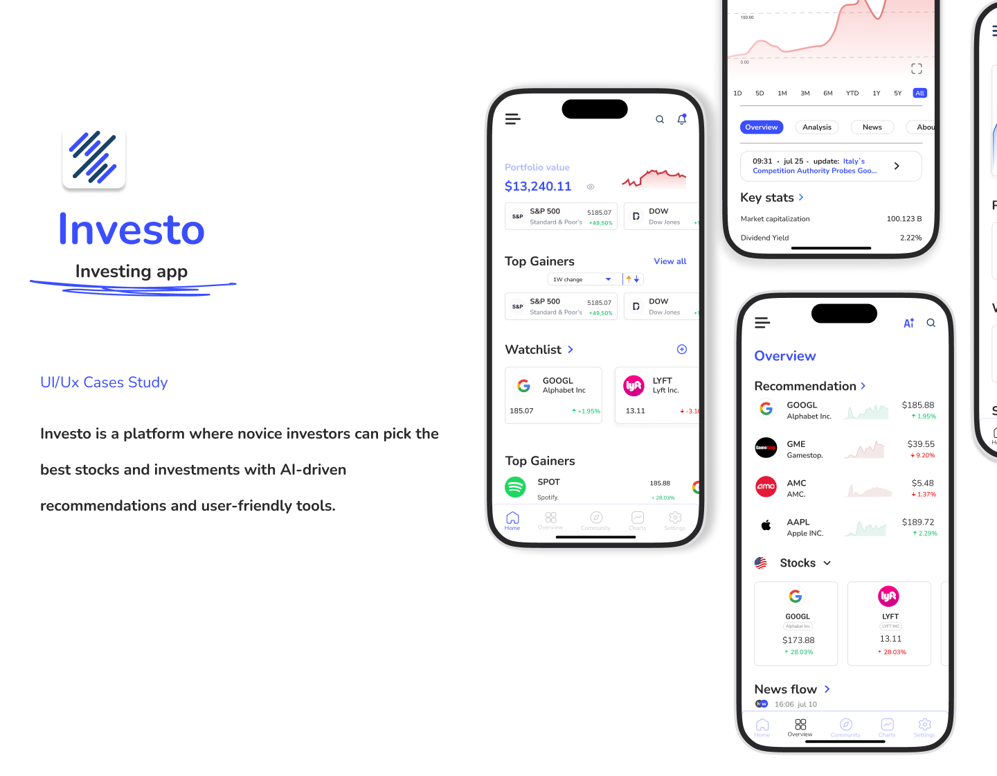
Investo is a platform where novice investors can pick the best stocks and investments with AI-driven recommendations and user-friendly tools.
My Role - Product & UI/Ux designer
Industry - Fintech
Platform - Ios

Reviews
1 review

Hello Farhad, glad to see your case study. I had chance to look through the project and it's a great effort.
What I think you did very well:
- Quite completed showcase with full stages in Design Thinking Process divided in a proper timeline of 4 weeks
- Clearly defined project goal, problem and the aimed solution
- Brand color is consistently used to reinforce the brand recognition
- Conducted usability testing to verify the solution
Some thoughts that I have to make the showcase better:
- The user flow presented is not literally user flow (including user tasks). It seems like a sitemap. I recommend user clearer verbs like: view charts, browse in community, make investment,...
- In terms of the way to display the showcase. I think you don't need to make some information faded out as the audience still need them to be easy to read.
- I am bit confused of the appearance of low-fi wireframes as some of the screens looks exactly like the final UI which is desaturated. On another hands, I do think there are plenty of rooms for improving the final UI. For examples, the margin of the screens could be more consistent, inactive menu tabs should be better contrasted, better spacing between section, more consistent line heights,...
- There's a lack of colors and typography used in the final UI that are not mentioned in the style guide. For example, neutral colors (text, border, divider,..) and body text. You are naming "heading" for all the used texts.
- Last but not least, the main problem that stated in the project overview - "Novice investors face complex information and high risk in the stock market" seems not to be solve thoroughly. Maybe I am expecting more about instructional onboarding for the completely newbie users, more personalized stock recommendation based on users' risk appetite, or even gamified experience making learning trading with more fun and easily.
Hope this feedback would help you in some way. Look forward to seeing more from you 😀
4 Claps
Average 4.0 by 1 person
You might also like
Project
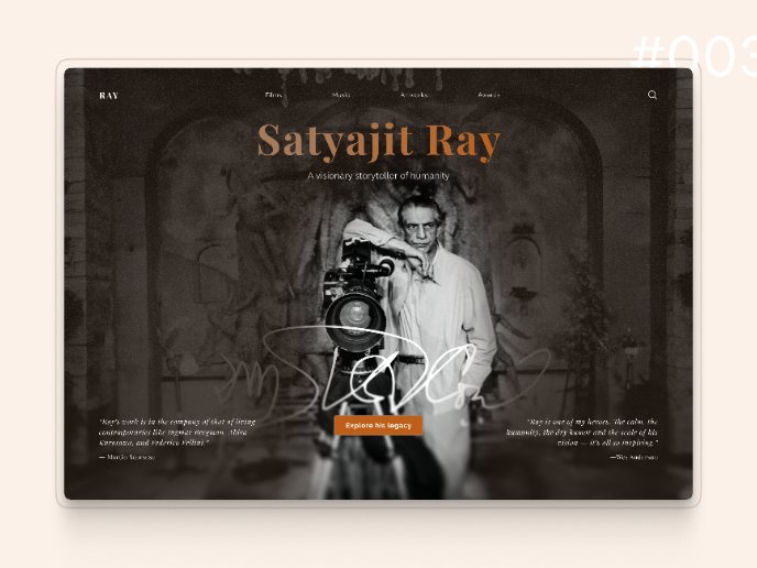
Satyajit Ray Memorial Landing Page - Daily UI 003

Design Rationale: Satyajit Ray Memorial Landing Page Visual Hierarchy & Typography The design establishes clear hierarchy through a distinct
Project
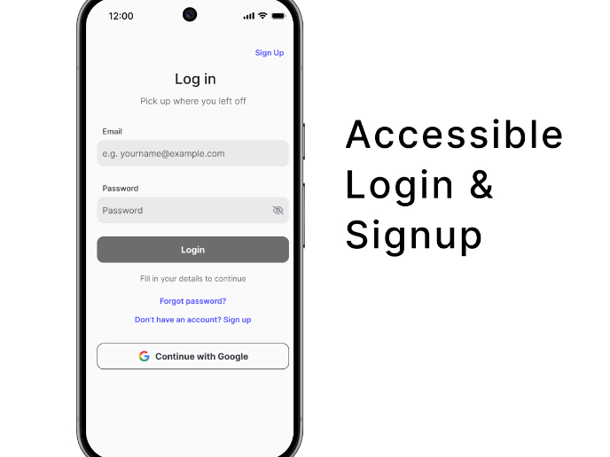
Florish Accessibility Signup Form

This project presents a mobile login and signup form for Florish, a SaaS platform, designed using WCAG 2.1 accessibility principles to suppo
Project
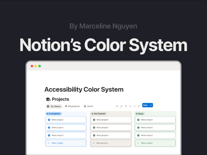
Notion - Accessibility Color System

Hello! I'm Marceline, and I'm thrilled to introduce you to my first project - Notion's Color System in response to UXCEL's Create an accessi
Project
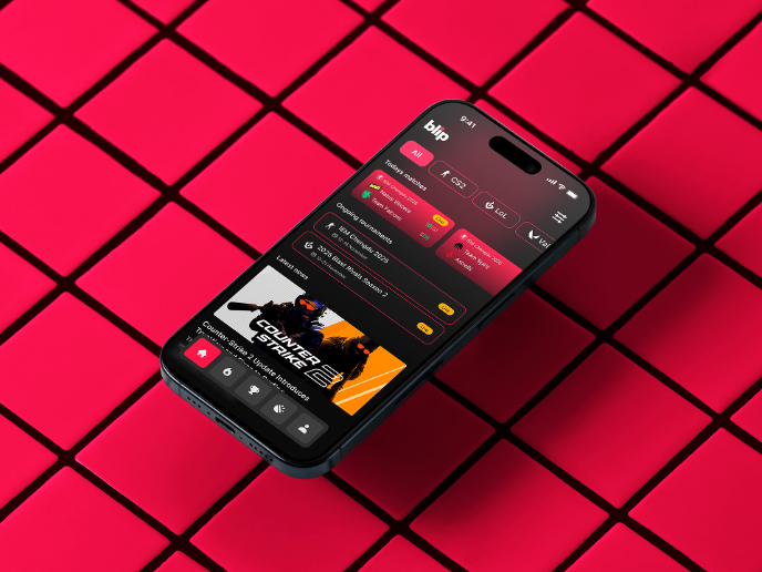
Blip - Esport app design (Light & Dark UI)

Bonjour, comrades! Today I present the case of Blip - an esports hub app for gamers where you can check esports news, learn about upcoming t

Project
Reimagining Asana's Color System

I created a color system based on Asana's current project management tool. Accessibility and the emotions the colors evoke were the primary

Project
Customer Journey Map for a Co-Working Space

In this project, I made a Customer Journey Map (CJM) for a co-working space. The goal of this project is to understand how customers feel an
Popular Courses

Course
UX Design Foundations

Learn the essentials of UX design to build a strong foundation in core principles. Gain practical skills to support product development and create better user experiences.

Course
Introduction to Figma
Learn essential Figma tools like layers, styling, typography, and images. Master the basics to create clean, user-friendly designs

Course
Design Terminology

Learn UX terminology and key UX/UI terms that boost collaboration between designers, developers, and stakeholders for smoother, clearer communication.