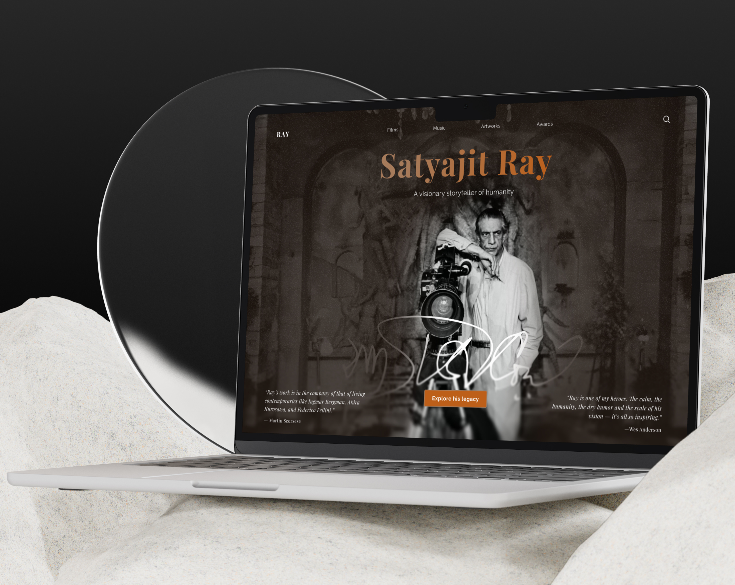
Satyajit Ray Memorial Landing Page - Daily UI 003

Design Rationale: Satyajit Ray Memorial Landing Page
Visual Hierarchy & Typography
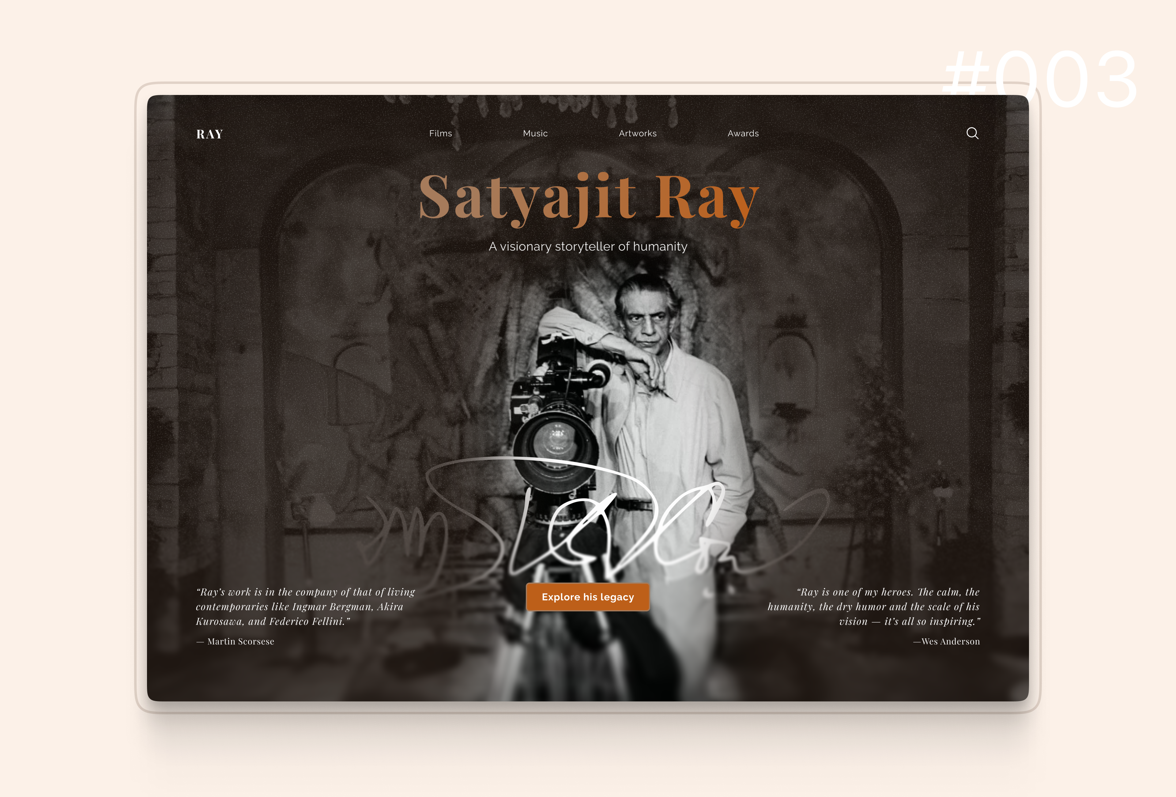
The design establishes clear hierarchy through a distinctive serif title in warm amber tones, creating an immediate focal point that evokes classic cinema. The lighter subtitle provides context while the typographic scale guides users naturally through the content, ensuring optimal scanability.
Emotional Design
The monochromatic background photograph creates an immersive, nostalgic atmosphere that honors Ray's legacy. This sepia-toned aesthetic immediately communicates the memorial's purpose and establishes emotional connection before any user interaction, leveraging atmospheric storytelling to engage visitors.
Call-to-Action & Visual Prominence
The orange "Explore his legacy" button creates high contrast against the monochromatic background, following principles of visual prominence for primary actions. Its central placement ensures discoverability while the color choice provides accessibility-compliant contrast ratios.
Navigation & Information Architecture
The minimal top navigation (Films, Music, Artworks, Awards) provides clear information scent and follows web conventions to reduce cognitive load. The search icon enhances findability for goal-oriented users seeking specific content.
Social Proof & Balance
Testimonials from Scorsese and Anderson flank the hero content, establishing credibility through social proof while creating visual balance. The italic styling differentiates these quotes, maintaining content hierarchy and guiding the eye from title to imagery to CTA.
Accessibility & Cultural Authenticity
The design maintains sufficient contrast for readability and follows touch target guidelines. The subdued palette, classical typography, and archival photography communicate respect and artistry—values aligned with Ray's cultural significance—creating appropriate tone while differentiating from commercial cinema sites.
Reviews
4 reviews

Looking at this hero section, I see a design that works really well with emotions and atmosphere. The archival photo with that sepia tone genuinely builds a mood of remembrance and respect. The typography with that warm, golden color in the title is also elegant and harmonizes well with the whole.
That large, stylized text in the center (looks like a signature or logo) obscures the main element. It kind of kills the visual connection with the subject. The quotes on the sides are a nice idea for social proof, but with that text length and dispersion at the edges, I'm betting not many people will read them. Especially on mobile this will be problematic.
The CTA is clear, but sounds quite generic. Could be more engaging or suggestive of what I'll actually find there.
Overall, I feel the design has soul and hits the emotional notes well, so the direction is good. Worth working on the clarity of the main image and practicality of those quotes, so it works as well functionally as it does visually. ❤️👍

Hi Roy,
I really like how the name is dominant, the subtitle clearly frames for me why Satyajit Ray matters (also I'm glad I reviewed your project since I found out about this person through it).
Also really nice how you chose the image with Ray and how you emphasized him by black and white vs sepia. Using quotes also adds credibility from my point of view, while having to say it was a little hard to read the quotes. Maybe a different font would do better?
I would also look more in depth over the CTA, as I feel "explore his legacy" is not totally clear what would do, where it would take me as a user.
Overall, really nice and clean work! Cheers!

Good exploration. You give professional touch to the hero image. Feel classic and modern touch in the same time. You know how to use color properly. Really like with the style. Good job!
Waiting for your next showcase!

Good job
You might also like

Improving Dating App Onboarding: A/B Test Design

FORM Checkout Flow - Mobile


A/B Test for Hinge's Onboarding Flow


Accessibility Asse


The Fitness Growth Engine


The Relational Workspace

Popular Courses

UX Design Foundations


Introduction to Figma

Design Terminology
