Home screen for a Fintech app

Feel free to leave comments and feedback!
---
I'm available for new projects or Full-time: bsheer.work@gmail.com
Behance: https://www.behance.net/youssefmu
Thanks.
Reviews
1 review

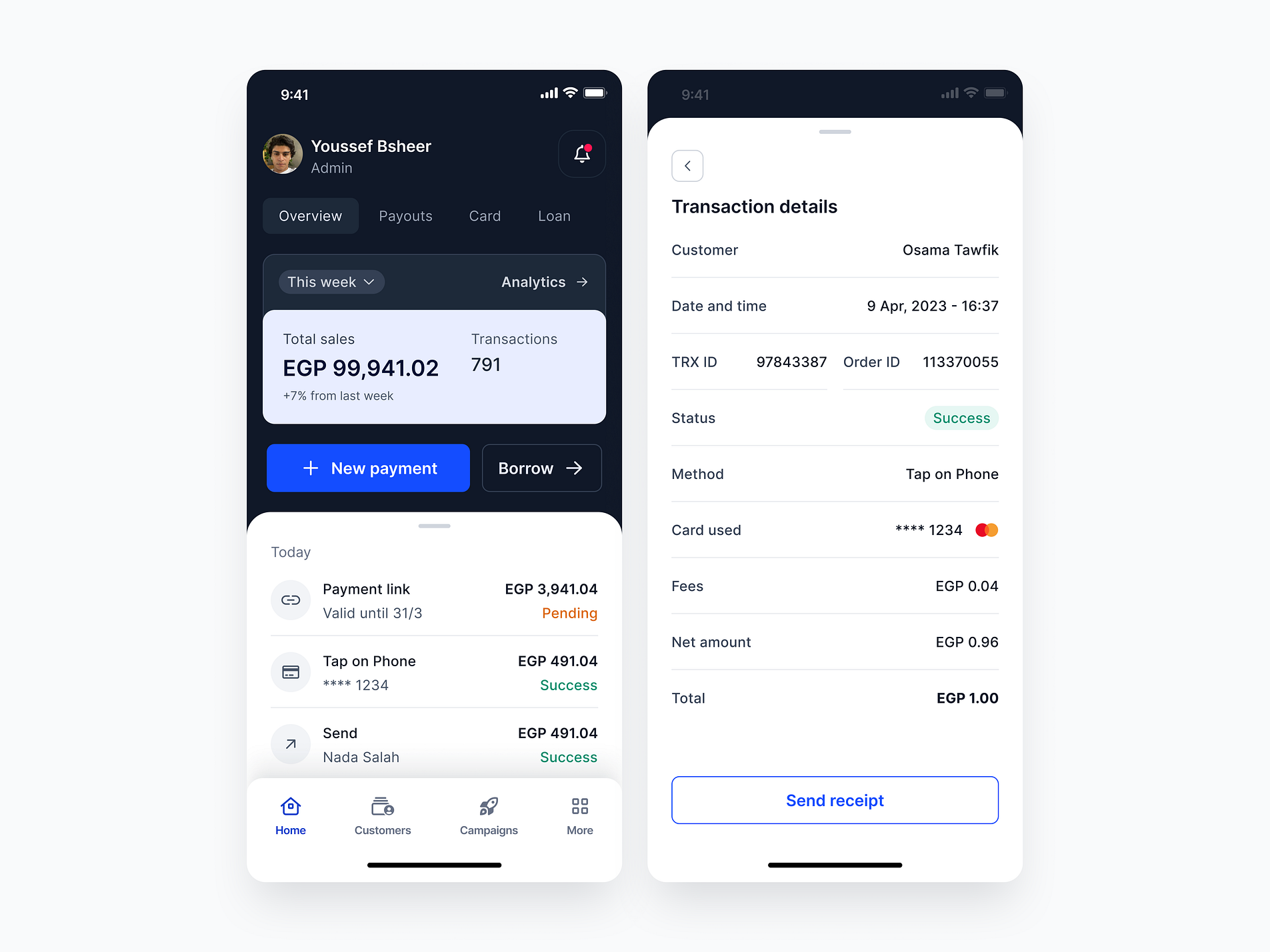
Very clean UI. There are a few things that could be improved, but they are minor details. Consider giving more prominence to the "Today" title by making it larger or bold. I would suggest changing the label "Success" to "Paid" for clarity. Additionally, the distinction between your labels and the text on the right could be more visible, as they are very similar, which causes some scanning issues on the third line with "TRX ID" and "Order ID." Another improvement would be to add a "Send" icon to the "Send receipt" button, as you are already using icons for the "New payment" and "Borrow" buttons. Overall, it is a very clean UI with clear calls to action.
You might also like

Pulse — Music Streaming App with Accessible Light & Dark Mode


Islamic E-Learning Platfrom Dashboard

SiteScope - Progress Tracking App


Mobile Button System


FlexPay


CJM for Co-Working Space - WeWork

Popular Courses

UX Design Foundations


Design Terminology


Core UI Components
