Home-Rental Website Design

Project Goal:
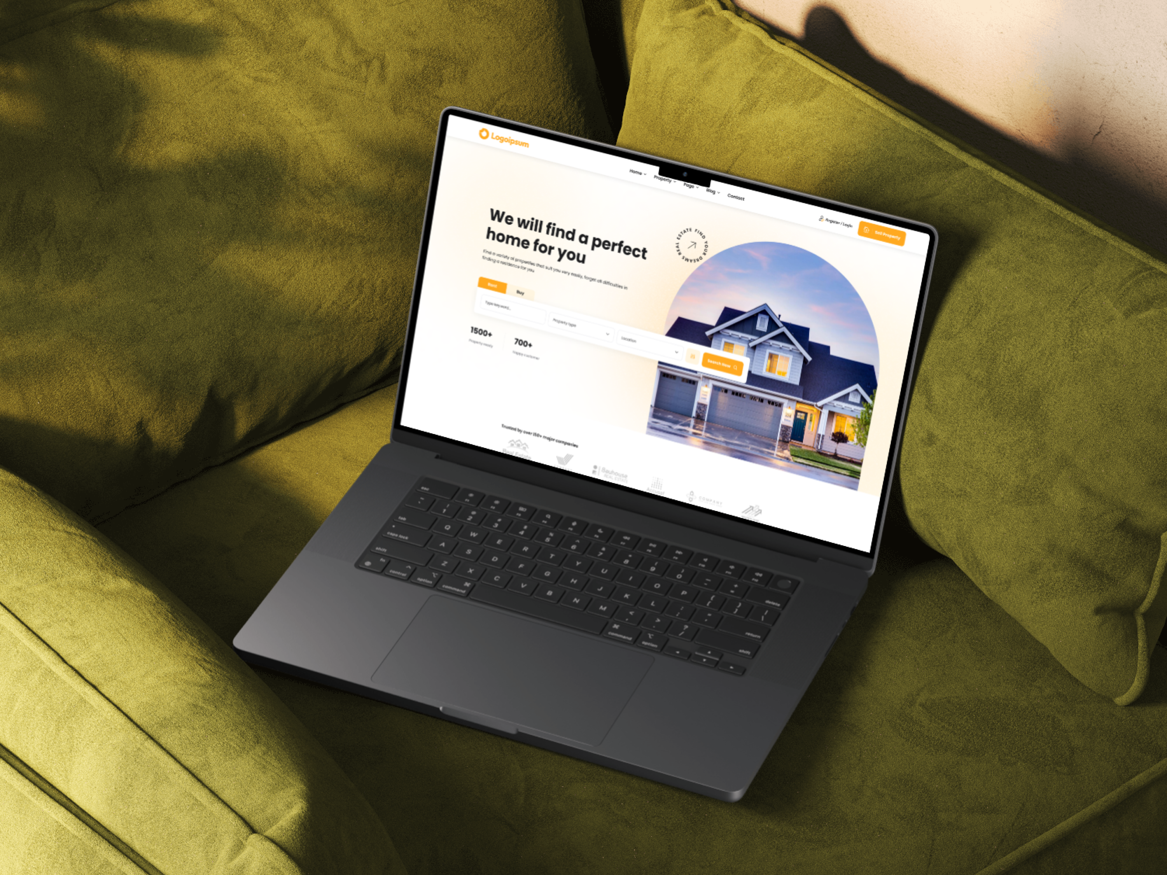
To design and develop an intuitive and user-friendly website that connects potential tenants with landlords/property owners seeking to rent out their properties. The website should provide a seamless and efficient platform for users to:
Search and filter properties:
Easily find suitable rental options based on criteria like location, budget, property type (apartment, house, room), amenities (parking, pets allowed, etc.), and more.
View detailed property information: Access comprehensive descriptions, high-quality images/videos, and contact information for each listed property.
Compare properties:
Easily compare different properties side-by-side to make informed decisions.
Contact landlords/agents: Initiate direct communication with landlords or property agents through integrated messaging or contact forms.
Manage rental requests:
Track rental applications, receive notifications, and manage communication with landlords.
Enhance user experience: Provide a visually appealing and easy-to-navigate interface with excellent user experience.
Key Objectives:
Increase visibility and reach for landlords/property owners.
Streamline the property rental process for both tenants and landlords.
Build a strong online community of renters and property owners.
Generate revenue through premium features or advertising.
Tools used
Topics
Share
Reviews
2 reviews

The design looks clean based on the mockups presented. However, since the details aren’t fully visible, it might be challenging for viewers to fully appreciate your thought process and design decisions.
Suggestion: Consider presenting your work as if you were showcasing it to your team or stakeholders. Adding context and highlighting important details can make your design more engaging and easier to understand.

Hello Sayeed,
Your design looks interesting, and the visuals create a good first impression. However, it would be great to see more detailed examples of how the website functions in different scenarios.
Right now, with just a few mockups, it’s hard to get a complete understanding of the user journey and how various elements interact. Including more screens showcasing microcopy, interactive components, and the overall scrolling experience would provide a clearer picture of how users navigate through the site.
From what can be observed, it seems that the contrast in some buttons could be improved. It would be worth checking the design against WCAG guidelines to ensure accessibility and readability.
Overall, the project has a solid foundation, but adding more depth to the presentation and refining contrast in key areas would make it even more compelling.
You might also like

Beautify Login page WCAG principles


edX Sign-Up Page Redesign


Design Prioritization Workshop


Notion Login Page Accessibility Optimization


Sanyahawa - Landing page Design


Healthy Dashboard

Popular Courses

UX Design Foundations


Introduction to Figma

Design Terminology
