Hoka-Hoka Bento - Inventory Management Dashboard Web UI Design

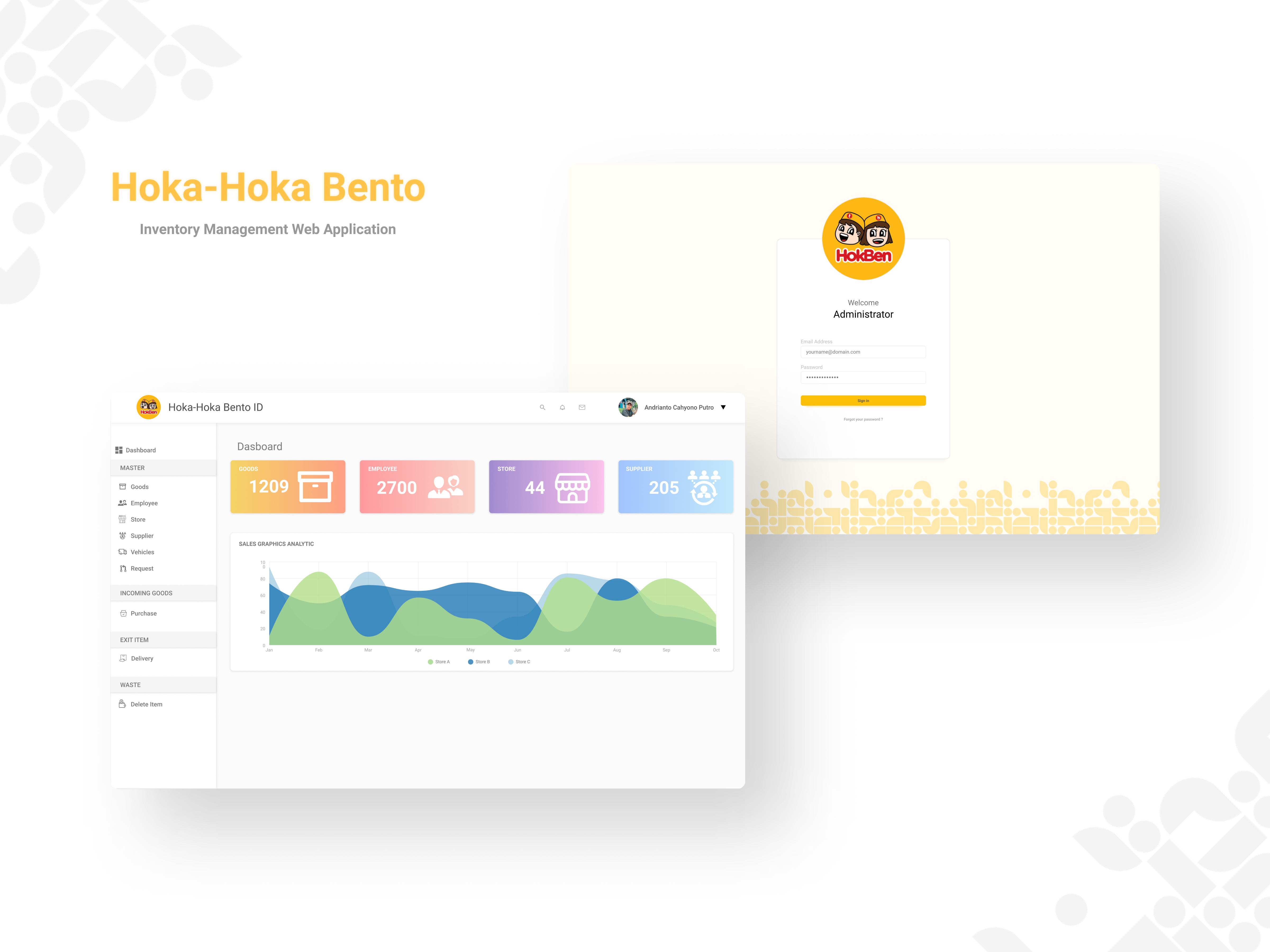
Introducing the inventory management dashboard UI design for Hoka-Hoka Bento, aimed at streamlining inventory tracking and management for restaurant staff. This design is centered around providing a clean, user-friendly interface to enhance operational efficiency.
Features
- Real-Time Inventory Tracking: Keep track of stock levels in real-time.
- Comprehensive Dashboard: Provides an at-a-glance view of critical inventory metrics.
- User-Friendly Navigation: Simplified access to different sections of the inventory system.
- Detailed Reports: Generate detailed reports on stock usage, order history, and more.
Tools Used
- Figma: For designing wireframes and the final UI.
Reviews
1 review

I like your approach to make the dashboard as uncluttered as possible, but there are some areas that may need your attention.
- Typography: The contrast of some text elements could be improved for better readability. e.g the yellow text on a light background might be hard to read for some users. use contrast checker and make sure all typeface and font choices are meeting the required WCAG.
- Padding and Spacing: Some elements, like the data cards on the dashboard, could benefit from a bit more spacing to avoid a cramped look and improve readability. The featuring icons are also quite big, if they are meant as illustrations or svg, then try to use different rather than increasing the sizes of interface icons.
- Interactive Elements: The interactive elements like buttons should stand out a bit more. You might want to consider using a slightly darker shade or adding subtle shadows to make them more prominent. the CTA section next to search for instance.
- Chart Component: The chart component looks great but seems to lack filtering options. Adding filters for date ranges, categories, or other relevant data would make the charts more interactive and useful for users, allowing them to tailor the data to their specific needs.
- Sidebar Navigation: The sidebar is clear but could benefit from better categorization to improve Information Architecture (IA). Consider grouping related items together under collapsible menus to reduce visual clutter and make navigation more intuitive. Additionally, adding tooltips or labels for icons can help users quickly understand what each icon represents without having to guess.
4 Claps
Average 4.0 by 1 person
You might also like
Project
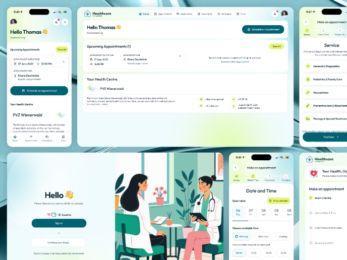
💊 Healthcare Desktop & Mobile App UX/UI Design

This project was created for a healthcare client aiming to offer a clear and accessible way for patients to book doctor appointments online.
Project
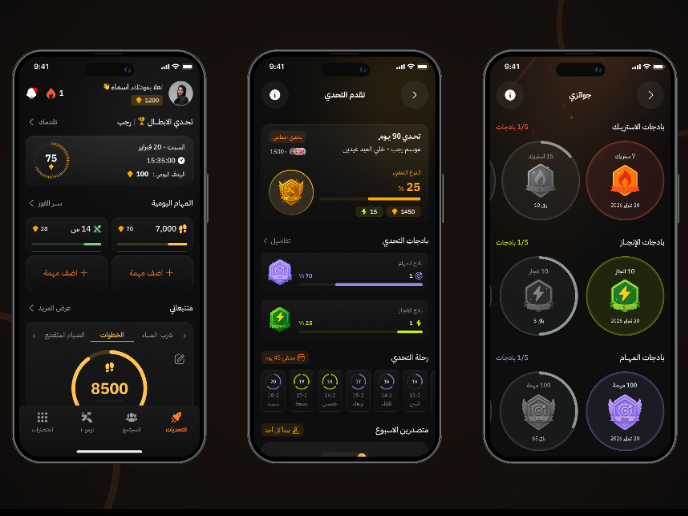
Fitness Challenges App

Mobile App for fitness and habits build on gamification and competition between users
Project
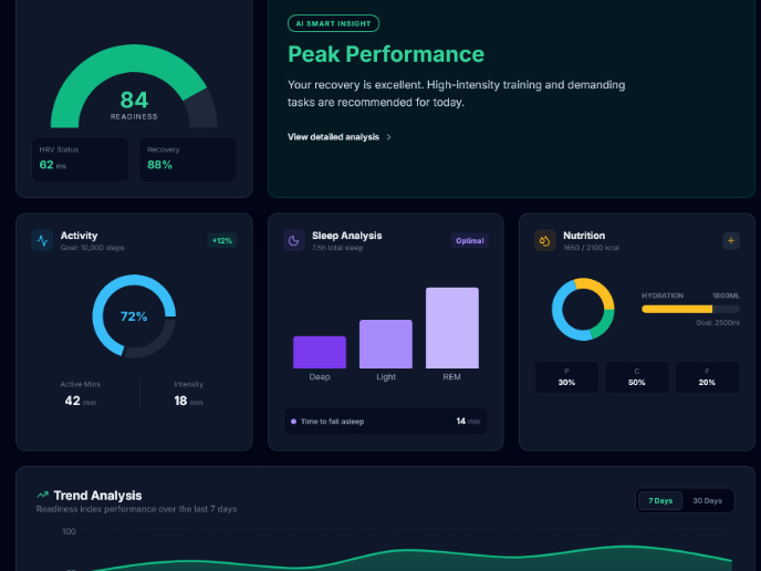
Personal Wellness Dashboard

Detailed ExplanationVitalTrack is a health-intelligence interface that consolidates fragmented data from wearables and manual logs into a si

Project
Events Managment App

🔹 Project OverviewEvent Management Tool (iOS) UX/UI concept for business community event managers This project focuses on designing functio
Project
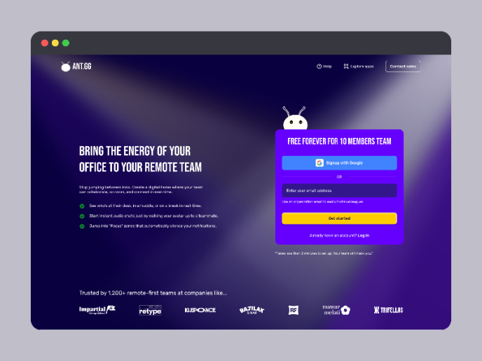
SaaS Signup Design

This is an exciting task, designing a SaaS sign-up page, and this time I chose my own app, ANT.gg, which offers a digital workspace/office f

Project
Customer Journey Map — Offsite Co-Working Experience
Structure explanation: The journey map is organized horizontally by seven experience stages, moving left to right from Awareness & Discovery
Popular Courses

Course
UX Design Foundations

Learn UX design fundamentals and principles that create better products. Build foundational knowledge in design concepts, visual fundamentals, and workflows.

Course
Introduction to Figma
Learn essential Figma tools like layers, styling, typography, and images. Master the basics to create clean, user-friendly designs

Course
Design Terminology

Learn UX terminology and key UX/UI terms that boost collaboration between designers, developers, and stakeholders for smoother, clearer communication.