High-Impact landing page Edu-tech website

🚀 High-Impact Landing Page Design
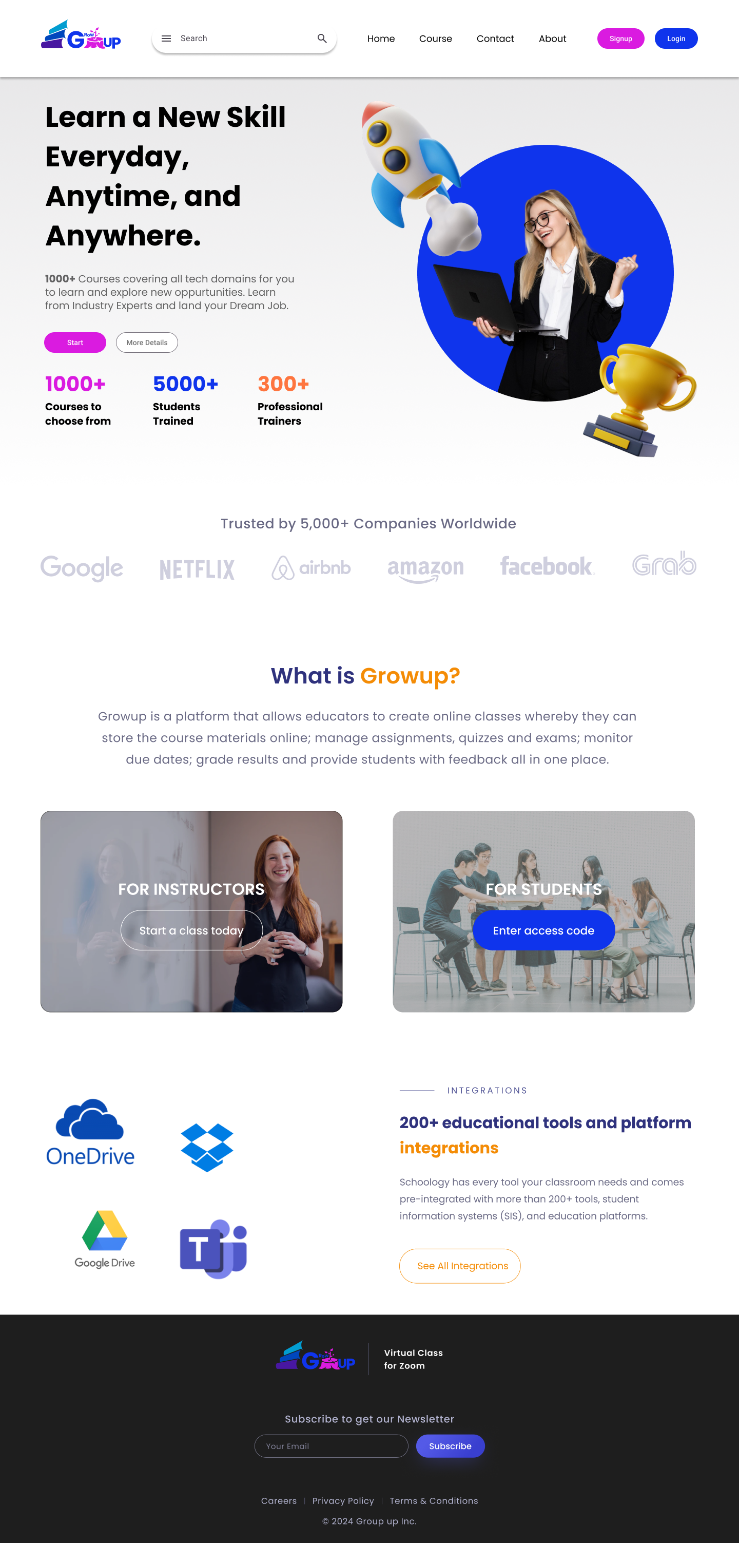
This landing page was designed to create an engaging and modern experience for an online learning platform (Growup). The goal was to make learning feel accessible, motivating, and trustworthy.
🔑 Key UX/UI Highlights:
- Hero Section: Strong headline with a motivational tone and clear CTAs ("Start" & "More Details") to drive action.
- Visual Engagement: Playful yet professional imagery (rocket, student, trophy) to emphasize growth and achievement.
- Social Proof: Trusted by 5,000+ companies with recognizable brand logos for credibility.
- User-Centric Flow: Separate entry points for Instructors and Students for personalized journeys.
- Integrations Showcase: Highlight of 200+ tools (Google Drive, OneDrive, Teams, Dropbox) to build trust and transparency.
- Consistent Branding: Bright, friendly typography and colors that balance professionalism with approachability.
✨ Design Focus: Simplicity, clarity, and a seamless user journey that guides users toward learning opportunities anytime, anywhere.
Tools used
From brief

Topics
Share
Reviews
4 reviews

Your landing page design for the edu-tech platform is very strong. I like how you balanced motivation with trust by using both playful visuals and social proof. The hero section is clear and makes it easy for users to take action right away.
The separation of entry points for instructors and students is a smart choice because it shows you thought about different user journeys. The integration showcase also adds credibility, especially for a platform that needs to connect with many tools.
One area you could refine is the hierarchy of information. At first glance, the hero section is engaging, but the following sections could guide the user with a bit more flow. For example, showing social proof right after the hero might build trust faster.
Overall, your design feels professional and approachable, which is important for an edu-tech brand. Nice job on making the experience both motivating and user friendly.

Great job on crafting such an engaging landing page—the structure and flow are clear; tightening logo consistency and CTA hierarchy would make it even sharper, but overall this is really strong work!

Muthuselvan, straight up three things that would make this even more impactful:
- I spent a few minutes trying to figure out what the logo says: G-tree stump-up? Egup? Gmup? It might help to also include the full word Growup in the hero section, like “Growup: learn a new skill every day, anytime, and anywhere.”
- The integration showcase logos look a bit messy. If a scattered layout is the style you’re aiming for, make it even more intentional, otherwise it’s better to tidy it up and keep the spacing consistent between logos.
- Have you decided on the name you’ll be using? Will it be Growup, Schoology, or Zidio? I have seen these names all in one layout.
Bonus points if you can make the Figma file accessible to the public, it’s still locked.

Congrats on finishing the project, Muthuselvan.
I noticed a few things that might be worth reconsidering:
- The logo feels quite complex, what led you to go with so much detail? How does it perform when scaled down to smaller sizes? A simpler version might work better for web use.
- I'm seeing multiple colors used for CTAs throughout the design. What's your primary brand color here? Right now headings and buttons are using the same colors, which makes it hard to understand the hierarchy. If something is not clickable don't use primary colors. Keep it simple.
- The illustrations in the hero section feel different from the rest of the visual style. It's like two design directions are competing. Have you considered sticking with one consistent style throughout the design?
I think with some refinement on these details, this could really shine.
You might also like

Monetization Strategy


edX Sign-Up Page Redesign


Beautify Login page WCAG principles


Design Prioritization Workshop


Notion Login Page Accessibility Optimization


Sanyahawa - Landing page Design

Content Strategy Courses

UX Writing


Common UX/UI Design Patterns & Flows


Building Content Design Systems
