Hercules Cycle


I like cycling so thought of make a landing page it.
Reviews
2 reviews

Good job!!! The UI is simple, but eye-catching and this is a good start.
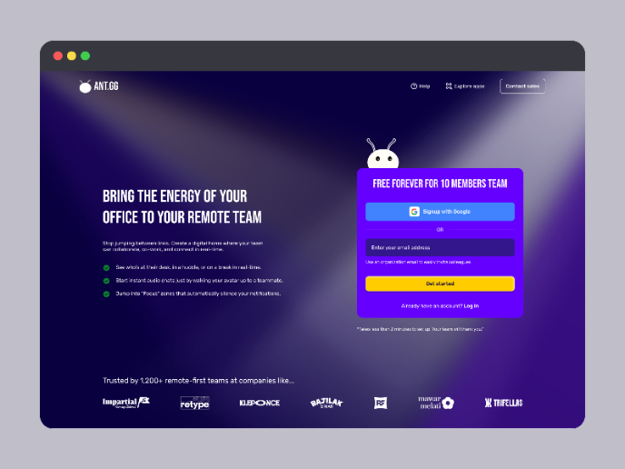
Usually a navbar, containing links for pages to visit is placed in the top center and not on the right, also the icons (profile and shopping) should be detached from the navbar. If you want to make things more consistent separate the 2 sections, or you can create one icon per page, but remember to use labels as well.
Another important thing is to reduce the use of accent color. In this case you used a gradient which is not optimal in buttons, since you have white microcopy, making the contrast low. Use a single color for the buttons (either orange or yellow) and take into account the contrast with the text. Also keep in mind to use only one accent color component per page.
Remember that explaining the rationale for everything you have done is important, so you need to present your work by adding a clear rationale.

From what you have done so far I can see your thinking and have some great ideas flowing! Be careful with alignment as i noticed your icons at the top are not aligned properly. With buttons I would stick to using one colour instead on a gradient. How would this stand from accessibility perspective? Will be interesting to see how this design will develop. Perhaps consider adding some background information to the design? Why did you design it what are your aims?
You might also like
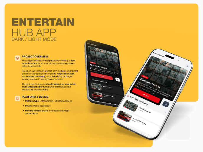
EntertainHub App (Dark / Light Mode)

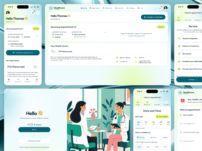
💊 Healthcare Desktop & Mobile App UX/UI Design

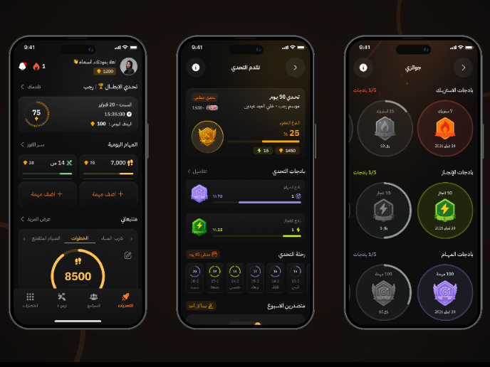
Fitness Challenges App

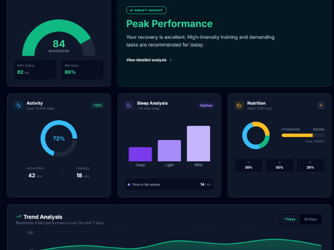
Personal Wellness Dashboard


Events Managment App
SaaS Signup Design

Popular Courses

UX Design Foundations


Introduction to Figma

Design Terminology
