Google Maps: Safer Navigation

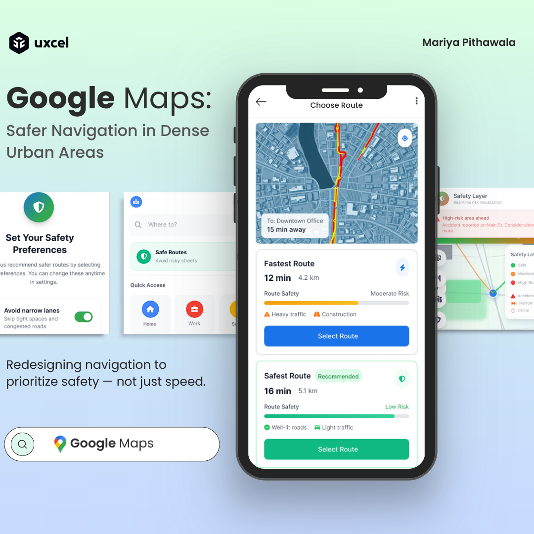
🗺️ Google Maps: Safer Navigation in Dense Urban Areas
Redesigning navigation to prioritize safety — not just speed.
Introduction
It’s midnight in Mumbai. The GPS says three minutes faster, but the street ahead is dimly lit and barely wide enough for two cars. That’s when I realized — navigation apps don’t always guide us safely, they guide us quickly.
This project reimagines Google Maps as a safety-first navigation experience, built for dense urban areas with narrow or risky roads. Using UXPilot.ai and iterative AI prompting, I designed a 10-screen flow that helps drivers make informed, calm, and confident decisions — not just faster ones.
1. Problem
Modern navigation tools optimize for speed, not safety.
In dense cities like Mumbai or Delhi, this often means routes through:
- Narrow, accident-prone streets
- Poorly lit or unsafe areas
- High-stress driving zones
Challenge:
How might we redesign Google Maps to help users avoid risky areas and feel safer while driving?
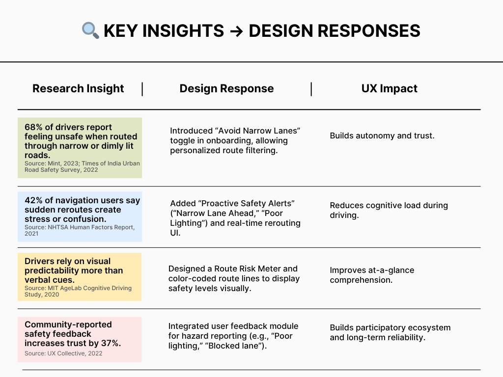
2. Research Insights
To understand real-world driver pain points, I reviewed user discussions, accident data, and local traffic reports.
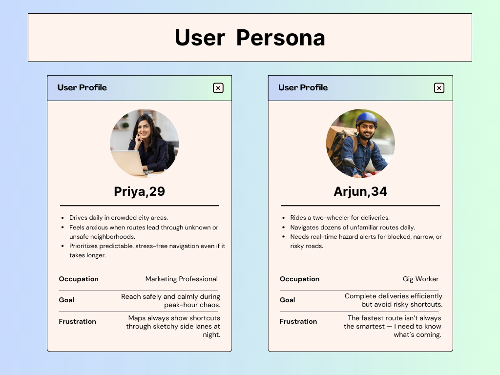
3. Core Users
From patterns in research and anecdotal interviews, two distinct user personas emerged:
4. Design Goals
- Prioritize safety over shortest routes
- Predict risks before the driver encounters them
- Empower personalization through safety toggles
- Maintain familiarity with Google’s visual identity
- Ensure accessibility and legibility while driving
5. AI Workflow with UXPilot
This project was completed using UXPilot.ai, experimenting with wireframes and high-fidelity generation through iterative prompts.
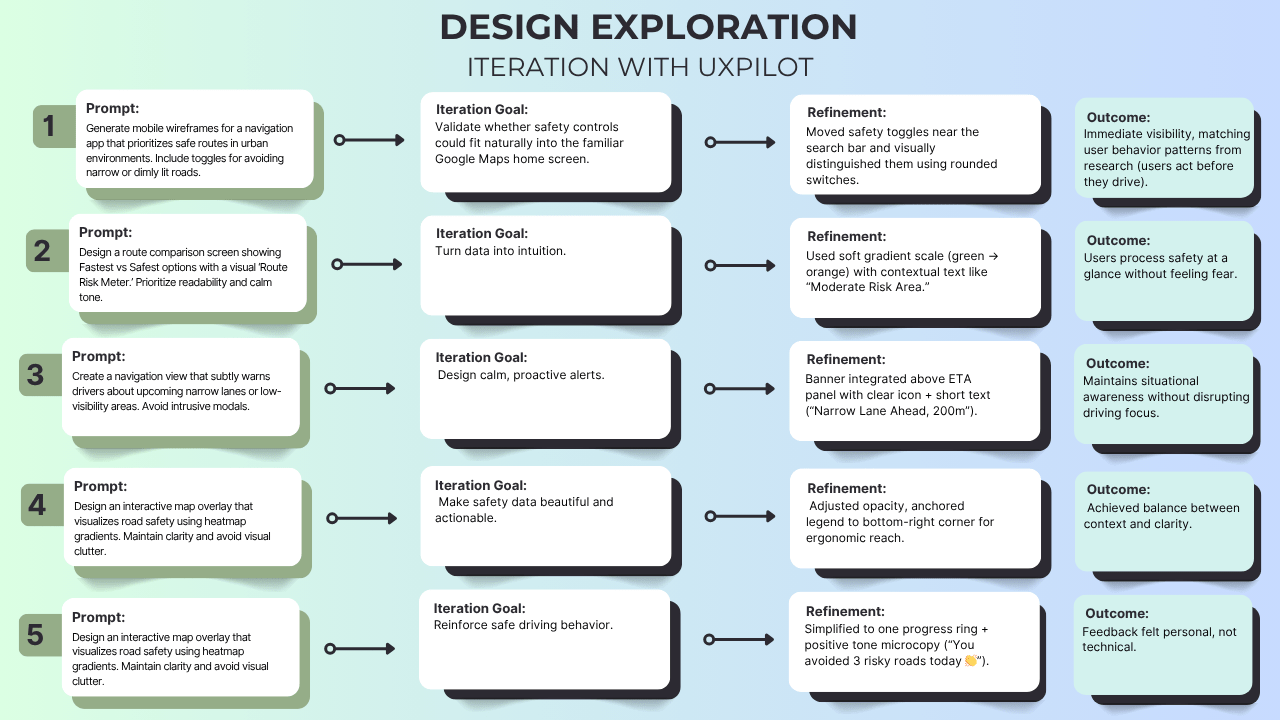
Result
Through UXPilot, I explored over 25 micro-prompts across 10 key screens — tweaking tone, spacing, and visibility with every iteration.
Instead of letting AI design for me, I treated it like a creative partner that helped me think faster, test ideas sooner, and see patterns more clearly.
6. Prompt Explanations for Each Screen (UXPilot)
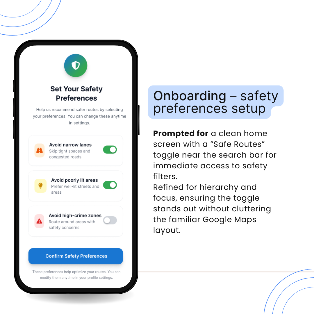
Onboarding – Safety Preferences Setup
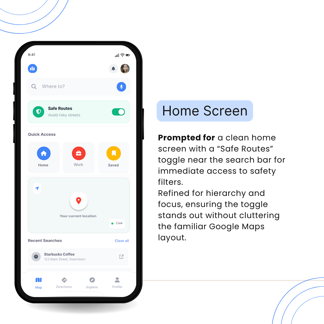
Home / Search Screen
Profile Screen

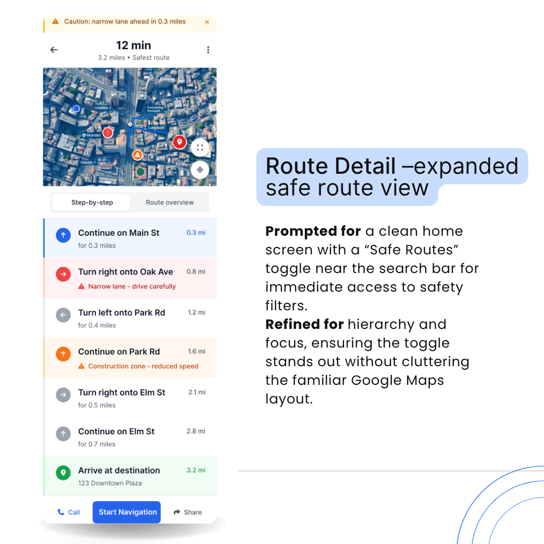
Route Detail – Expanded Safe Route View
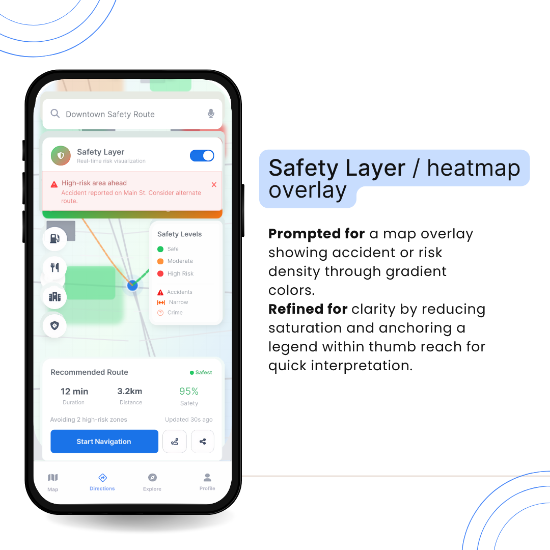
Safety Layer / Heatmap Overlay
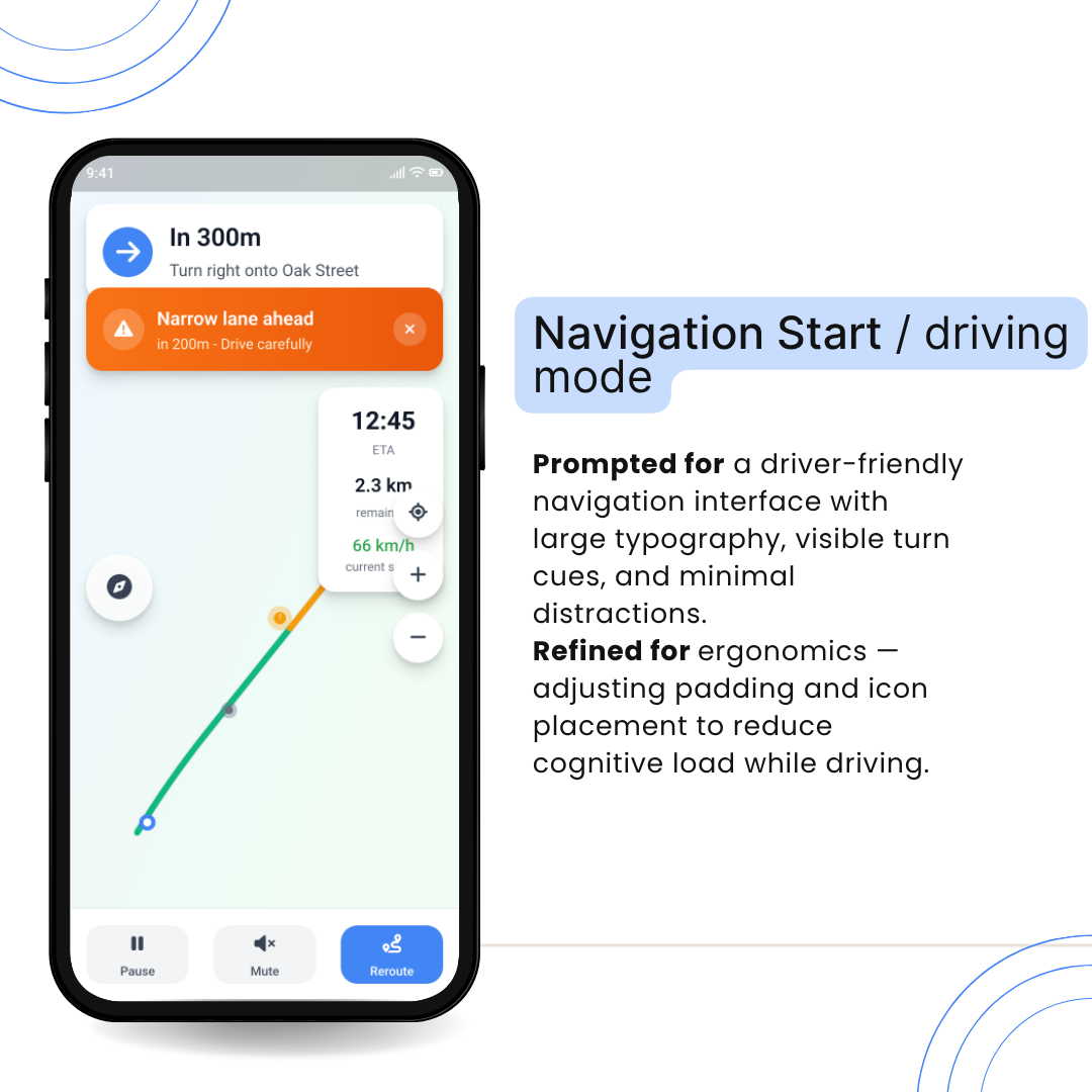
Navigation Start / Driving Mode
Post-Trip Summary

7. Challenges & Learnings
Challenge 1: Adding safety layers without cluttering the interface
→ Solution: Used translucent overlays and simple iconography to preserve map readability.
Challenge 2: Ensuring proactive alerts don’t distract drivers
→ Solution: Designed calm color cues (orange for mild risk, red for severe) and subtle animations.
Challenge 3: Maintaining brand familiarity
→ Solution: Kept Google Maps’ Material 3 design system — typography, color, spacing — while introducing new UI elements harmoniously.
8. Outcomes
- Created a 10-screen high-fidelity redesign focused on proactive safety.
- Demonstrated how AI-assisted workflows can accelerate ideation while preserving design intent.
- Proved that UX psychology principles — cognitive load reduction, user control, trust-building — can make everyday navigation safer and calmer.
9. Reflection
Navigation isn’t just about directions — it’s about decisions.
This redesign combines data, psychology, and AI-assisted design to create safer journeys through the chaos of urban driving. Through UXPilot’s AI workflow, I explored how human empathy and machine intelligence can co-design interfaces that anticipate risk, reduce cognitive load, and build trust.
The result isn’t just a concept — it’s a glimpse into a future where navigation doesn’t only get us there faster, but gets us there safer.
Tools Used
- UXPilot.ai – AI-driven ideation and wireframe generation
- Figma – Refinement and prototype building
- Material 3 System – For UI consistency
Tools used
From brief

Topics
Share
Reviews
2 reviews

nice!

Great concept!
I really like the idea behind this app and how it addresses a real-world problem.
I’m curious, what made you decide to design a full safety-first navigation experience instead of creating an integration or feature that could enhance an existing navigation app?
How does the safety score system work, and what do the points actually mean for users? What’s the difference between someone with a low score and someone with a high one? Are there any benefits or incentives tied to those points?
Overall, I think this is a great concept tackling an important issue that deserves a modern solution.
Do you have any ideas on how the app could influence the problem directly, rather than just helping users avoid it? For example, could it somehow contribute to urban design or safety improvements in cities? That might be a big challenge, but I’d love to hear your thoughts on that direction.
You might also like

Smartwatch Design for Messenger App


Bridge: UI/UX Rebrand of a Blockchain SCM Product


Pulse Music App - Light/Dark Mode

Uxcel Halloween Icon Pack


Monetization Strategy


Designing A Better Co-Working Experience Through CJM

Product Thinking Courses

Ethical & Responsible Product Design

Product Vision & Strategy


Product Management Foundations
