
Reviews
3 reviews

Really sleek Glide Mobile App design! The UI feels modern and well-structured, with a smooth, intuitive flow. The color choices and typography work well together. Maybe refining the spacing in some sections could improve readability even more, but overall, great job!

Hi Omar,
Your design is modern and very clean. All the information is exactly where it should be.
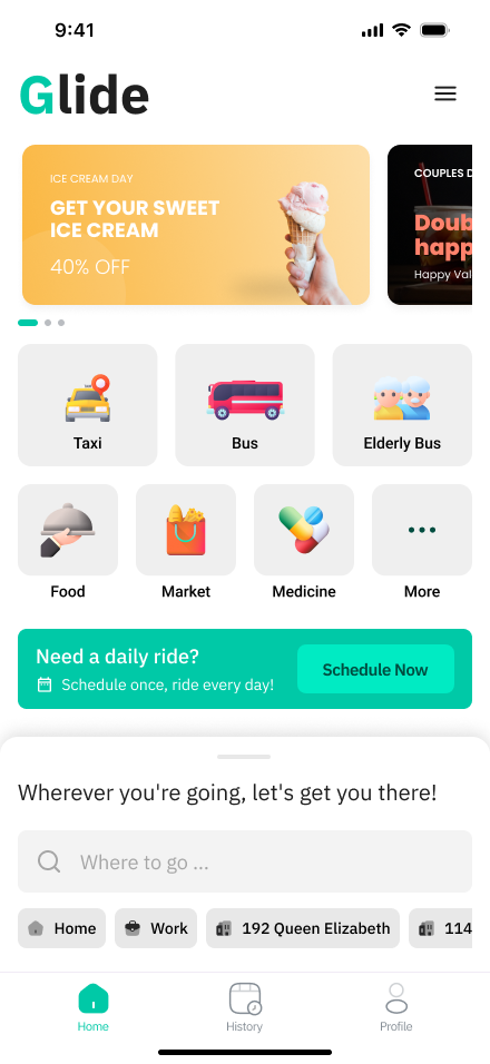
I just have one suggestion. The suggestion chips under the search section appear deactivated because of their faded colors, similar to how they look in disabled states. If you adjust their colors to better match the brand and make them look more like CTA elements, it will be clearer that they are interactive.
Everything else is perfect—wishing you great success!

Hello Omar,
Your design has a solid foundation, and the idea behind the Glide Mobile App looks promising. The layout is clean, and the use of icons and colors creates a visually appealing experience. However, I believe adding more context about the app's purpose and target audience would enhance understanding.
One key aspect to consider is accessibility. The white text on the green and the white text on the orange background have low contrast, which may not meet WCAG accessibility standards. This could make readability difficult for some users. Adjusting the contrast or choosing alternative color combinations would help improve legibility and ensure a more inclusive design.
Overall, great work! With some refinements, this could be even more user-friendly and accessible. Keep it up!
You might also like

PLANTIST


Lumen

NORTHSIDE - Coworking space Customer Journey Map


Accessible Signup Form for Monkey Survey


Crave Corner - Bakery App Design


Wealthsimple 404 Page

Popular Courses

Introduction to Figma


Design Terminology


Apple Human Interface Guidelines