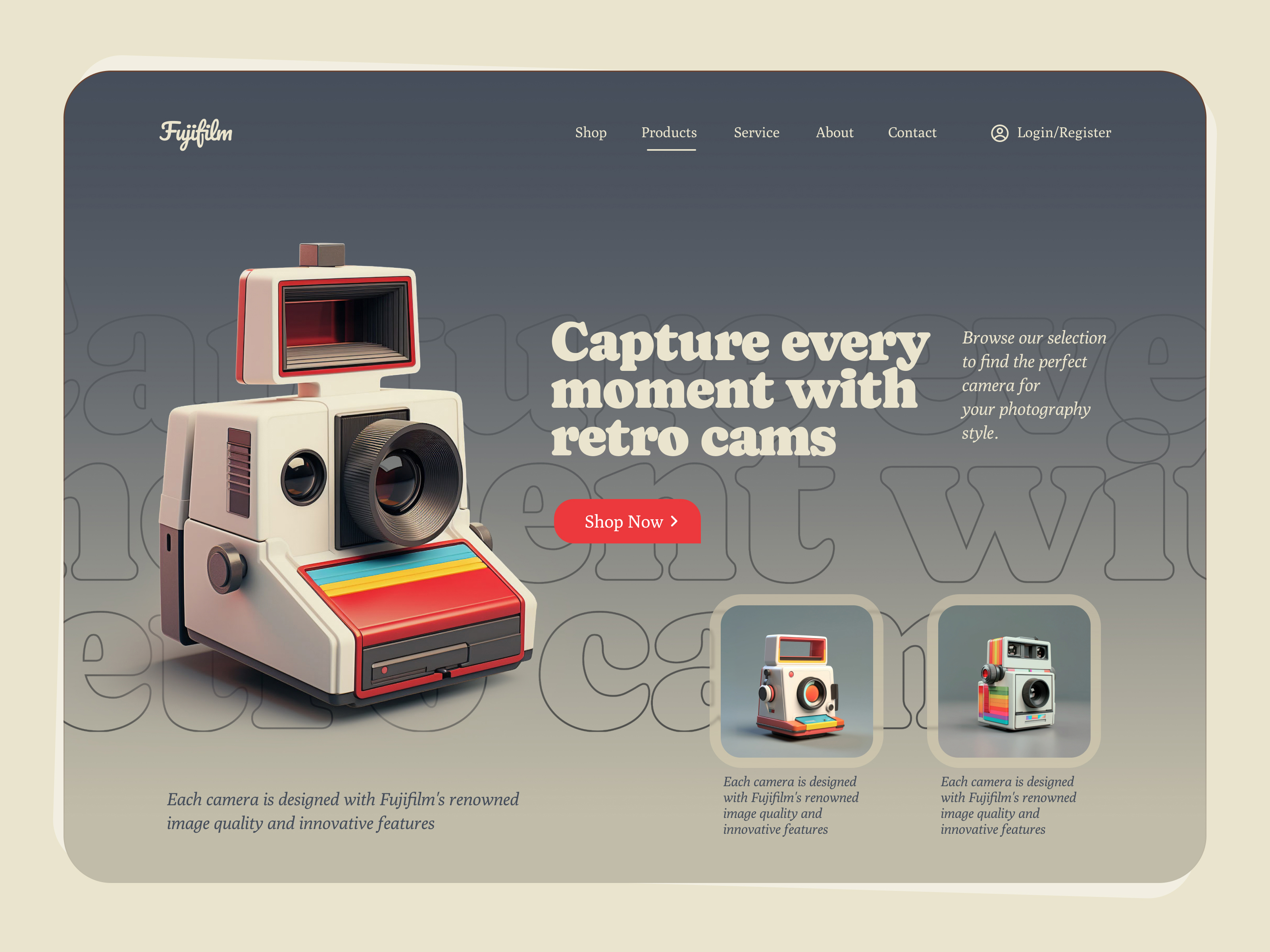
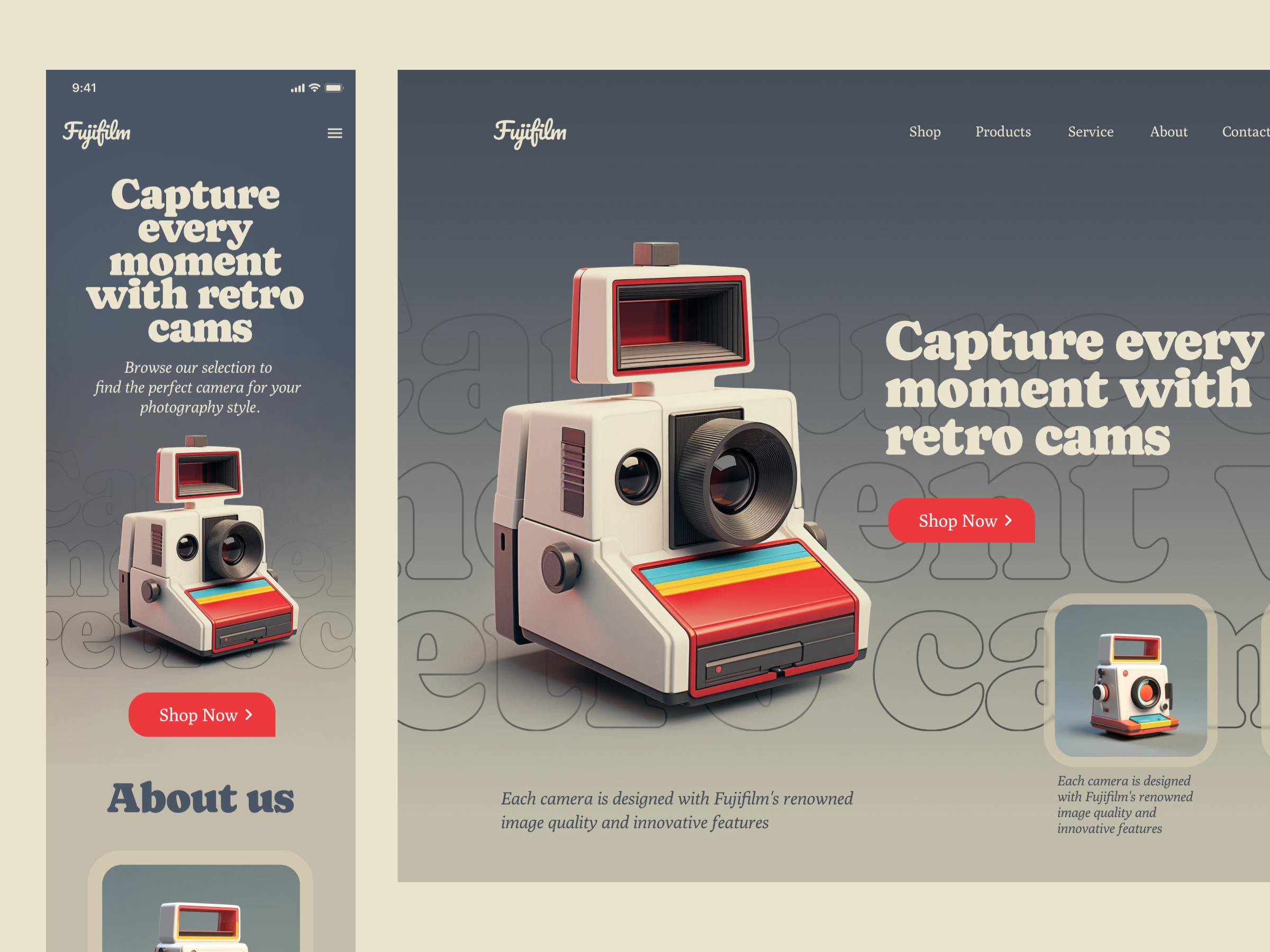
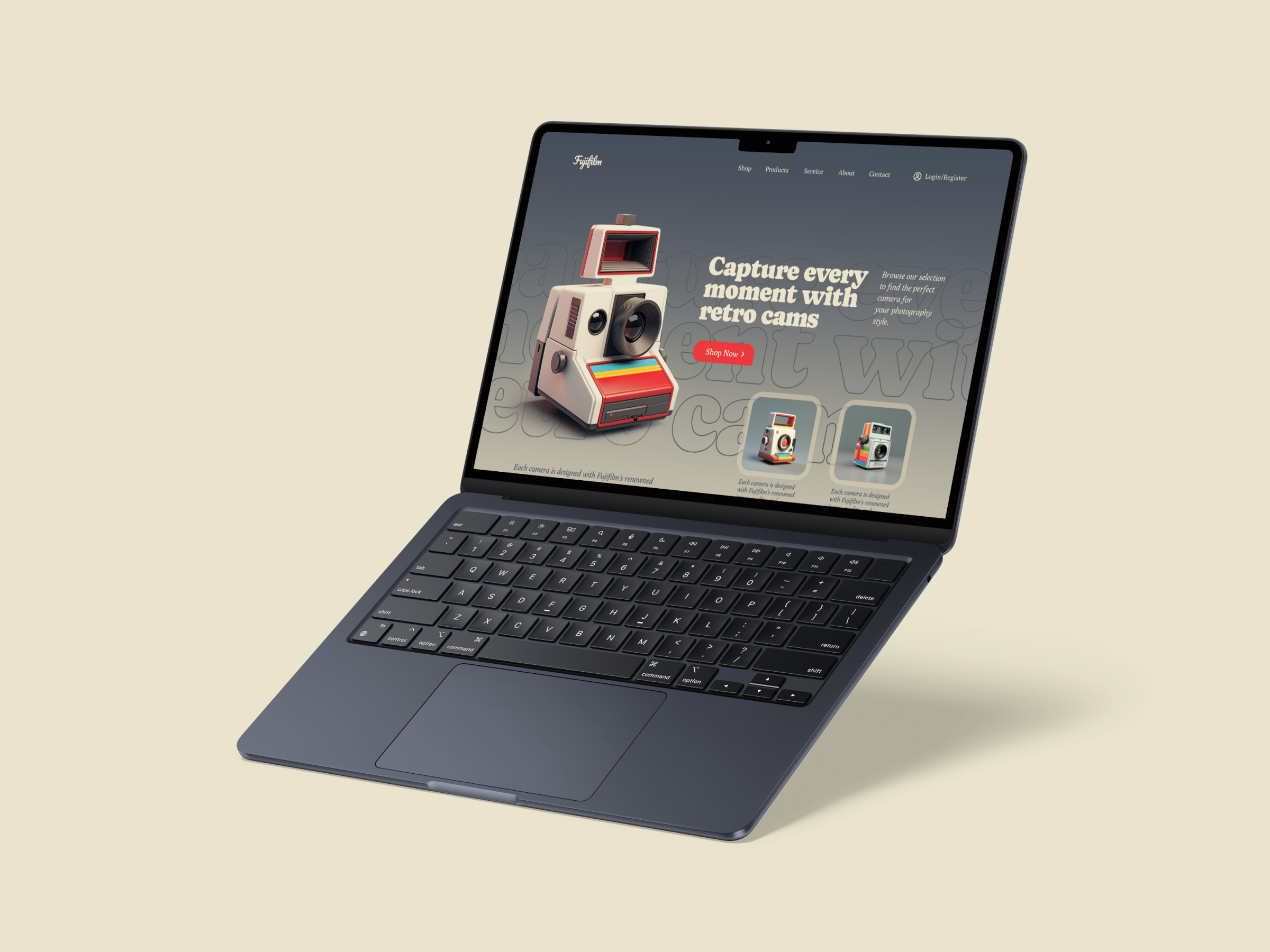
Fuji-film Polaroid Camera shop landing page

Hey People,
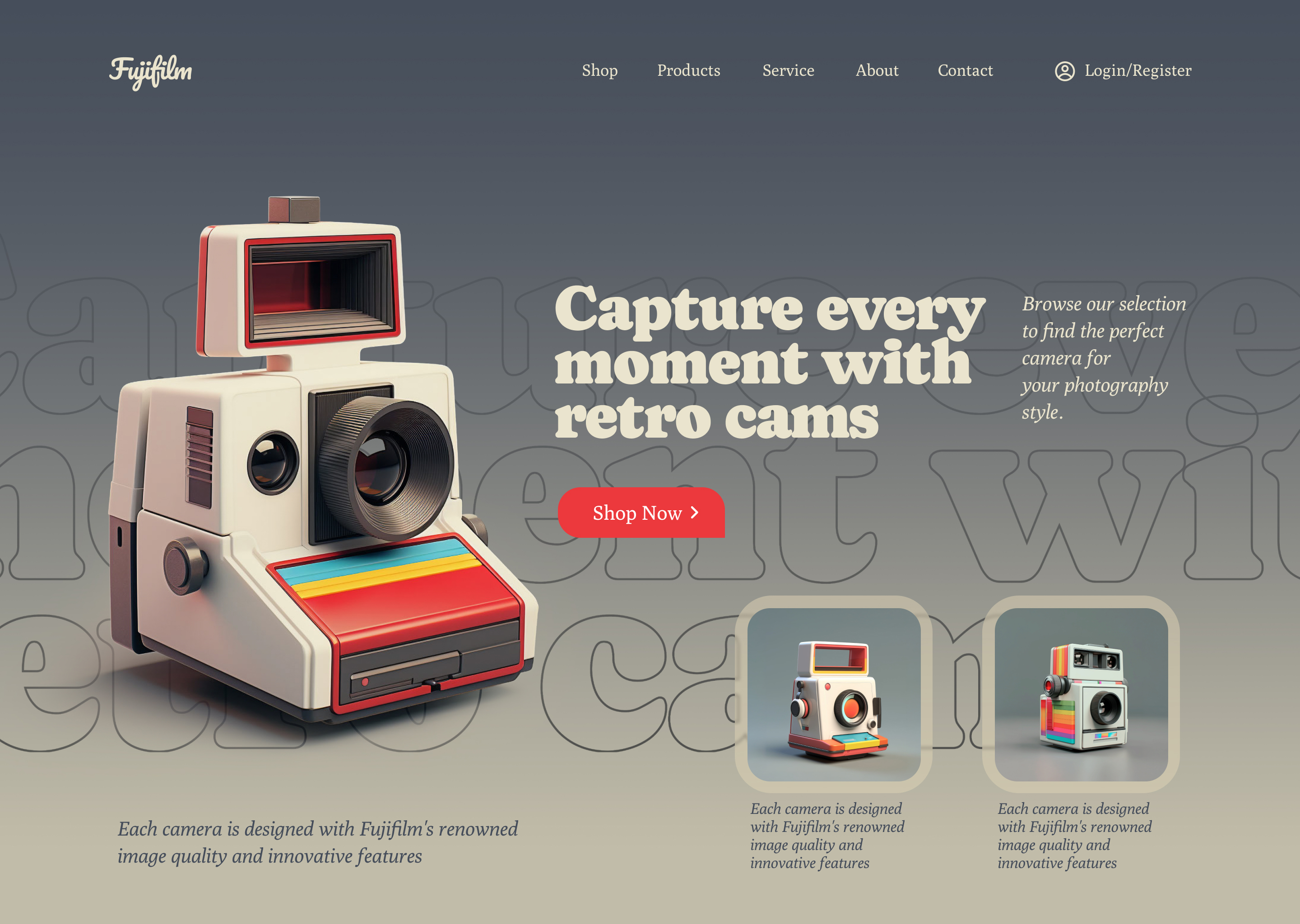
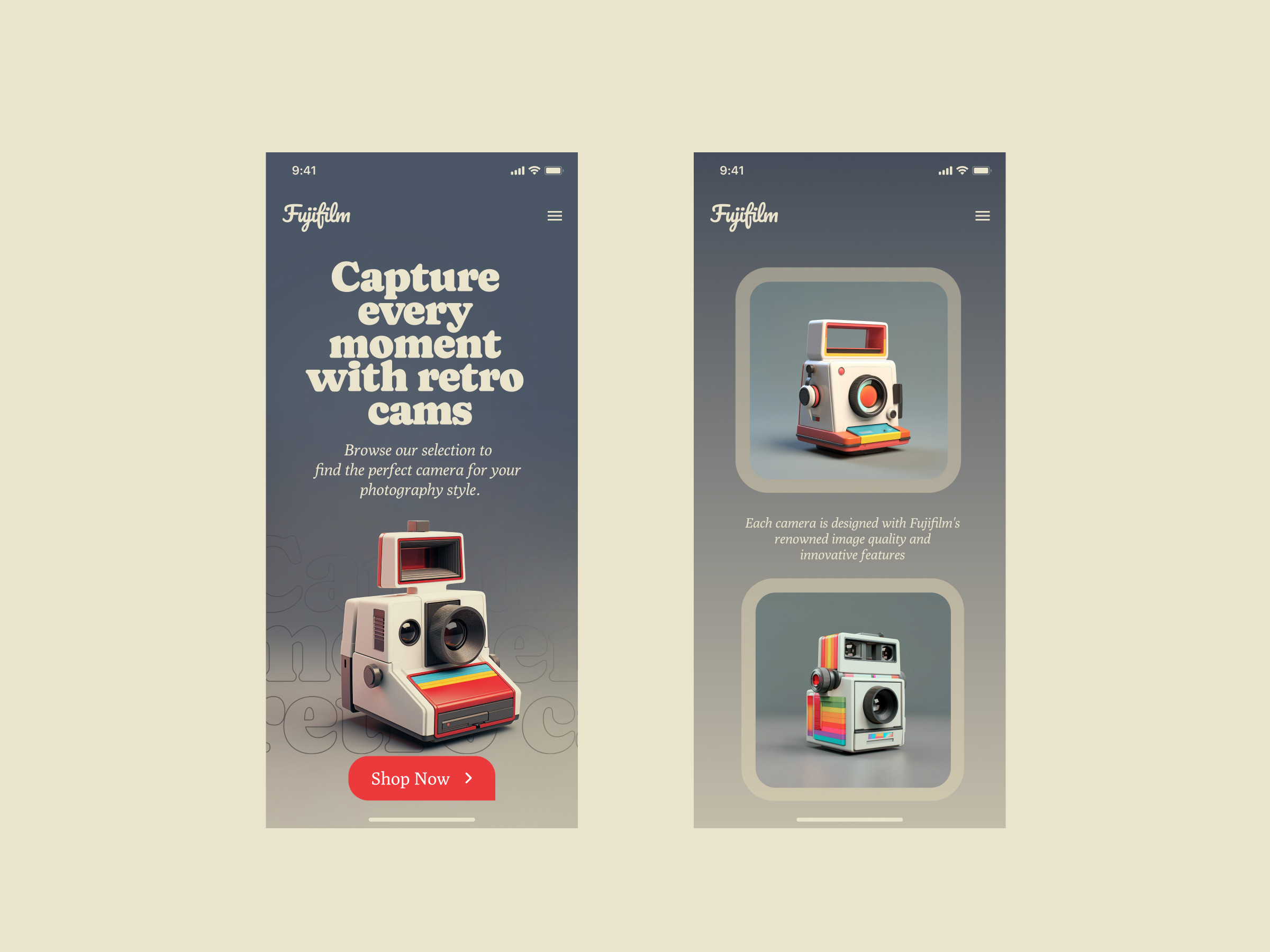
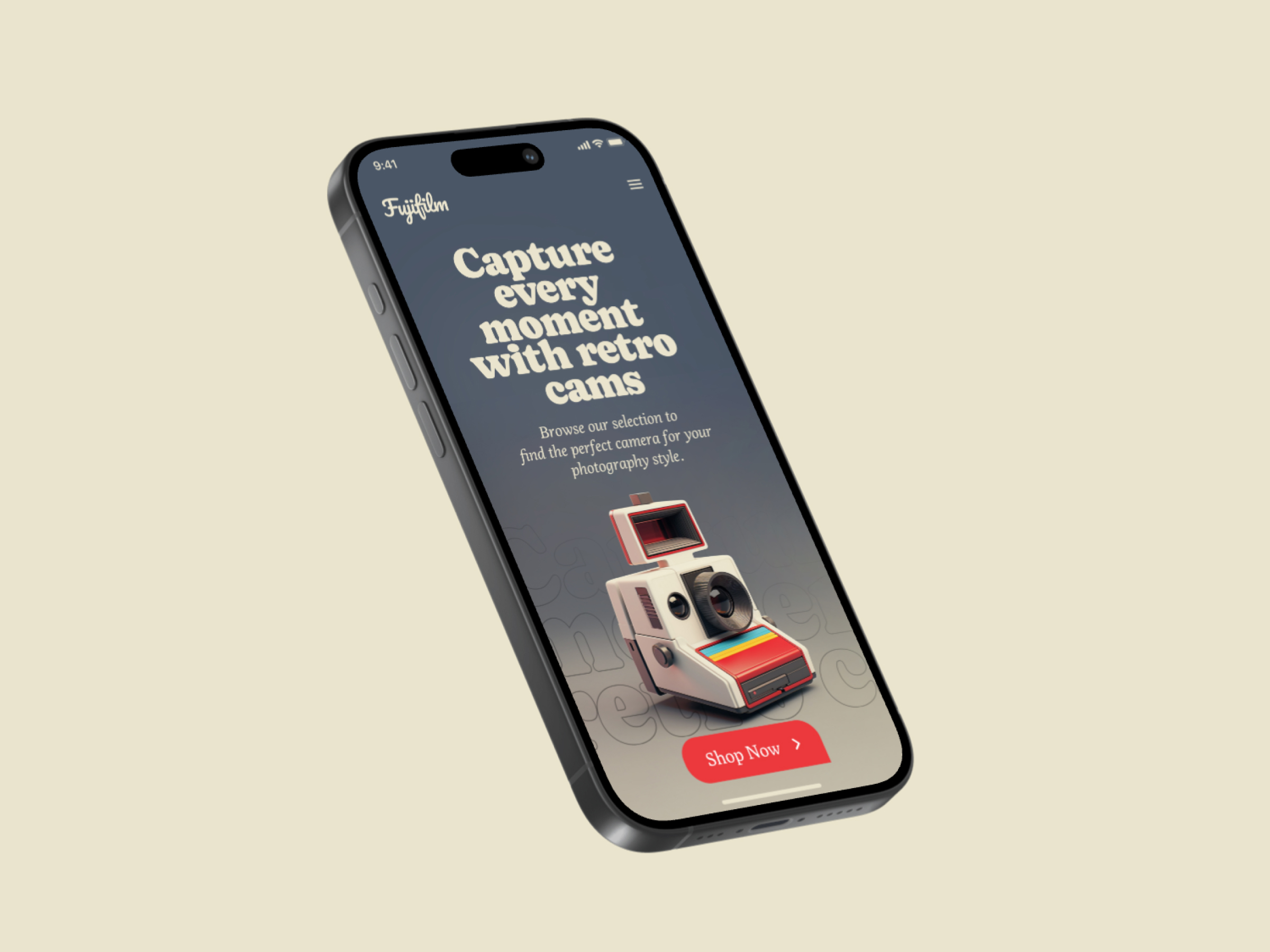
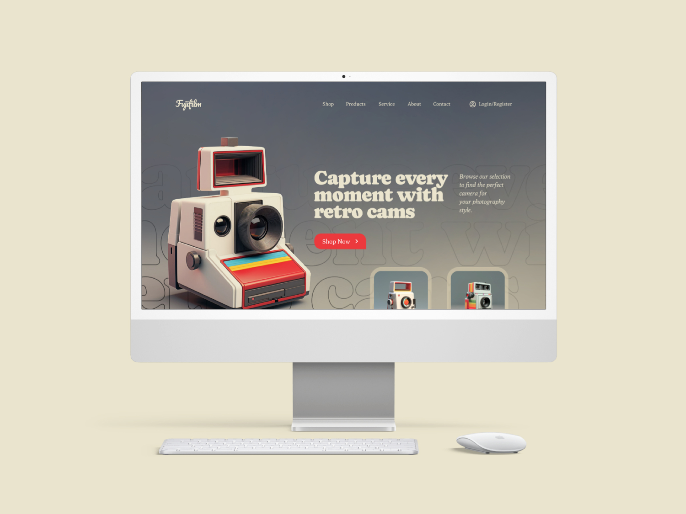
Retro camera shop landing page concept. Tell me what do you think about this design? Please share your suggestion in a comment section. Scroll down for more images.

Reviews
4 reviews

The landing page is aesthetically pleasing and effectively captures the retro theme as intended.
I have a few observations and suggestions:
Primary Button Visibility - The "Shop Now" button blends in with its surroundings as its color closely matches the adjacent image. Since the image occupies more visual space and draws attention, the button seems to lose its prominence.
Contextual Information for Shopping - As this is a shop's landing page, including the cameras' prices or other contextually relevant details would add significant value. Without such information, users might mistake the website for a gallery rather than a shopping platform.
I would love to hear your thoughts on this! Keep up the great work!

Hi Yogesh. I admire your creative vision and how you’ve balanced a vivid product with a pastel, toned-down colour palette—it’s visually striking and carries a strong 60s influence, which I love!
A few things I want to bring up:
- Enhance the Product Page Layout. The product page could be redesigned to showcase products more effectively. Consider how users might want to browse: perhaps a list view with clear naming, pricing, and filtering options. For a unique product, adding a comparison feature could also elevate the user experience.
- Simplify UX Copy. The page feels cluttered due to the volume of text. Shortening or streamlining the copy would make it more digestible while maintaining clarity.
- Improve Typography and Accessibility. Some text is difficult to read against the lighter background. Revisit contrast ratios and consider improving readability by adjusting font weights or colours.
- Global Typography Refinement. Your mobile design could benefit from a smaller heading scale, allowing key elements like the USP to occupy less screen space and flow more naturally. This adjustment would enhance readability and improve balance across devices.
Overall, this is a great piece of work with lots of potential for further refinement. Keep it up!
Yuliia

Nice choice on vintage colours, I love it
Nice design, Liked the presentation.

Great design and an amazing vintage vibe impression!
You might also like

Improving Dating App Onboarding: A/B Test Design

FORM Checkout Flow - Mobile


A/B Test for Hinge's Onboarding Flow


Accessibility Asse


The Fitness Growth Engine

Uxcel Halloween Icon Pack

Popular Courses

UX Design Foundations


Introduction to Figma

Design Terminology
