
Reviews
1 review

Hello Dewni Amaya Jayasekara,
Your designs are very modern and visually appealing great work! They successfully capture user attention. However, there are a few areas that could be improved when looking at the details:
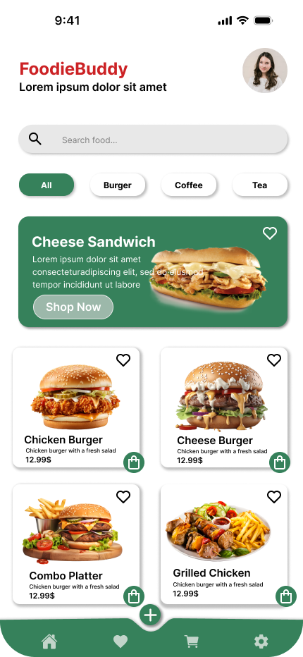
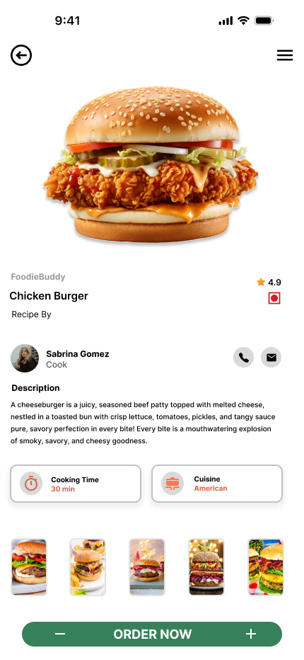
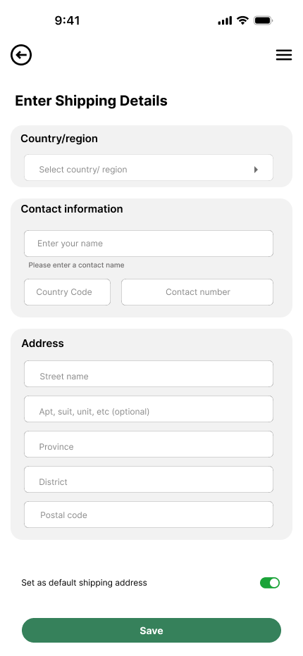
- Grid Structure - It’s noticeable that several elements are not aligned within the grid. Especially on mobile, designs usually follow a grid system with 16px margins, and elements are placed accordingly. In the current designs, the left side follows the grid while the right side does not. Ensuring proper grid alignment is essential for visual consistency. https://app.uxcel.com/courses/ui-components-best-practices/grid-best-practices-485
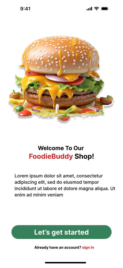
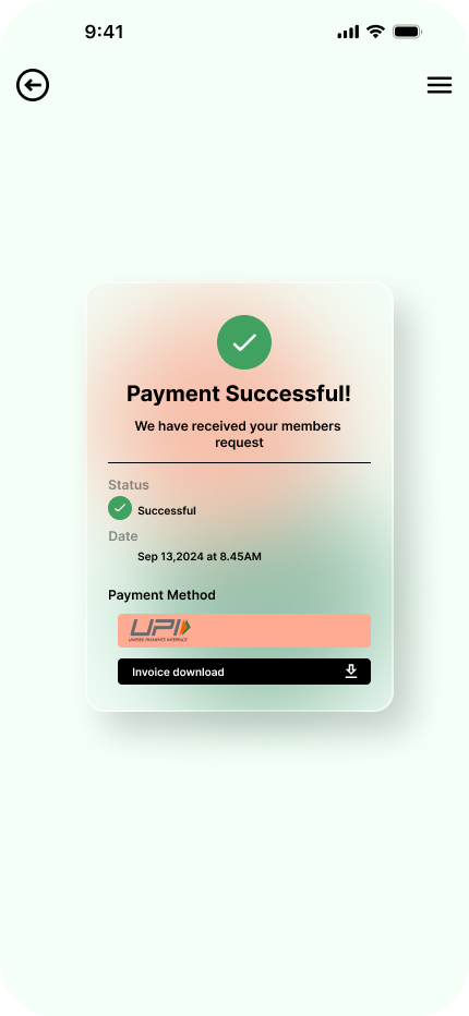
- Typography - Typography is not used correctly in many parts. For example, the text inside buttons appears too large relative to the button size. Best practices suggest using font sizes between 14–18px for buttons. Also, the header and subheader fonts are quite small. Font sizing is crucial, especially across different mobile breakpoints, so this should be carefully considered. I’m including a course link below that could be very helpful. https://app.uxcel.com/courses/typography-basics
- Input and Button Sizing - Make sure inputs and buttons follow best practices in terms of sizing: typically, 40–48px is recommended to match the average finger size. Also, ensure the text inside inputs is vertically aligned with the input field itself. Button- https://app.uxcel.com/courses/ui-components-n-patterns/anatomy-iii-298. input- https://app.uxcel.com/courses/ui-components-n-patterns/input-functionality-best-practices-822
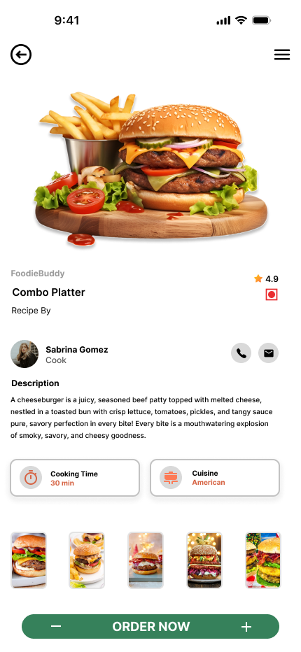
- Add to Cart Interaction - Instead of using a cart icon for adding burgers to the cart, consider using a plus (+) icon initially. This creates a clearer UX pattern. After the user clicks the plus, the icon can change to a cart with a quantity badge (e.g. 1), which aligns better with common UX best practices. https://app.uxcel.com/courses/design-foundations
If you build your designs based on these UI/UX best practices, they will become both pixel-perfect and highly user-friendly. Wishing you continued success!🫰🚀
Thank you so much.
4 Claps
Average 4.0 by 1 person
You might also like

Project
Beautify Login page WCAG principles

This accessible signup form design follows WCAG principles by ensuring the interface is perceivable, operable, understandable, and robust fo

Project
edX Sign-Up Page Redesign

OverviewThis project focused on improving the accessibility and user experience of the edX sign-up page. The original design had usability a

Project
Design Prioritization Workshop

A structured session to evaluate product ideas, prioritize high-impact features, and define a clear implementation plan.

Project
Notion Login Page Accessibility Optimization

Overview: This project focused on improving the accessibility and usability of the Notion login page. The original design had several UX and

Project
Sanyahawa - Landing page Design

I designed this with one goal in mind: make creating an account quick and easy Many sign-up pages feel crowded and confusing, so I focused o

Project
Healthy Dashboard

well being dashboard
Popular Courses

Course
UX Design Foundations

Learn UX design fundamentals and principles that create better products. Build foundational knowledge in design concepts, visual fundamentals, and workflows.

Course
Introduction to Figma
Learn essential Figma tools like layers, styling, typography, and images. Master the basics to create clean, user-friendly designs

Course
Design Terminology

Learn UX terminology and key UX/UI terms that boost collaboration between designers, developers, and stakeholders for smoother, clearer communication.