food blog
Reviews
1 review
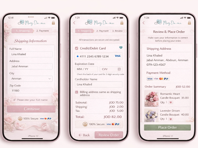
Nice start! The concept is very interesting and highly popular. It may be your first concept, but it would still be nice to add a little extra detail or description—what is the purpose of the screen, or what kind of landing page is it?
Also, when presenting, from a UI perspective, the contrast will definitely fail WCAG guidelines, because that green on a light background won’t pass the acceptable mark. It’s worth checking it using contrast checker tools in Figma—most of them are free, or you can use Figma’s native tools.
Check button sizes as well, and try to stick to one type of alignment throughout.
Takk Elene, jeg setter pris på det.
1 Claps
Average 1.0 by 1 person
You might also like

Project
Islamic E-Learning Platfrom Dashboard
Visual Language & Color I wanted the interface to feel like a quiet room you'd actually want to sit in and study. The warm neutrals - off-wh

Project
Pulse — Music Streaming App with Accessible Light & Dark Mode
Platform & DeviceFor this project, I designed Pulse, a mobile music streaming application for iOS devices (using the provided mobile templat
Project
SiteScope - Progress Tracking App
🧩 Project OverviewThis project showcases the design of a mobile login and sign up experience for a construction progress tracking app. The

Project
Mobile Button System
As my first ever ux design attempt, I tried to go with a simplified approach with only a few button types and states. I kept the color palle

Project
FlexPay
The onboarding was designed to reduce financial anxiety, create a sense of instant reward, and encourage early action. Instead of overwhelmi

Project
May.Da.Ma Candles & more
Content Strategy Courses

Course
UX Writing
Learn to write microcopy that communicates clearly and concisely to improve user experience, build trust, and boost conversions across digital products.

Course
Common UX/UI Design Patterns & Flows
Learn how to use tried and tested UX/UI design patterns and flows to solve recurring design problems faster and build interfaces that feel intuitive

Course
Building Content Design Systems
Master systematic approaches to creating consistent, reusable content across your entire product ecosystem


