Focus Labs - Accessible Signup Form

Disclaimer: Focus Labs is a fictional company created for the purpose of this case study. This login/register screen is designed solely as an educational exercise to showcase accessibility best practices and is not part of a fully functional application.

Reviews
1 review

Hey Adam!
I think you did a good job with the sign up portion of the design as it looks clean and modern! It is pretty easy to read and the contrast seems to be good also which is important when creating for accessibility :)
I have a couple points of feedback, mostly based on the design brief criteria:
- The image with text on the left of the sign up feels out of place. I would remove the text and just let the image sit on its own. Currently it's competing with the sign up form too much
- Contrast for password requirements may not be enough for all users to read. It is competing in value a little bit with the background color.
Rationale
- I think you should flesh out your rationale a little bit and go over why your design meets WCAG guidelines, your process, detail any research and analysis, personas, etc.
- You should include your thought process about designing accessible functionality such as users being able to tab through content, alt text for images (and what you would use for alt text), etc.
- I am curious what age group the website is targeted towards - the reason why is because some legislation does not allow children to sign up themselves. This means that some of the copy may need to be more geared towards parents even though the child will be using the platform. Just something to consider :)
- What problem were you trying to solve with your design? How did you approach solving the problem?
With accessibility you usually have a little more explaining and demonstrating to do. So my biggest advice is to always be ready to show your reasoning for your choices and be able to detail the problem you are trying to solve :)
Overall good visual design! Keep on learning and designing!
You might also like
Satyajit Ray Memorial Landing Page - Daily UI 003

Florish Accessibility Signup Form

Notion - Accessibility Color System

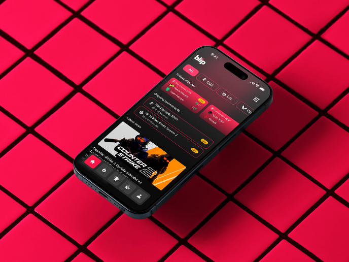
Blip - Esport app design (Light & Dark UI)


Reimagining Asana's Color System


Customer Journey Map for a Co-Working Space

Visual Design Courses

UX Design Foundations


Introduction to Figma

Design Terminology
