Enchanted Bloom - A Florist e-commerce App

Enchanted Bloom is a personalized florist eCommerce app designed to enhance the flower shopping experience. The app allows users to easily find and purchase flowers based on their preferences, occasions, and budget. It provides detailed information about each flower, including its composition, care instructions, and origin, ensuring users make informed decisions.
Reviews
2 reviews

First, congratulations on the extensive and thorough case study, Barbara. It is remarkable the work you put into it. Starting with the overall user experience, I agree with Alesya's feedback on the inconvenience of using an additional app to review such an extensive project, as it requires significant loading time and effort.
You stated that your goal was to "enhance user engagement, streamline navigation, improve visual appeal, simplify the purchase journey, and establish a reliable feedback loop". These are excellent goals for a florist e-commerce app, addressing critical areas that influence user satisfaction and business success.
It would be insightful to know how new users find your app. Are they coming through Google searches, social media, or other channels? Understanding this can help tailor the app's features and marketing strategies. How does the florist engage with her audience? Detailed insights into this interaction would be beneficial. Does the app have integrated social media features or promotional notifications? Consider adding screens that appear after a purchase, such as a "Rate Your Experience" prompt. This feature could help in establishing a feedback loop, showing users that their opinions are valued.
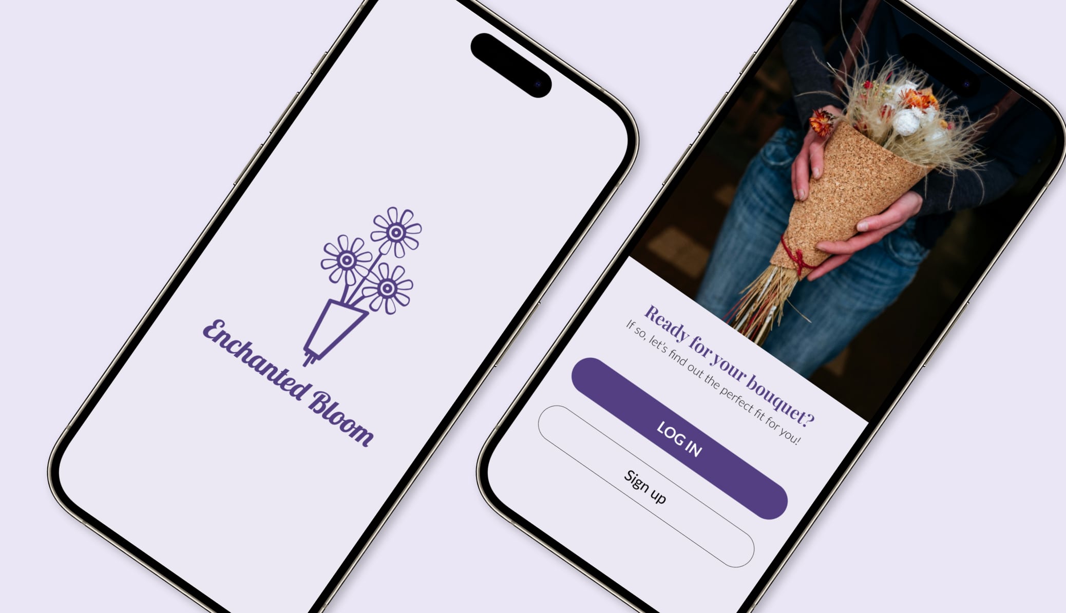
The lavender colour scheme is a great choice for a flower shop. It evokes the image and scent of lavender flowers, enhancing the app's visual appeal and thematic coherence. Some colour contrasts need improvement to meet WCAG (Web Content Accessibility Guidelines). For example, the lavender (#543F82) on light lavender (#BEADE4) does not have sufficient contrast. Ensuring that all text meets accessibility standards is crucial for readability and inclusivity.
The icons have varying line weights, which can be visually confusing. Consistent line weights would enhance visual harmony. The icons in the menu use a different white than the rest of the app, which is inconsistent. Consider unifying the colour palette across all icons and elements. Adding small labels to the menu icons could help users who are not tech-savvy. This can improve navigation and usability. The functionality for favouriting products is unclear. Ensure there is a clear and accessible way for users to favourite items, possibly through a visible icon or button on each product page.
The inconsistency in button labels, with some using all caps and others using capitals, is confusing and visually unappealing. Standardizing the button labels to a single style will enhance the app's overall visual coherence.
That's a thorough case study, thank you. The user flow reflected through the interactive prototype seems pretty intuitive. However, I feel the visual design could be improved. Some icon styles are inconsistent, there are too many fonts, and the use of different font cases for buttons isn't clear.
Additionally, we encourage users to upload and articulate their designs directly within Uxcel. Referencing Behance, Notion, or Dribbble requires extra clicks and effort for those reviewing your work, which isn’t very user-friendly. Thanks for your effort!
You might also like
SiteScope - Progress Tracking App


FlexPay


CJM for Co-Working Space - WeWork


Ubani Design System


Accessible Signup Form for SaaS Platform

Loginino

Popular Courses

UX Design Foundations


Introduction to Figma

Design Terminology
