Empty State Design (No Favorite Courses)

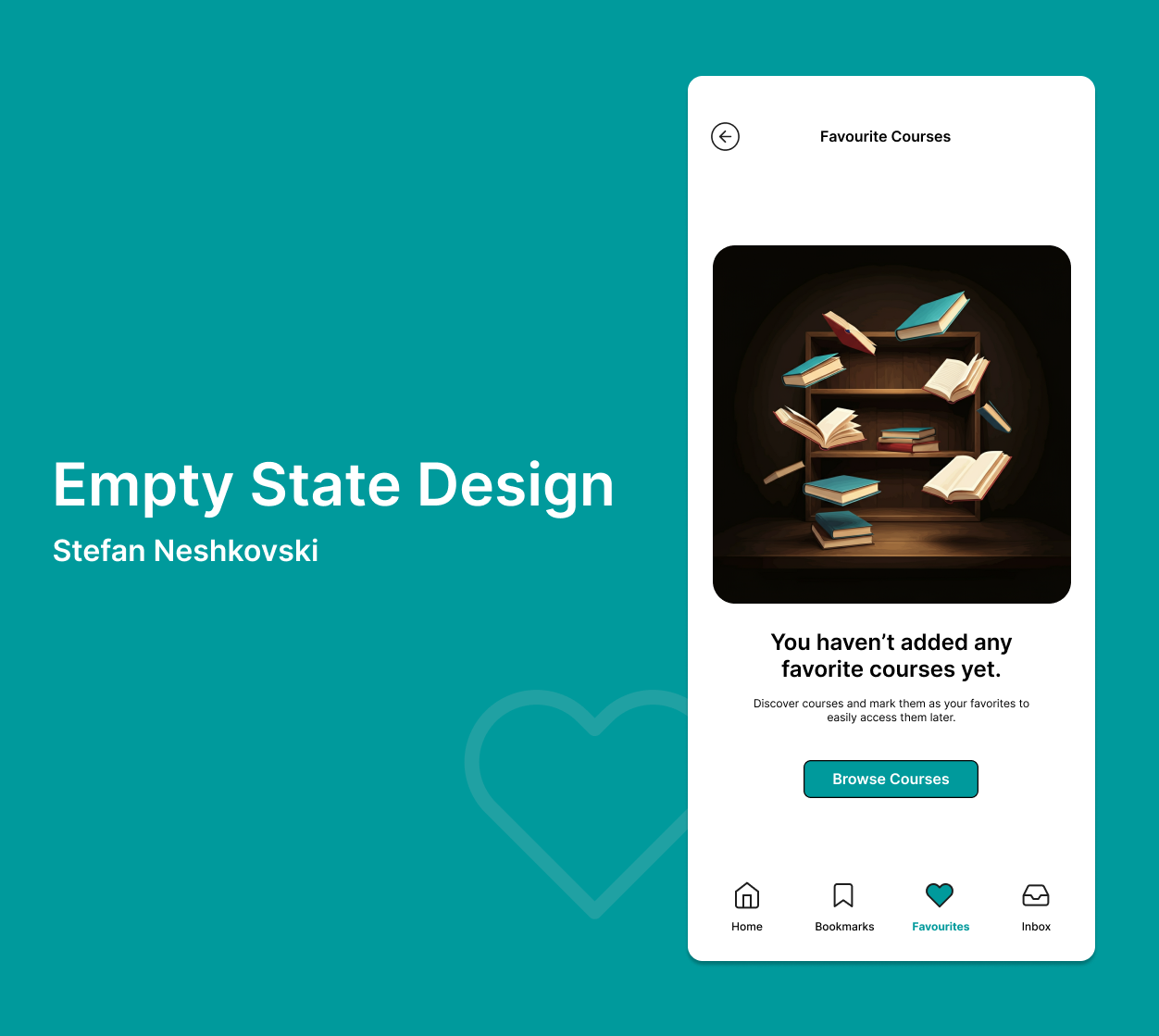
The empty state page for "No Favorite Courses" was designed with a focus on clarity, user engagement, and guiding the user toward the next step.
You haven’t added any favorite courses yet. Discover courses and mark them as your favorites to easily access them later. The copy directly acknowledges the current state (no favorite courses) while maintaining a positive, motivating tone. It encourages users to explore and interact with the platform, without making them feel like they missed something. The phrase “easily access them later” emphasizes the benefit of the feature, presenting it as a way to streamline their learning experience.
The CTA is simple, clear, and action-oriented, urging the user to begin exploring content right away. It aligns with the goal of leading the user to discover new courses and add them to their favorites. By using a direct phrase like “Browse Courses,” the action feels easy and accessible, ensuring that the user can begin their journey seamlessly.
The design not only guides the user to take action but also reinforces the idea of progress and personalization. It subtly encourages users to interact with the platform and make it their own, ultimately driving engagement. This design aims to transform a potentially frustrating "empty" page into a helpful, engaging, and motivating experience for the user, aligned with the platform’s goal of personalized learning.

Reviews
1 review

This looks really nice! I think it's great that you have a CTA to direct the user to do something to add to the favorites tab.
The only thing I'd like to be a little more clear is what kind of courses this app is for. Are these courses the app creator made or is the user looking at college courses? Are the courses about writing, books? Clarity about the purpose of the app in the UI and case study would add that extra edge of polish.
Keep up the good work!
You might also like

Pulse — Music Streaming App with Accessible Light & Dark Mode


Islamic E-Learning Platfrom Dashboard

SiteScope - Progress Tracking App


Mobile Button System


FlexPay


CJM for Co-Working Space - WeWork

Content Strategy Courses

UX Writing


Common UX/UI Design Patterns & Flows


Building Content Design Systems
