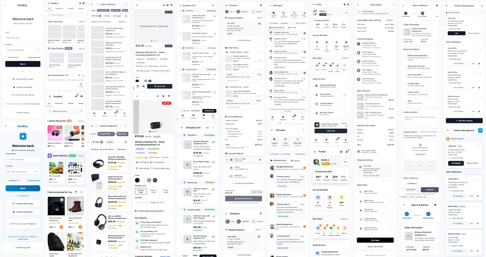
EaseBuy
Product Name: EaseBuy
Tagline: 🛒 The Seamless Way to Shop. Clean, Clear, Comfortable.
EaseBuy is a mobile e-commerce application dedicated to providing the ultimate clean, clear, and comfortable user experience. Built on a foundation of Minimalist design philosophy, we eliminate the visual clutter and complex flows common in traditional shopping apps, ensuring every transaction is swift, convenient, and reliable.
Key Features & Highlights:
- Minimalist Design, Relaxed Browsing: Ample whitespace and a soft color palette create a stress-free visual environment where product images take center stage, offering a truly comfortable browsing experience.
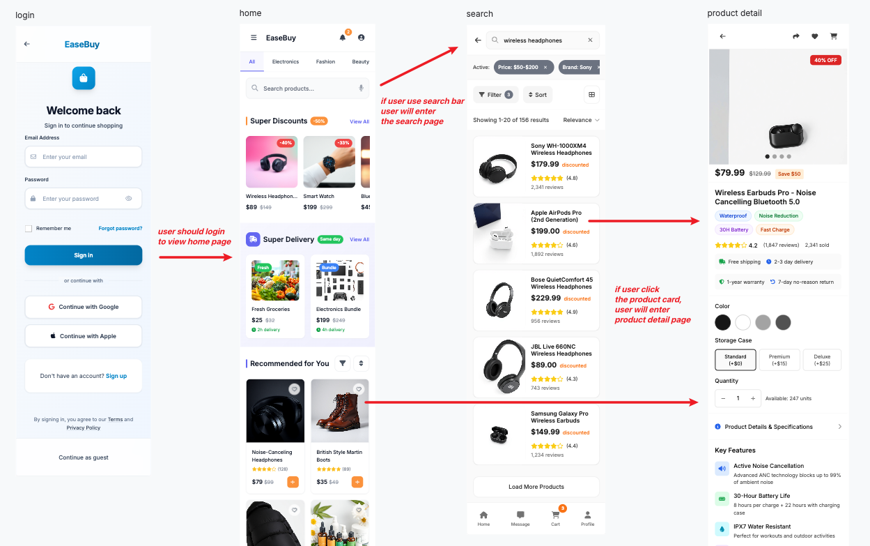
- Clear Structure, High Efficiency: The Home Screen features swipeable Category Tabs for quick navigation, while card-based grouping (in Cart and Messages) makes information instantly digestible. Core actions like search and management are always accessible.
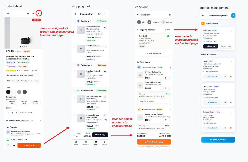
- Transparent Flow, Built on Trust: From the Product Detail Page through to the Checkout process, all details—including price breakdowns, specific discounts, and shipping status—are presented in a modular and transparent manner, ensuring a reliable journey and eliminating user anxiety.
------------------------------------------------------------------------
Updated November 5, 2025
Thank you so much for your comments! Your points about areas for improvement have allowed me to reflect more deeply on the logic of the project development process.
Therefore, I restructured and updated the project and further documented the entire iterative process.
This idea originated from a shopping experience I was going through—I simply wanted to select a piece of clothing. Still, from the moment I entered the homepage, the barrage of pop-ups and the various mini-games crammed into the overall shopping flow left me completely exhausted, to the point where I considered giving up on using the app for shopping altogether.
That experience made me think: What if I redesigned a set of flows, starting from my own ideal shopping process, using UX Pilot to help me?
------------------------------------------------------------------------
Initial prompt
Here is the prompt for generating the initial wireframe:
Design Style & UX Goal:
Design a Mobile UI for an e-commerce platform. The aesthetic must be Minimalist, aiming for a clean, clear, comfortable, and stress-free user experience.
Visual & Authentication Guidelines:
- Layout & Whitespace: Emphasize ample whitespace and a modular, grid-based design.
- Color: Background is pure white/light beige. Typography is high-contrast dark color. Brand accent is a low-saturation, soothing grayish-blue. Subtle soft orange is reserved sparingly for key CTAs.
- Authentication Flow: Home Screen and Product Detail Page are accessible without login. Messages Screen, Cart Screen, and the Checkout flow require prior Login/Sign-up (8) authentication.
Core Screen Design Specifications:
- Home screen: Swipeable Top Tabs: Home features independent sections (e.g., Super Deal, Flash Sale). Primary Categories are navigated via swipeable Top Tabs. Each Category view includes a dedicated Search Bar and Product List.
- Search Results & Filtering: Filtering Modal: Clicking Filter opens a Modal covering 80% of the screen. The Modal must include a sidebar/side menu for quickly switching filter groups: Price Range, Shipping, Discounts, Popular Brands.
- Product Detail Page: Top-to-Bottom Flow: Product Image/Video ➡️ Price ➡️ Product Name ➡️ Product Info (details pop up in a Modal upon click) ➡️ User Reviews ➡️ Q&A Section ➡️ Store Card (with Quality/Shipping/Service Ratings) ➡️ Detailed Product Graphics/Text.
- Messages Screen: Categorization: Message list must be categorized by Store or Channel (e.g., Store A, Store B, Promotions/Assistant).
- Cart Screen: Grouping & Actions: Products are grouped by store. Supports individual product selection or select-all for the entire store. Features a Manage button (for Delete/Move to Favorites) and a separate Checkout button.
- Checkout Page: Information Flow: Top is Shipping Address Info (editable, linked to Address Management). Products are grouped by Store, showing Shipping Info and Notes field below. Price Breakdown details discounts: Vouchers, Store Discounts, Points Deduction, Official Reduction. Bottom features Payment Methods (Alipay/WeChat Pay/Credit Card).
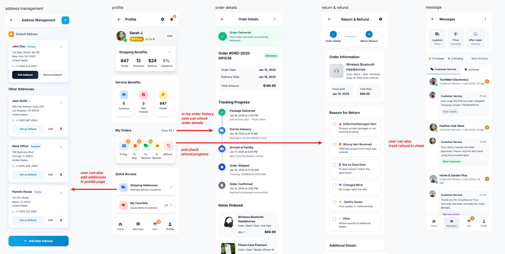
- Profile Screen: Hierarchy: Top section: Username/Membership Level. Next section: Service Benefits (Coupons/Points/Balance). Followed by My Orders Statuses (To Pay/To Ship/To Receive/To Review/Refund & After-Sales). Final section: Other Settings.
- Login/Sign-up: Design a minimal flow for user authentication required to access restricted screens (Cart, Messages).
- Address Management: Allows users to add, edit, set default, and delete shipping addresses, accessible from both Profile and Checkout.
- Order Detail: Displays the single order's full transaction info, logistics tracking status, and the entry point for After-Sales requests.
- After-Sales/Refund Flow: A step-by-step form guiding users to initiate returns/refunds, requiring clear prompts for evidence upload.
------------------------------------------------------------------------
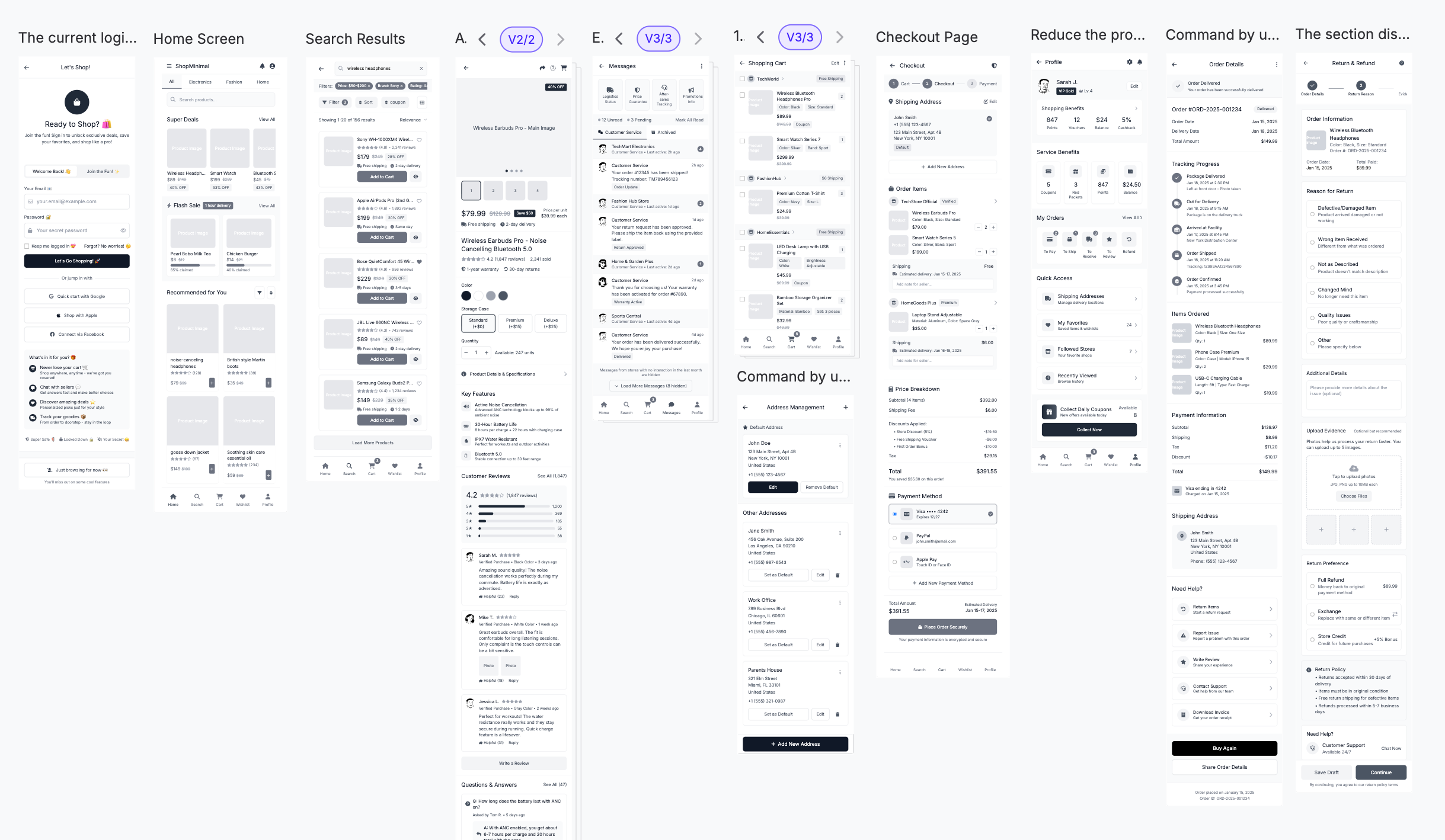
I then input this set of prompt instructions into the UX Pilot dialogue box, created an 'Auto Flow,' and initially generated the wireframes for the corresponding 11 pages. Based on these wireframes and referencing my own shopping experience, I removed the sections that created extra interference in the overall shopping flow. I then chose to generate the high-fidelity (Hi-Fi) mockups on the final revised version.
And here's the V1 result.
------------------------------------------------------------------------
wireframe Modify
At this stage, my thinking was to first leverage AI to implement the complete path. I wanted the AI-generated results in the initial version to cover as many aspects as possible—because UX Pilot offers diverse editing functions, making further cuts based on existing content seemed simpler to me.
Next, I started adjusting the existing wireframes. At this stage, I revisited the question—to create a minimalist/clean and comfortable shopping process, what content is essential? What content can be omitted?
Since my goal was minimalism and cleanliness, I focused on the amount of information conveyed to the user on the first screen of each interface—taking the product search return page and product detail page as examples.
For mobile shopping app users, on the Product Detail Page (PDP) or Product Listing Page (PLP), the essential information users need to understand or make a decision "at first glance" (or without scrolling/deep thinking) should focus on core value, immediate feasibility, and trust building.
Based on the goal of a simple and fast shopping process, this essential displayed information can be categorized as follows:
I. Core Values and Attractiveness
- Quickly attract and retain users, and determine if they meet your needs.
- 1. Product main image/video: High-quality, clear main visual.
- 2. Concise name: Clearly describe what the product is.
- 3. Key selling points/discounts: Eye-catching discount tags (e.g., 40% OFF) or concise value propositions (e.g., "waterproof," "noise-reducing").
II. Prices and Transaction Costs
- It determines whether users can afford it and whether they are willing to continue.
- 1. Final Price: This should be the price the user ultimately pays (including the base discount).
- 2. Shipping/Logistics Commitment: Free shipping, or a promised 2-day delivery.
- 3. Savings: Highlight the comparison between the original price and the discounted price.
III. Immediate Decision Factors
- Allows users to make a "next step" decision without going through the details.
- 1. Basic Specifications Selection: The most critical specifications, such as color (if only 2-3 options are available) or size range (if applicable).
- 2. Inventory Status: For example, "Only 20 pieces left" or "In Stock," to prevent users from spending time browsing only to find the item is out of stock.
IV. Trust and Reliability
- Build users' sense of security regarding product quality and purchasing behavior.
- 1. Ratings and Number of Reviews: Clear average star rating and number of reviews.
- 2. Commitment/Guarantee: Concise return policy (e.g., "30-day return") or warranty information.
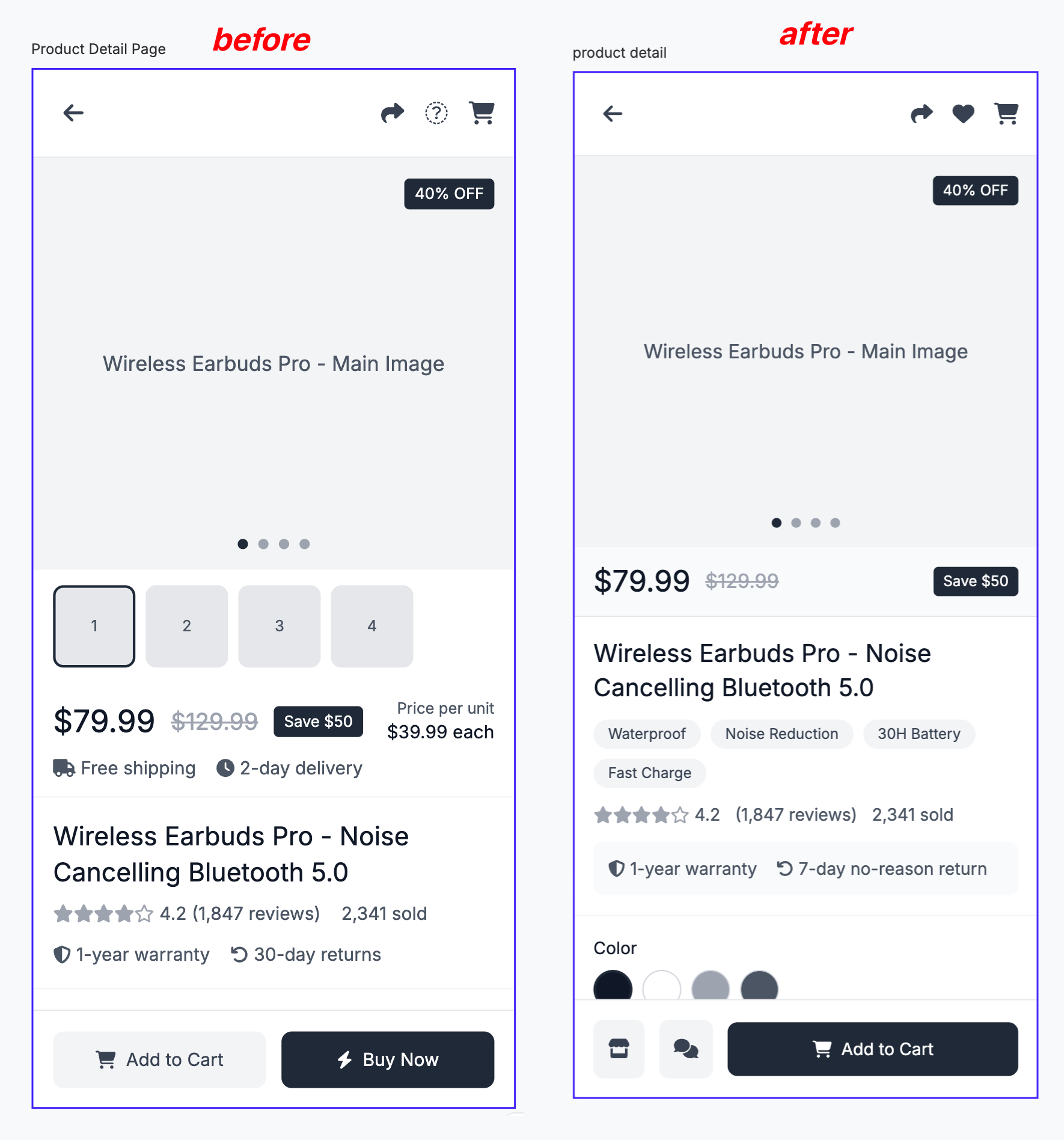
Therefore, based on the initial wireframe, I made the following adjustments to specific sections of the diagram, and here's the prompt:
Create a minimalist/gradually revealing product details page:
Display the following on the first screen of the product details page:
Product main image/Product name/Product features/Discount/Final price/Savings
Ratings and review count/Promises and guarantees (e.g., 7-day no-reason return policy)
First, display the product main image, then show the price information in a banner format: zoom in to show the final price, then highlight the discount, and finally the original price (highlighting the savings). Below, display the product name, with product features listed as tags following the product name, such as: waterproof/noise reduction.
Product details page footer: Display quick access to the store/customer service via an icon, and an "add to cart" CTA occupying half the width.
Basic specification selection (e.g., color/size)/stock status (only 20 left/in stock) can be selected in a pop-up window after clicking "add to cart".
Modify the price banner; place logistics information below the product rating. Distribute prices horizontally to minimize banner height.
------------------------------------------------------------------------
Hifi Prompt
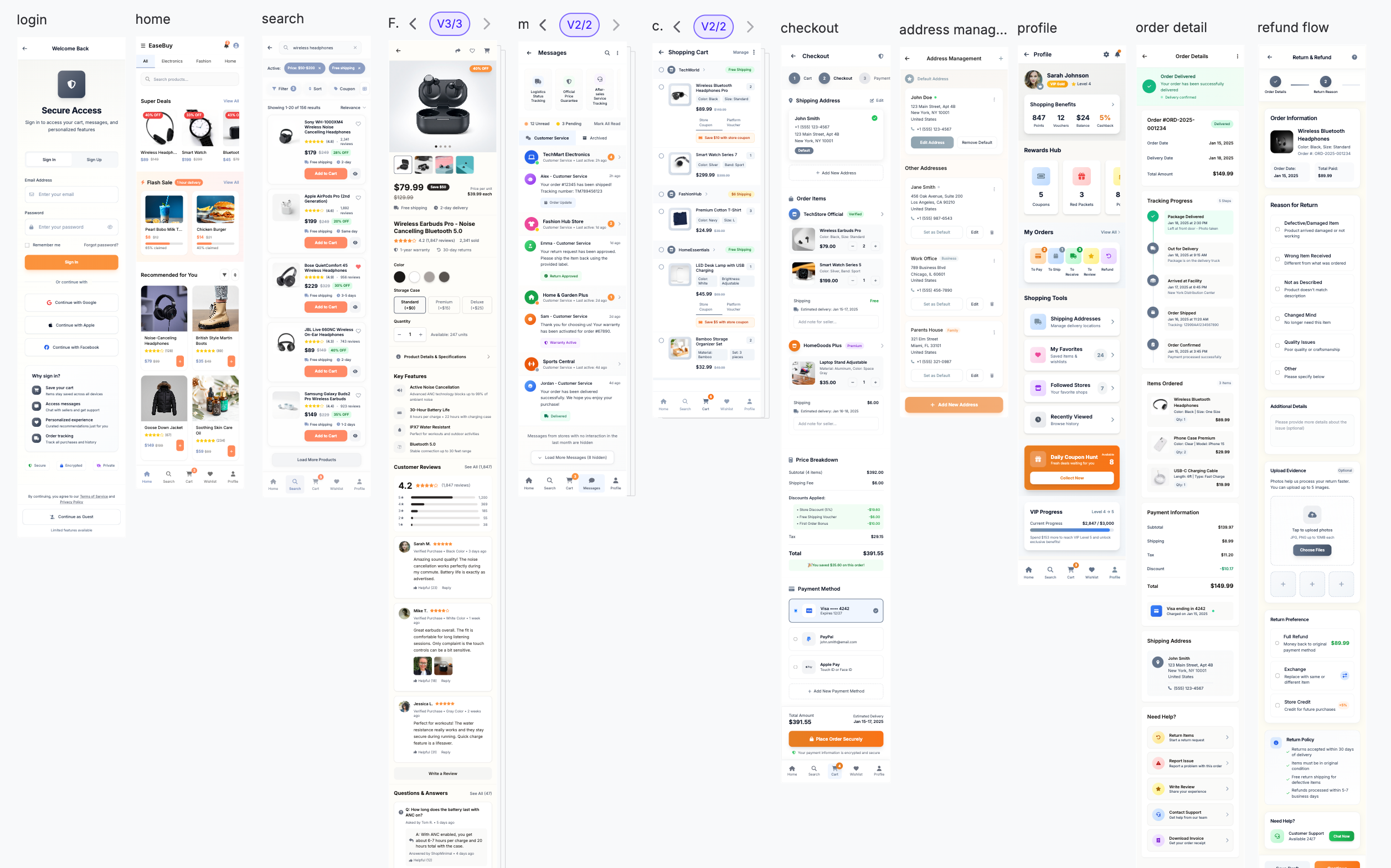
After confirming the ideal wireframe, I want to generate a HIFi diagram based on it.
here's the prompt:
Part 1: Limit the addition of new elements
Focus on the elements that already exist on the current page, and prevent new elements from appearing.
Part 2: Requires generating HIfi
Transform the provided wireframe code into a sophisticated and visually captivating high-fidelity (hi-fi) design, while strictly preserving the wireframe's structure, layout, and all existing elements.
Part 3: Ensure accessibility
1. Color Contrast Test
Instruction: Ensure the contrast between all text (including brand color text) and the background color meets WCAG 2.1 AA standard (≥ 4.5:1).
Instruction: Ensure the contrast between all non-text UI elements (such as icons, input box borders, inactive states) and the background meets WCAG 2.1 AA standard (≥ 3:1).
Purpose: To ensure that colorblind users and users with poor vision can clearly identify all information.
2. Typography
Instruction: The minimum font size for body text (such as product descriptions and reviews) should be 14pt or 16px.
Instruction: The minimum font size for auxiliary small labels (such as timestamps and price units) should not be less than 12pt or 14px.
Purpose: To avoid user fatigue due to excessively small font sizes and achieve a comfortable reading experience.
3. Touch Target Size
Directive: The minimum clickable area of all interactive elements within the app (such as buttons, icons, navigation labels, and filters) must be at least 44 x 44 pixels (px).
Directive: Key CTA buttons and bottom navigation icons should consider using a size of 48 x 48 pixels (px) to further enhance usability.
Directive: Ensure sufficient spacing (at least 8px) between interactive targets to prevent accidental touches.
Purpose: To ensure users can complete actions quickly and accurately, reducing frustration from accidental touches.
------------------------------------------------------------------------
Tools used
From brief
Topics
Share
Reviews
5 reviews
I can see that the EaseBuy project is solid work showing your ability to work with AI tools and think about a complete user flow. I notice that your brief was well thought out, and the visual result is consistent and professional.
I can see that the visual consistency works really well – I notice a well-considered color system (grayish-blue + soft orange), typography, and spacing across all screens. Your description was detailed and well-constructed, which helped the AI generate a cohesive, minimalist design aligned with your goals. The information hierarchy is clear, and the card and module layout makes content easy to scan.
What needs improvement:
Below is my subjective assessment of elements worth refining according to the assignment criteria:
- No prompt iterations – you don't show HOW you refined your prompts, what you changed between wireframes and hi-fi, what decisions you made.
- Accessibility – I don't see color contrast tests (especially for grayish-blue), information about font sizes, or touch target sizes.
- Presentation – A few PNGs without context isn't enough. Where's the described flow? How do the screens connect? I'm missing annotations and explanations of decisions.
I think the design itself is really solid and shows good UI sense, but process documentation and presentation account for 40-50% of the evaluation according to the assignment criteria. I'd recommend showing prompt evolution, and packaging it in a better presentation format – then you'll have a complete project ready for your portfolio.
Great job!!
Looks great! However, if the idea was really clean and minimalistic experience, I would play more with the UI to remove the labels that are not necessary and creating more visual noise and focus more on progressive disclosure in that case.
I'm very happy to see your AI experiments with UI. Keep up the good work!
Nice try!
This is just encouragement; reflecting on optimization from your own experience is a good perspective. However, the entire process seems to lack a bit of design consistency. Although I saw a few relevant descriptions in your shared prompt, that's not enough for a successful and effective optimization. I hope you keep up the good work!
You might also like

Smartwatch Design for Messenger App

Bridge: UI/UX Rebrand of a Blockchain SCM Product

Pulse Music App - Light/Dark Mode

Monetization Strategy

Designing A Better Co-Working Experience Through CJM

Design a Settings Page for Mobile
Product Thinking Courses

Ethical & Responsible Product Design

Product Vision & Strategy


