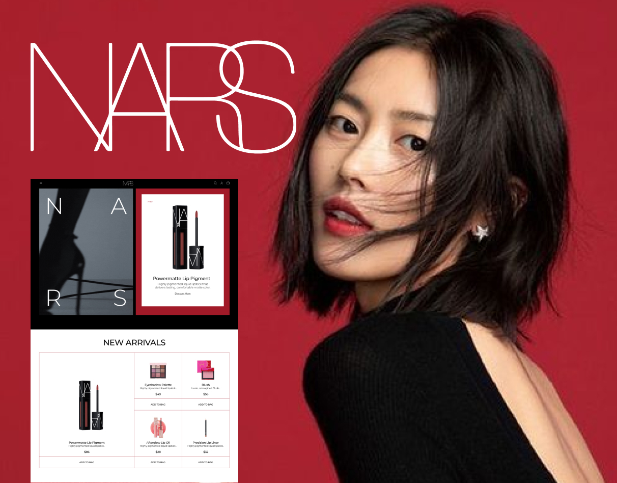
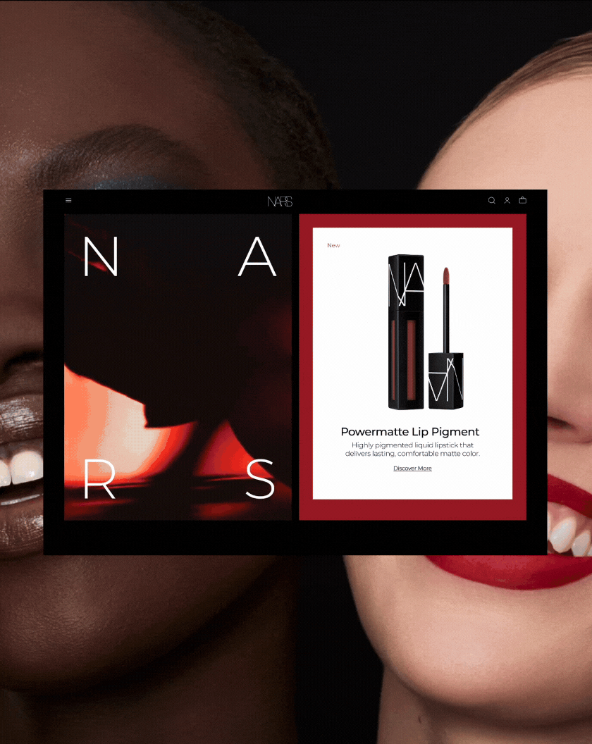
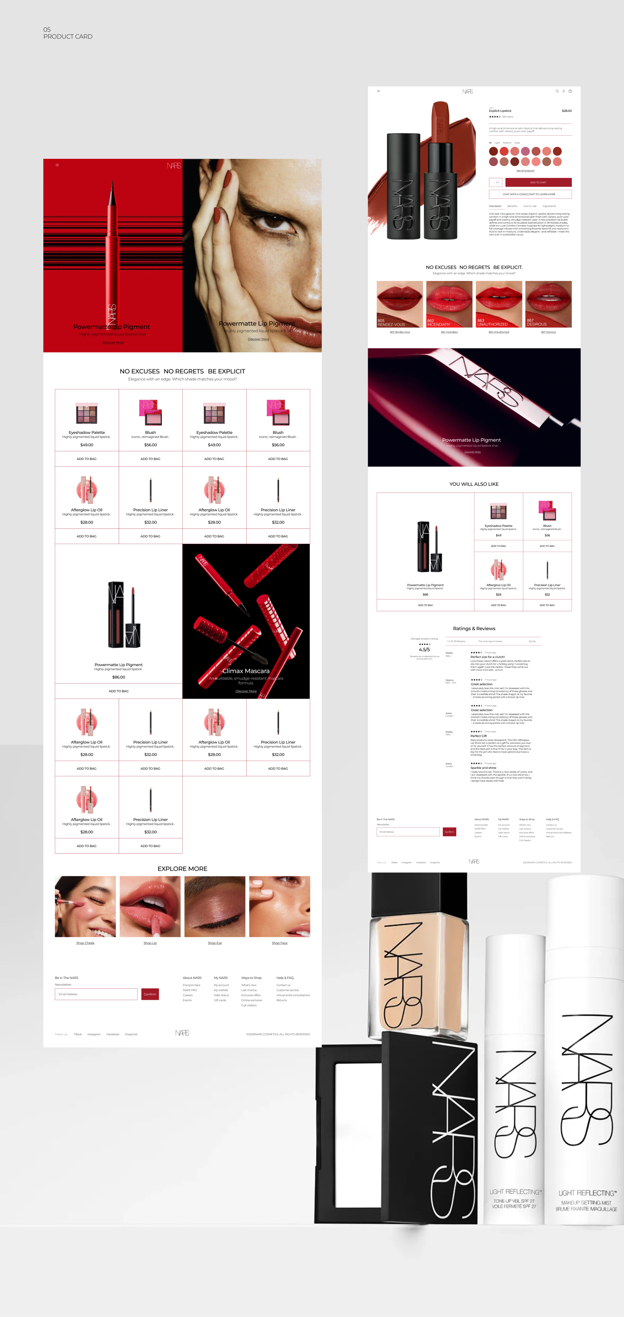
E-commerce. Cosmetic store web-design


Reviews
4 reviews

Awesome work Dasha! Definitely proved your unquie style in the design.
If I have to be a critical thinking client, I have to question the responsive of this design whether every device will look as great as this.
Other than that, great job! Looking forward to your next project!
Dasha

Hi Dasha, congrats on your project. I can see your attention to details and a strong sense of fashion/cosmetic industry understanding you put into the showcase. I love how well the typography is build and combined and the minimal yet bold colors selected. The animation is also visually captivating.
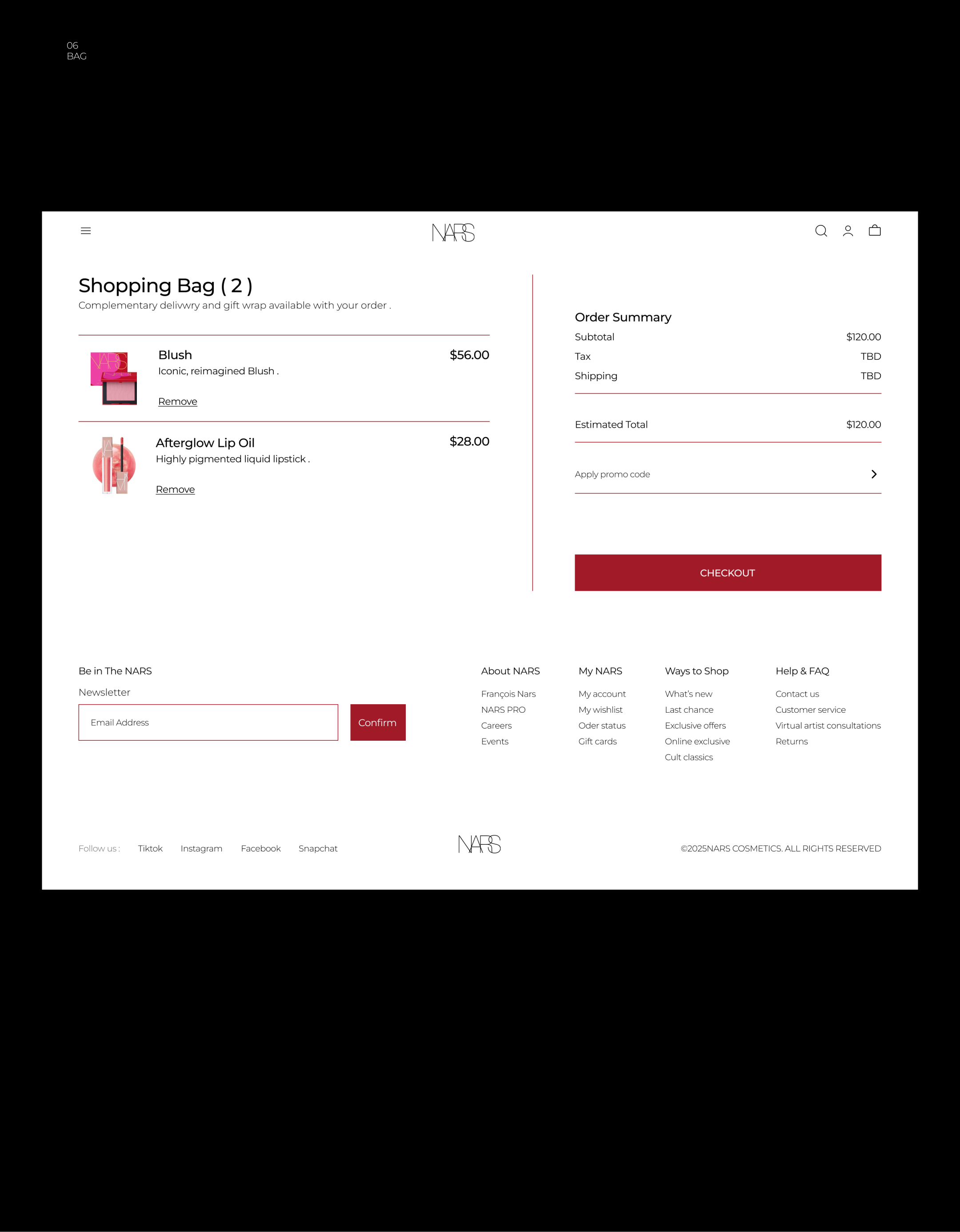
I only have a small UX suggestion in the Cart Page that it should involves the steppers for changing the quantity of item selected as the users might be interested in buying more than 1 set of product.
Look forward to seeing more from you <3
Dasha

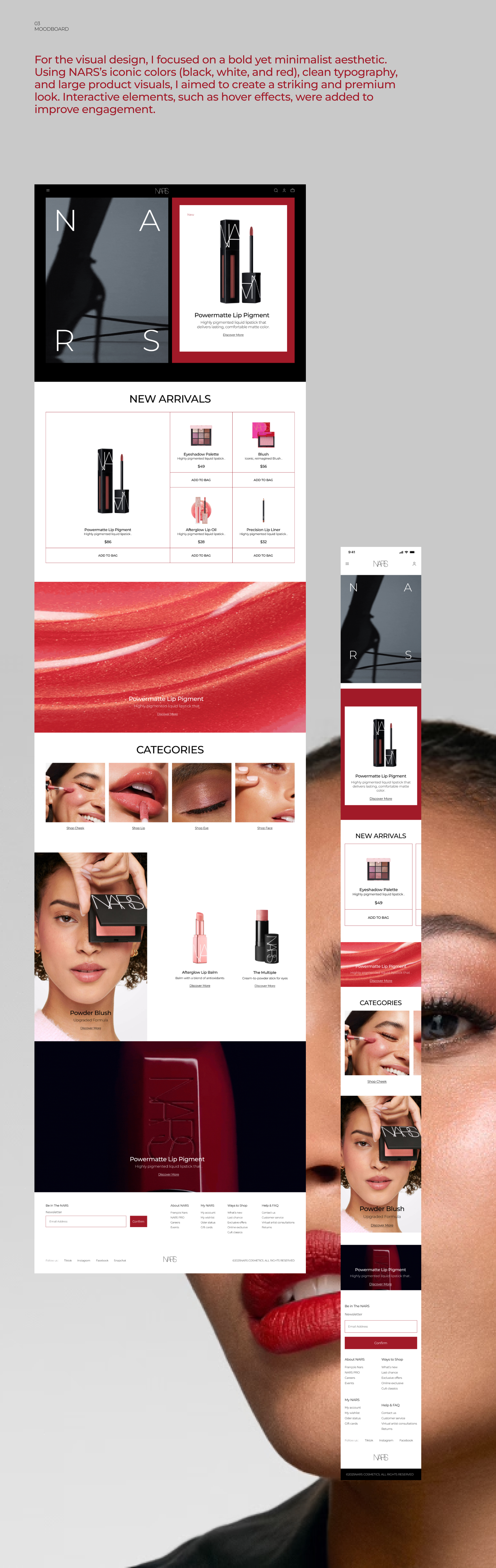
This e-commerce design beautifully captures the essence of a cosmetic store—clean, sophisticated, and inviting. The layout is intuitive, making navigation seamless, while the visuals and typography enhance the brand’s elegance. The product presentation feels thoughtful, ensuring a delightful browsing experience. A slight refinement in contrast or spacing could improve readability and accessibility even further. Overall, it’s a well-executed design that balances aesthetics with functionality. Amazing work!
Dasha

Great job — the concept is genuinely interesting and shows strong creativity. There are just a few small enhancements that could make the experience even better. For example, the New Arrivals section would benefit from a link leading directly to the full collection. On the product cards, you could add some essential features such as a wishlist, compare option, or a quick view — even triggered on hover.
For the category section, adding a View All link would improve navigation, and if you have multiple categories, arrows for browsing would be really helpful.
In the product carousel below, adding swipe arrows and an indicator would make the interaction feel more complete.
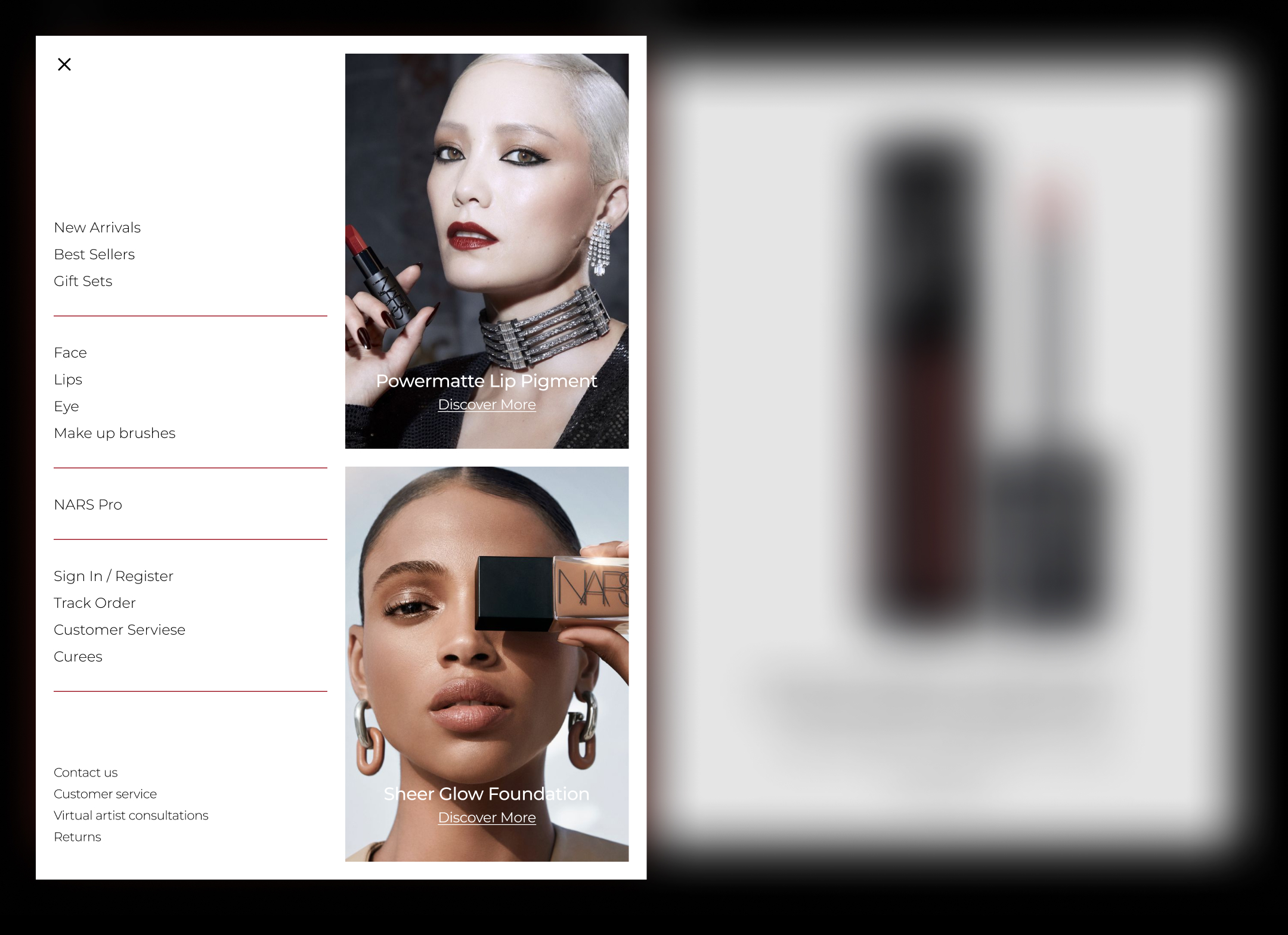
From the main navigation, I would remove Returns and Track Order and refine the information architecture a bit to keep everything clean and intuitive.
Overall, the creative direction is strong — just remember that functionality is what ties the whole experience together.
Fantastic work so far — keep it up!
You might also like

Pulse — Music Streaming App with Accessible Light & Dark Mode


Islamic E-Learning Platfrom Dashboard

SiteScope - Progress Tracking App


Mobile Button System


FlexPay


CJM for Co-Working Space - WeWork

Popular Courses

UX Design Foundations


Introduction to Figma

Design Terminology
