E-com
I created the checkout as guest for an online shopping experience.

Reviews
1 review
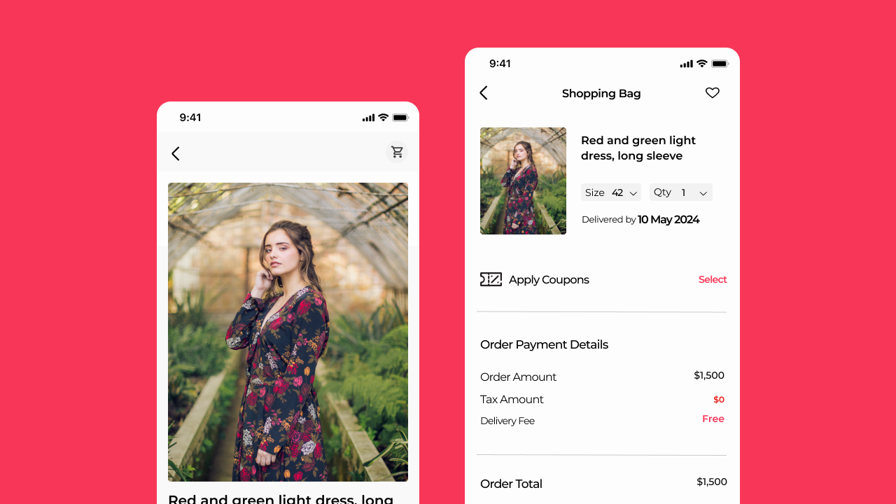
The checkout flow is generally simple and appealing, but there are a few areas that need attention:
- The reddish color used for the primary 'Buy Now' button may be confusing, as such colors are typically associated with destructive actions. Additionally, both buttons turn dark blue on hover, which adds to the confusion.
- The address input should ideally start with the country, especially for products with a global market. Different countries have specific formatting requirements, such as states in the US and counties in the UK.
- The titles on the payment details page and the new card details are misleading; they should be labeled appropriately instead of being grouped under 'Checkout'.
- Upon clicking 'Finish', it is confusing to be taken to a success screen. After adding new payment option details, users expect a final review before proceeding to payment. This abrupt transition can be disorienting and may cause anxiety.
3 Claps
Average 3.0 by 1 person
You might also like

Project
Smartwatch Design for Messenger App

Practice your interaction design skills and design experience optimized for smartwatches.

Project
Bridge: UI/UX Rebrand of a Blockchain SCM Product

A UI/UX overhaul project of Bridge, a blockchain-based enterprise supply chain management web app originally called BSCM. This short case st

Project
Pulse Music App - Light/Dark Mode

This project presents a mobile music streaming interface designed in both light and dark modes. The visual direction combines Japandi minima

Project
Monetization Strategy

This project evaluates two monetization models (freemium and paid) for a new mobile point-and-click adventure game. It compares their streng

Project
Designing A Better Co-Working Experience Through CJM

Project ContextThis project focuses on improving the experience of individuals using co-working spaces. The objective is to identify key pai

Project
Design a Settings Page for Mobile
Showcase your information architecture and content strategy skills by crafting a settings page for mobile.
Interaction Design Courses

Course
UX Design Foundations

Learn UX design fundamentals and principles that create better products. Build foundational knowledge in design concepts, visual fundamentals, and workflows.

Course
Introduction to Figma
Learn essential Figma tools like layers, styling, typography, and images. Master the basics to create clean, user-friendly designs

Course
Design Terminology

Learn UX terminology and key UX/UI terms that boost collaboration between designers, developers, and stakeholders for smoother, clearer communication.