drippy.ai - Landing Page (AI Fashion Stylist)
The design for the drippy.ai landing page followed a focused approach prioritizing clarity, speed, and modern sophistication.
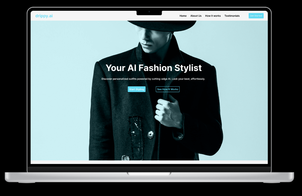
The use of a off-white background and black text establishes a clean, high-contrast canvas that ensures exceptional readability and a professional, uncluttered user experience.
The primary light blue color was strategically chosen to function as the action and accent color. This light blue is reserved for all critical elements that require user interaction, such as Calls-to-Action (CTAs) like "Get started" or "Start Free Trial," as well as key headings and informative icons. This intentional color usage creates a clear visual hierarchy. The goal is to immediately guide the user's eye to the most important features and conversion points, and reduce cognitive load. I wanted to emphasize the cutting-edge, yet accessible, nature of the AI service.
Tools used
From brief

Topics
Share
Reviews
2 reviews

Well done, Sidney!
I like that you used a minimalist color palette, with shades of turquoise, and a very readable sans-serif font.
I also like how you organized the sections, presenting the product, the features, how it works, testimonials, and a call to action section.
Some improvement suggestions:
- Use Figma alignment tools or auto-layout to keep the spacing consistent and content well placed;
- increase the spacing in the top menu to avoid clicking on the wrong option;
- Increase the padding in the buttons Start Styling and Book a Demo, it will look better, and we want to make it easier for the user to click;
- desaturate and darken a bit the background of the last section to increase contrast and readability, or use a picture with a dark overlay as the background of the last section. As it's a fashion product, having a photo with a call to action seems a good idea.
Keep up with the good work!

This page gives off such a bright, confident energy, Sidney! It immediately draws you in and makes the brand feel approachable. You’ve clearly thought about flow and contrast to guide the eyes toward key actions and it mostly works really well. A little tweak to the white text over light blue would help the readability even more, especially for users in bright settings.
The “How It Works” section is already engaging and clear; just aligning the text a bit tighter between steps would polish it further. Same with the testimonial cards, they already have charm and a little consistency in spacing would make them feel perfectly balanced.
I really like the closing CTA “Ready to Elevate Your Style?” The drop shadow adds depth and the section feels inviting. If the buttons had a slightly darker or outlined treatment, they’d stand out even better without breaking the aesthetic.
You’ve built a page that feels confident and lively, just a few gentle refinements away from looking truly effortless.
You might also like

edX Sign-Up Page Redesign


Beautify Login page WCAG principles


Design Prioritization Workshop


Notion Login Page Accessibility Optimization


Sanyahawa - Landing page Design


Healthy Dashboard

Content Strategy Courses

UX Writing


Common UX/UI Design Patterns & Flows


Building Content Design Systems
