Designing Movie Time: Mobile UX Wireframes for Engagement

🧠 Project Background
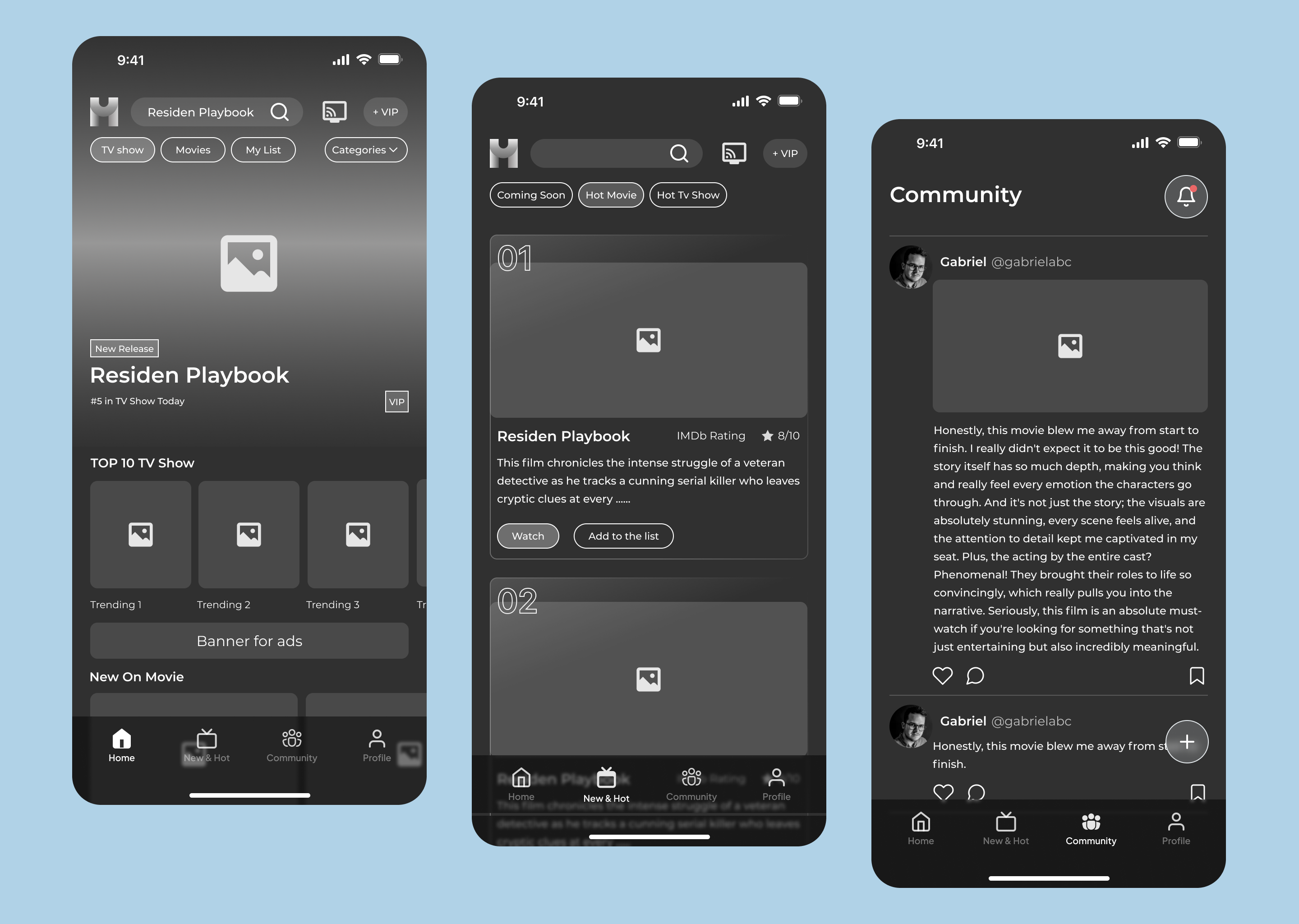
As a member of the design team for a video streaming service, I was assigned to create a user experience that is more intuitive, engaging, and distinct from competitors. This project focuses on mobile devices, with a design approach that prioritizes easy content access, user engagement, and fast content discovery.
Tools used
From brief

Topics
Share
Reviews
1 review

Hey Maya,
I feel like this dark-mode UI is almost ready to deploy for a wireframe 😄 great work.
I’d like to chime in on a few things. First one’s probably semantic, by engagement, do you mean:
• Who: new users? occasional users? VIP subscribers?
• Type of engagement: most-watched content or social interaction in the community?
As a user, I’d be happy to see small ad placements hehe but would it be appealing to advertisers? They usually need high-visibility and visually rich areas (the kind we often find annoying as users!)
There are a few UI tweaks for improvement, but these two caught my eye the most: the button hierarchy between “Notifications” and “+ New Post” in the community tab. Do they have the same importance? What if it's just the bell icon without the circle, aligned with the “Community” text baseline? Just something I pondered, I’m sure you’ve done your research too.
Now let me continue binging Resident Playbook S01E05 🤓
You might also like

Beautify Login page WCAG principles


edX Sign-Up Page Redesign


Design Prioritization Workshop


Notion Login Page Accessibility Optimization


Sanyahawa - Landing page Design


Healthy Dashboard

Interaction Design Courses

UX Design Foundations


Introduction to Figma

Design Terminology
