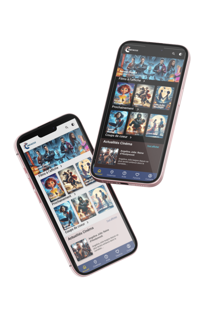
Designing an cinema app 🍿
As part of the UX Design workshops offered by Google, I designed a mobile application dedicated to purchasing cinema tickets. This achievement included user interviews, the creation of personas, the development of user journeys, the design of wireframes, the carrying out of tests and the development of prototypes, all following the Design Thinking method.
To view the case study, please click here: https://docs.google.com/presentation/d/13CaN4hz-eJ3Yg1jFtu047o_TjcO1nm7J/edit?usp=sharing&ouid=113518952985779357588&rtpof=true&sd=true
Tools used
Topics
Share
Reviews
5 reviews
Hi Marjorie,
Thank you for submitting your project. It’s clear that you’ve put a lot of effort into it, and I appreciate the hard work you’ve invested. However, I would strongly recommend presenting your work in English, especially if you’re aiming for a broader audience. While I understand the importance of native languages, using English will make your project more accessible to a wider audience, including those who may not be familiar with French.
User Flow and Architecture
First off, I want to commend you on the user flow and overall architecture of the app. It’s intuitive and easy to navigate, which is a crucial aspect of any successful application. You’ve done an excellent job here, making the app user-friendly. However, there’s always room for improvement. One area that stood out is the reservation process—currently, it appears that users cannot add more tickets when making a reservation. Enhancing this feature would significantly improve the user experience.
UI Design and Visual Improvements
In terms of the UI, there are several areas where improvements could elevate the overall look and feel of the app:
1. Use of Negative Space and Grid System:
• It seems that the app doesn’t fully utilize negative space or adhere to a grid system. A consistent grid, such as the 8px grid system, can bring structure and balance to your design. For example, the name categories feel cramped; adding more padding would allow the elements to breathe.
2. Film Categories Presentation:
• Consider using a carousel for displaying film categories. This would not only save space but also create a more dynamic and engaging user interface.
3. Hero Header Image:
• The text overlaid on the hero header image is difficult to read, whether in light or dark mode. I suggest adding a gradient overlay from the bottom of the image to improve text readability. You might want to look at how platforms like Netflix or HBO Max handle this—both do an excellent job of ensuring text stands out against background images.
4. Bottom Navigation Bar:
• The bottom navigation bar feels too narrow, which can make the app seem dated. Consider increasing the height and adding more padding around the icons to give the elements more breathing room. A modern, spacious navigation bar will contribute to a more contemporary feel.
5. Payment Process Page:
• The payment process page requires significant refinement. The containers could benefit from a white background to enhance clarity, and the use of negative space should be optimized to improve visual hierarchy. I recommend studying well-designed apps that feature payment processes—analyzing and adapting their approaches could provide you with valuable insights.
Overall, you’ve made a solid start with this project. The user flow is strong, and the core architecture is well thought out. By focusing on refining the UI elements and enhancing usability, you can significantly improve the overall user experience. I encourage you to explore current design trends and best practices, particularly in areas like grid systems, negative space, and modern UI components, to take your design to the next level.
If you make these adjustments, I believe your project will stand out even more.
Great vibes,
Cristian
Although it may have all been in French, clicking through your presentation's screens is straightforward, and you can clearly see your thinking. Well done on this!
Nu stiu daca intelegi importanta comunicarii in aceeasi limba.
Proiectul are o structura destul de buna, insa cu o cromatica si o interfata grafica de anii 2010. Sunt foarte multe aspecte ce trebuie imbunatatite aici. Incearca sa te uiti la aplicatii precum IMDB sa vezi diferente si sa urmaresti trend-uri.
Spor
Hello Marjorie!
It looks like a big project was done by you. It's hard to follow the Google presentation in unknown language, but the structure of the slides looks settled.
The final design can be improved with the design principles in mind. I would also suggested to test the colour choice for the movie app, usually the entertain applications done with more bright and appealing colour palette.
Great start!
/Yuliia
First of all great start, I can see the time you have put into your design! So great work there! A few ideas to help develop your design.
- Think of white space - space out your pictures and text and let your interface breathe.
- With the header text for each section, are they clickable as they have an arrow next to them? To a user it may not be obvious what your intention with this text is?
- With your header picture think about the text on top? How would you make more visible to users?
Keep up the great work and I look forward to seeing how your design will develop!
You might also like

Pulse — Music Streaming App with Accessible Light & Dark Mode

Islamic E-Learning Platfrom Dashboard
SiteScope - Progress Tracking App

Mobile Button System

FlexPay

CJM for Co-Working Space - WeWork
Popular Courses

UX Design Foundations

Introduction to Figma


