Dashboard design for "UpRun"

Dashboard design for "UpRun"
Tools used
Topics
Share
Reviews
3 reviews

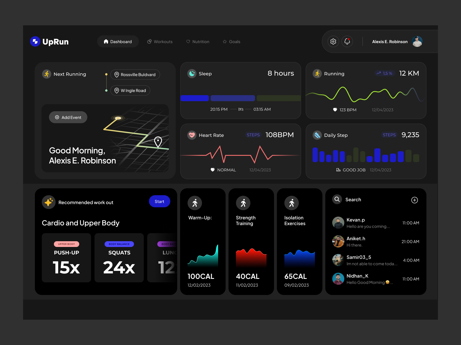
I am a runner myself and one of the most important things to run it's motivation. I feel your design has a room for improvement, maybe the colors can be more vibrant like the new running sneakers from popular running brands. I know it's a dark theme but your can play more with greys and give more deep to the ui. The users list on the bottom right, I really don't understand for what is about.
The designs look clean, polished, and minimalistic. However, I can't give your work a high grade for two reasons. Firstly, it's not a case study, but rather just a single image. Secondly, we encourage users to present their work in a case study format and share their design process insights, research phase, and wireframes. You can familiarize yourself with the best practices for creating a project here.

Your project features innovative interactions that enhance user engagement. The creative use of animations and transitions adds a dynamic element to the user experience. Keep exploring new ways to engage users!
You might also like

Events Managment App


Customer Journey Map — Offsite Co-Working Experience


Mobile Onboarding: Casa di Pasta


Accessible Signup & Login Experience — Brainex


Accessible Signup Form


Accessible Signup Form

Popular Courses

UX Design Foundations


Introduction to Figma

Design Terminology
