Dajaan - E Commerce Proposal

Overview
As a Product Designer at 1MORETHING VENTURES, I played a crucial role in renovating the e-commerce ordering experience by introducing "Daaj," an AI assistant integrated into the Daajan app. Daajan is a luxurious e-commerce mobile app that offers high-quality groceries and household essentials. My responsibilities included designing a seamless and intelligent user experience leveraging AI to enhance the shopping process. This part-time, remote role allowed me to focus on integrating advanced AI features to make Daajan a standout e-commerce platform.
Key Achievements
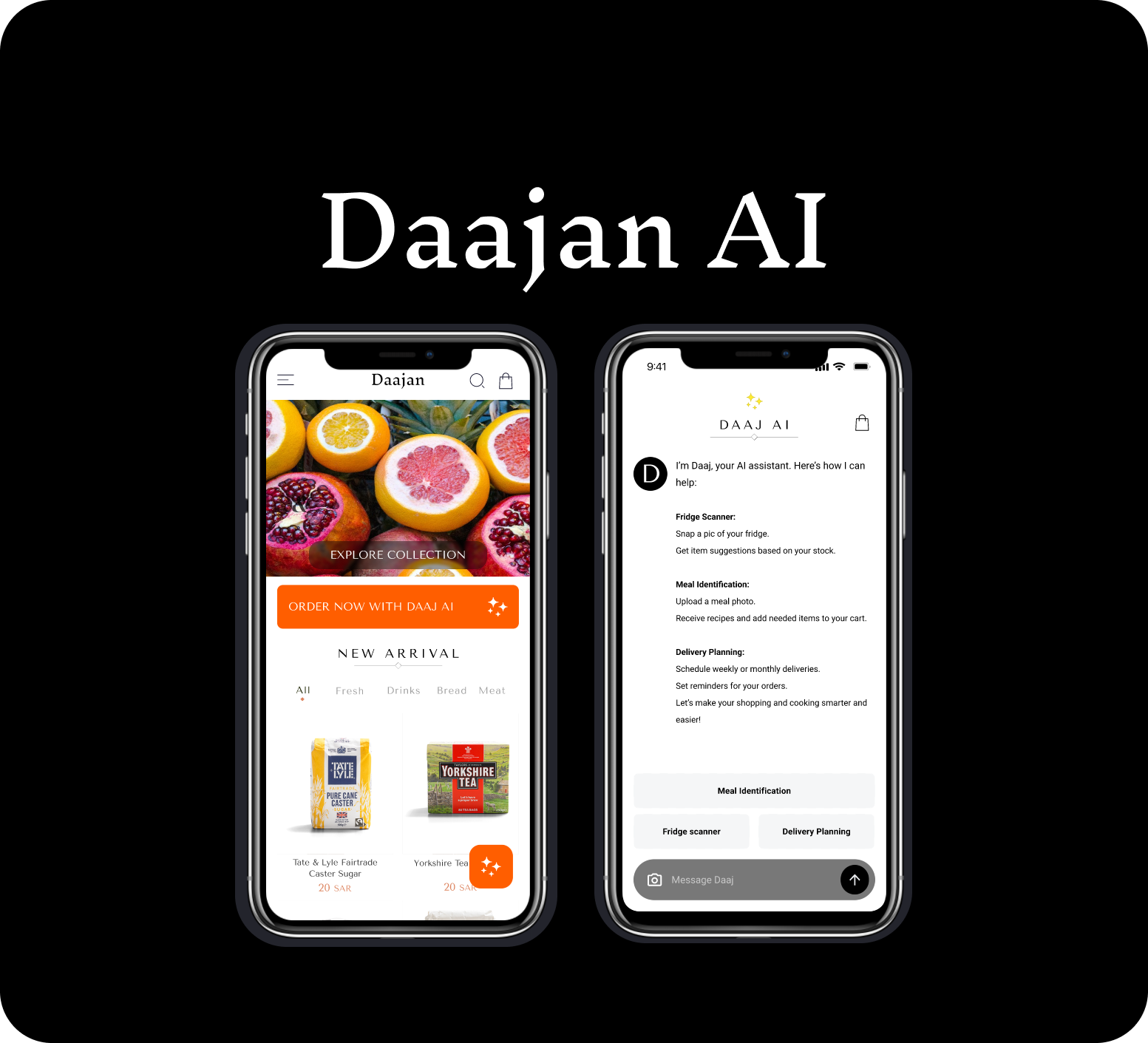
- Introduced Daaj, the E-commerce AI Assistant:
- Conceptualized and integrated Daaj, an AI assistant, to personalize and streamline the shopping experience.
- Enhanced User Experience:
- Renovated the user interface and user experience to align with Daajan's luxurious brand image and advanced functionalities.
Key Features and Screens
Homepage & Categories:
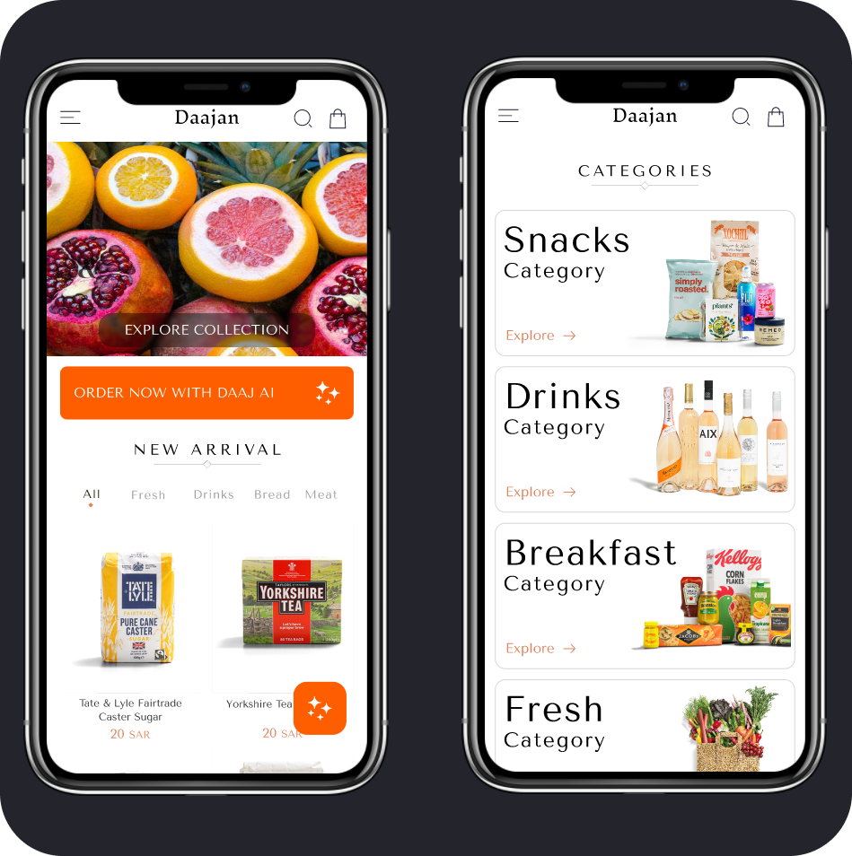
- Designed a visually appealing homepage that highlights featured products and categories.
- Ensured easy navigation with clear, intuitive categories to help users find products quickly.
Product Listing:
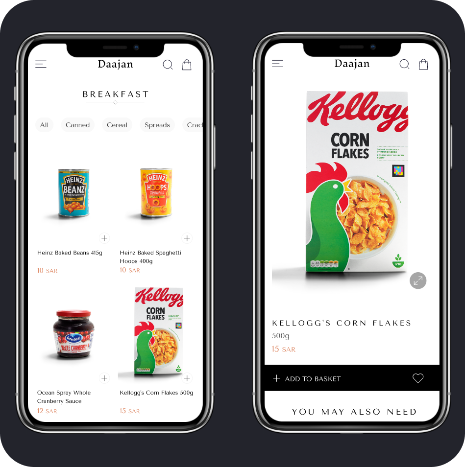
- Developed a product listing interface with high-quality images, detailed descriptions, and pricing information.
- Included advanced filtering and sorting options to enhance user experience and product discoverability.
Cart & Checkout:
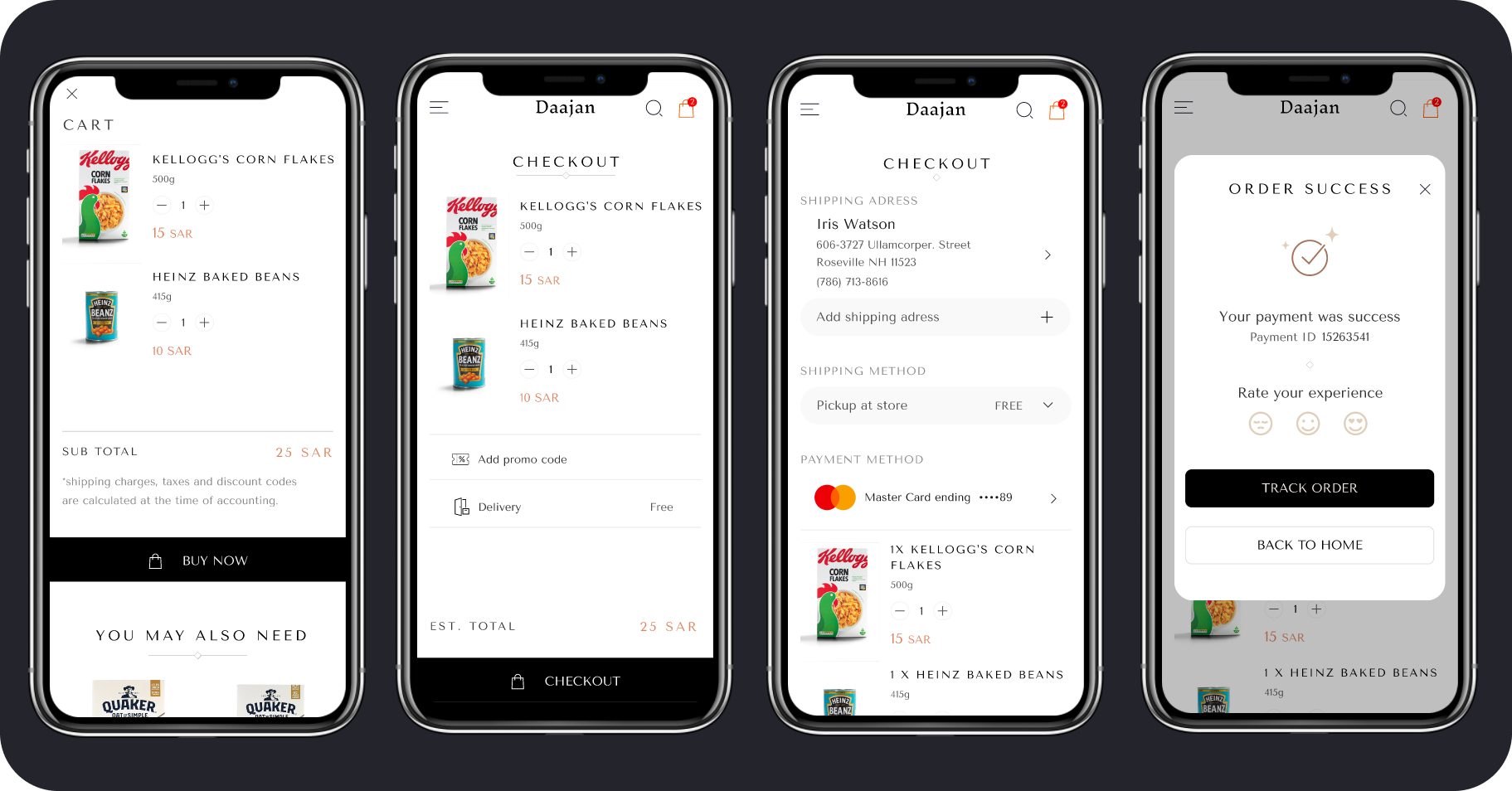
- Created a streamlined cart and checkout process that simplifies adding items, reviewing the cart, and completing purchases.
- Added features like delivery scheduling and multiple payment options for a comprehensive checkout experience.
Fridge Scanner:
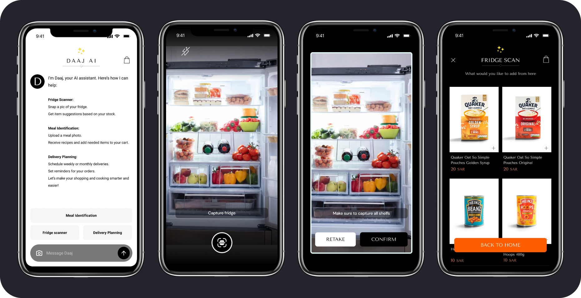
- Developed an innovative fridge scanner feature that allows users to take a picture of their fridge.
- Integrated AI to analyze fridge contents and provide personalized product suggestions based on existing items.
AI Meal Identifier:
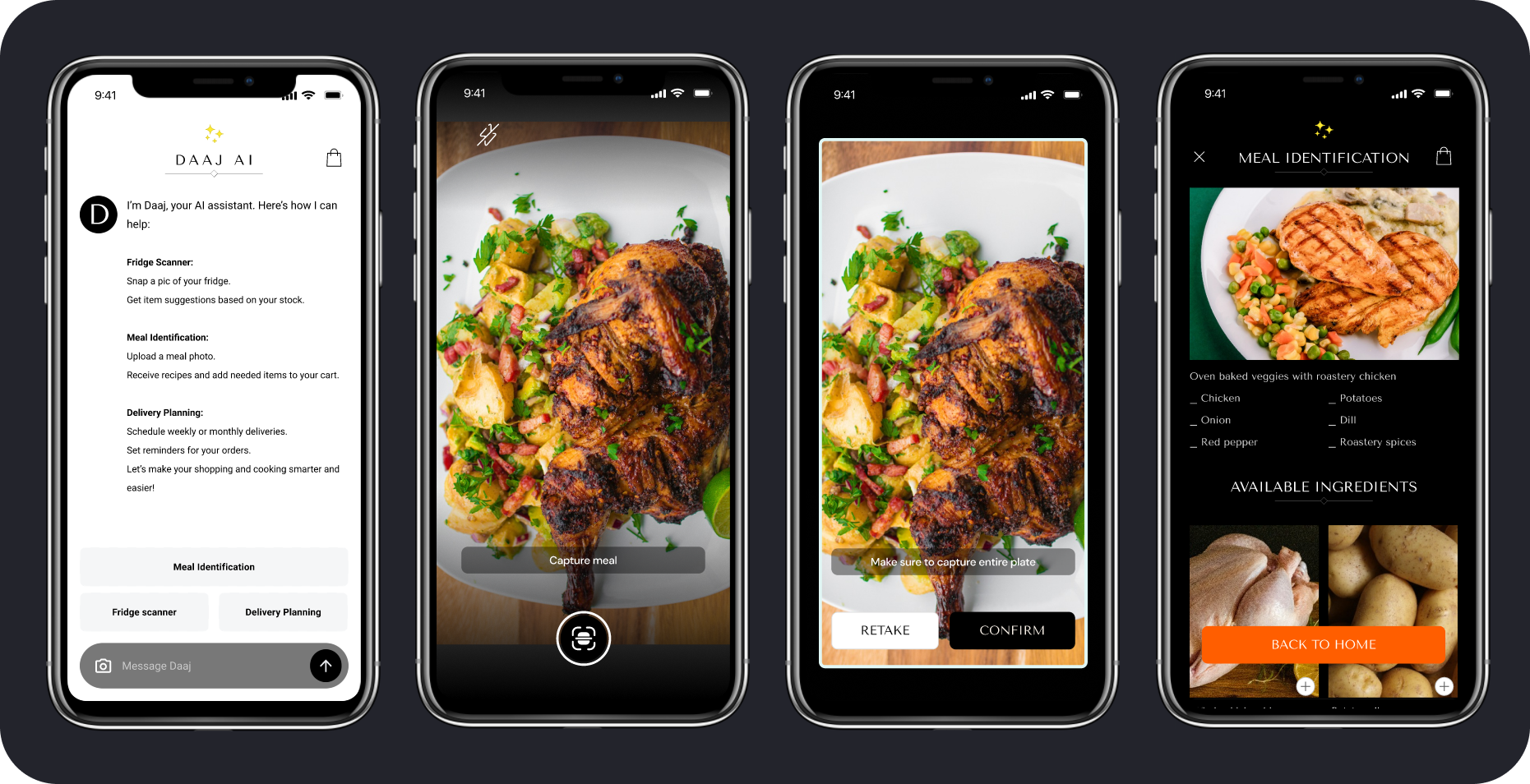
- Designed the AI meal identifier interface to allow users to upload photos of their meals.
- Implemented AI to identify meals and suggest recipes and ingredient recommendations, enhancing the cooking and shopping experience.
Results and Impact
- Personalized Shopping Experience:
- The integration of Daaj and AI features like the fridge scanner and meal identifier provided users with personalized product suggestions and recipes, significantly enhancing engagement and satisfaction.
- Seamless Shopping Flow:
- The intuitive design of the homepage, product listing, and checkout process ensured a smooth and enjoyable shopping experience.
- User Convenience:
- Features like delivery planning and the To-Get List helped users manage their purchases efficiently, ensuring they always have what they need.
Personal Reflections
Working on the Daajan App as part of 1MORETHING VENTURES has been a wonderful experience. Introducing Daaj, the AI assistant, and designing advanced features like the fridge scanner and AI meal identifier challenged me to innovate and push the boundaries of user-centered design. The positive feedback from users about the personalized and seamless shopping experience was incredibly rewarding. This project has reinforced my skills in integrating AI into practical applications and delivering high-quality design solutions that meet user needs effectively.
Reviews
1 review

Hey Karim,
Nice job on this! First off, I really appreciate how you’ve broken everything down for the reader—it makes the experience much more engaging. Here are some points of feedback that could help elevate the quality of your already great work.
Homepage & Categories:
- AI Feature Button: I love that you’re productizing this feature with its own icon, helping users become familiar with it. However, users tend to avoid what they don’t understand, and right now, "ORDER NOW WITH DAAJ AI" doesn’t clearly communicate what it does or why they should use it. Since this is an unconventional feature, the copy should provide more clarity and incentive for users to engage.
- Floating AI Button: Consider lowering it slightly—since your app doesn’t have a bottom nav, this adjustment could improve usability.
- Category Cards: The large, easy-to-understand images work well, but the text alignment could be improved. The second line has less left-side padding than the first, which might need optical adjustment depending on the typeface.
- Top Toolbar: Needs more padding—it’s currently too close to the notch.
Product Listing:
- Card Definition: This is more of a personal preference, but I tend to prefer clearly defined product cardsagainst the background. While your clean and minimalist approach works well, ensuring easy scannability is especially important for online grocery shopping.
- Add to Basket Button: High contrast typically drives conversions, but your button design is unconventional, which might affect usability. Also, having both a plus & heart icon inside the button could cause confusion—it might look like a "like" button at a glance. As a rule of thumb, buttons should have only one icon to avoid misinterpretation.
Cart & Checkout:
- "Buy Now" Button Labeling: The "Buy Now" copy here might not be the best fit—this term is traditionally used on product pages to skip the cart and go directly to checkout. In the cart, it would be clearer as "Checkout" or "Proceed to Checkout," followed by "Continue" on the next step.
- Cart Counter Visibility: The counter size and background contrast may make the number hard to read—adjusting contrast or size could improve clarity.
Great work here—I can see a lot of effort went into this.
Keep it up!
You might also like

Improving Dating App Onboarding: A/B Test Design

FORM Checkout Flow - Mobile


A/B Test for Hinge's Onboarding Flow


Accessibility Asse


The Fitness Growth Engine

Uxcel Halloween Icon Pack

Popular Courses

UX Design Foundations


Introduction to Figma

Design Terminology
