Reviews
2 reviews
You’ve done an amazing job with the design—it’s visually striking and full of creativity! However, there are a few areas where refining your approach could enhance the user experience:
- While I love the creativity, incorporating too many different styles—like line icons, gradients, and different styles of illustrations—can potentially overwhelm or confuse users. To create a more cohesive experience, try to unify the style across your design. Choose a primary style that best represents the brand and stick with it for a consistent user experience.
- Make sure to use the latest YouTube logo to keep your design up to date. This helps maintain a professional look and ensures brand recognition.
- The design is visually rich, which is great, but it can feel a bit busy. Introducing more white space, especially horizontal white space, will help give the content room to breathe. This will make your design feel more open and less overwhelming.
- Ensure that your text is easily readable, especially on the red background. High contrast between text and background is key to accessibility. Consider using a lighter or more neutral background color for text-heavy sections to improve readability.
- The headlines currently appear a bit cluttered. Increasing the line height will create more separation between lines of text, making the headlines easier to read and more visually appealing.
This is lovely, and as a landing page, I only have praise for this work. Well polished and aesthetically pleasing.
9 Claps
Average 4.5 by 2 people
You might also like
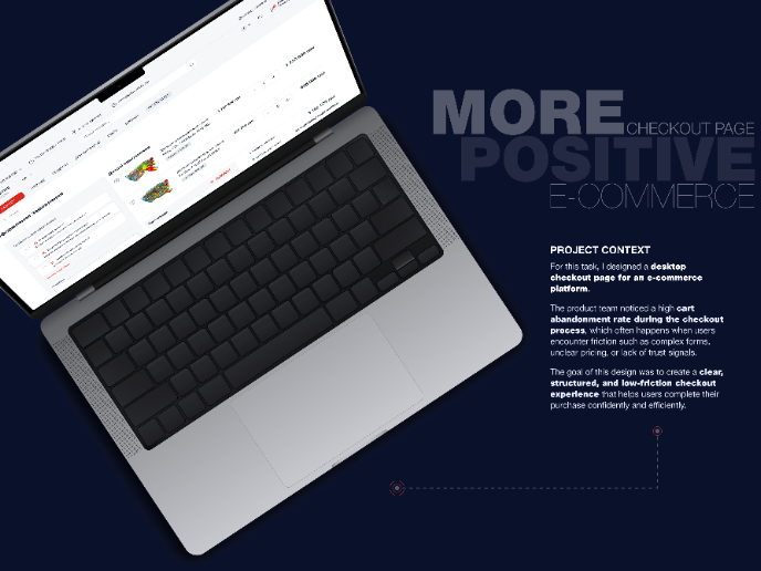
Project
🖥 Desktop Checkout Flow Design
Designing a friction-free checkout experience to reduce cart abandonment 1️⃣ Project ContextAs part of the product design team for an e-comm
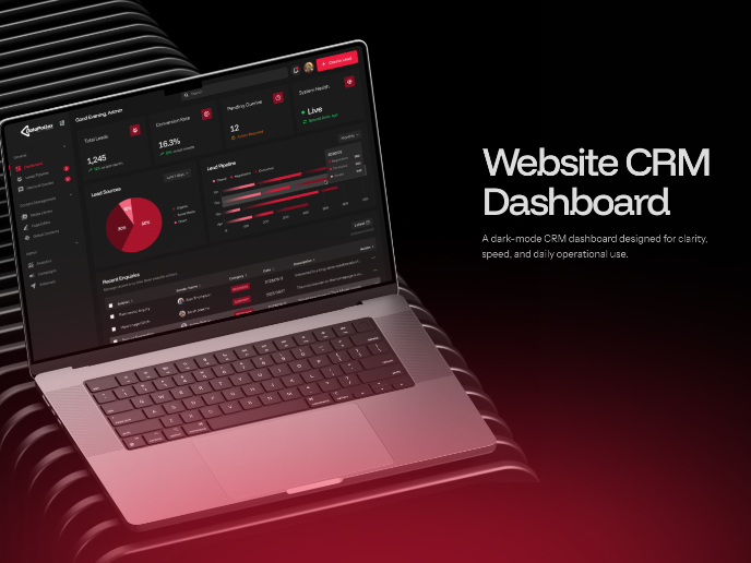
Project
Website CRM Dashboard
When designing the DataPollex CRM dashboard, the core question I kept asking was: what does a person actually need to do in the first 60 sec
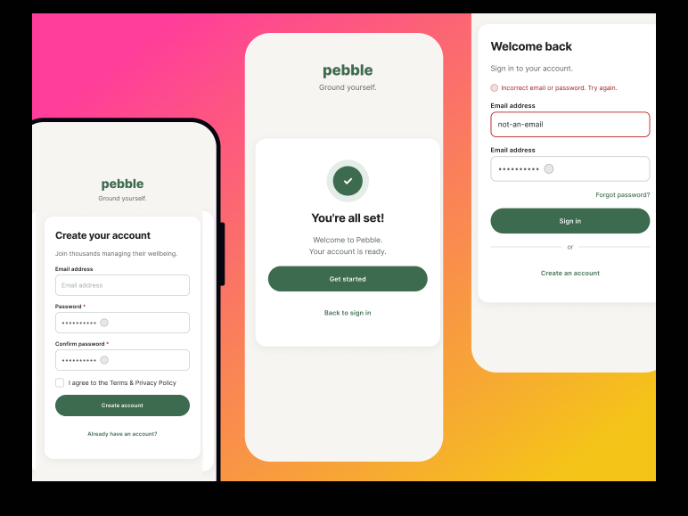
Project
Pebble Accessible SAAS Signup Flow
Pebble Pebble is a mental health SaaS concept designed as part of the UXCEL UX Design career path. The brief was to design an accessible s
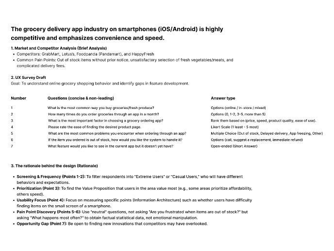
Project
Create a UX Research Survey
The grocery delivery app industry on smartphones (iOS/Android) is highly competitive and emphasizes convenience and speed.
Project
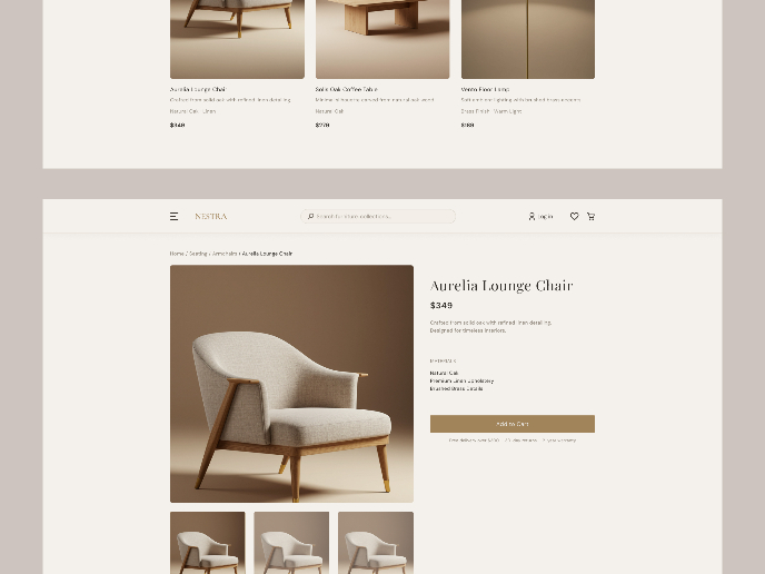
Nestra from homepage to checkout process
Checkout Flow Design – Decision-Making Process & Rationale1. Platform & Device ChoiceFor this project, I chose a desktop e-commerce experien
Project
QuickScan Onboarding
A mobile onboarding flow for a Nutrition Scanner app designed to deliver instant value by enabling users to scan a product and receive a cle
Popular Courses

Course
UX Design Foundations
Learn UX design fundamentals and principles that create better products. Build foundational knowledge in design concepts, visual fundamentals, and workflows.

Course
Introduction to Figma
Learn essential Figma tools like layers, styling, typography, and images. Master the basics to create clean, user-friendly designs

Course
Design Terminology
Learn UX terminology and key UX/UI terms that boost collaboration between designers, developers, and stakeholders for smoother, clearer communication.


