CoralFlow: A Vibrant Redesign for JIRA

Inspired by JIRA's mission to empower teams and streamline productivity, I reimagined its color palette to feel fresh, approachable, and engaging. Drawing from the teamwork and harmony of coral ecosystems, I selected colors that reflect collaboration, growth, and focus.
- Blue Raspberry (Primary): Establishes trust and stability for key UI elements.
- Aquamarine (Secondary): Adds balance and clarity.
- Electric Flamingo (Tertiary): Sparks creativity and highlights important actions.
All colors were tested for WCAG compliance, ensuring accessibility and ease of use. This palette combines functionality with a modern, vibrant identity that aligns with JIRA’s vision.
Tools used
From brief

Topics
Share
Reviews
1 review

Your initiative to refresh JIRA's colour palette is commendable. Drawing inspiration from coral ecosystems to symbolize collaboration and growth is a thoughtful approach. Here's a detailed review of your colour choices:
Blue Raspberry (Primary):
- Purpose: Conveys trust and stability, essential for key UI elements.
- Application: Ideal for primary buttons, headers, and backgrounds.
Aquamarine (Secondary):
- Purpose: Introduces balance and clarity, complementing the primary colour.
- Application: Suitable for secondary buttons, highlights, and informational alerts.
Electric Flamingo (Tertiary):
- Purpose: Adds vibrancy and draws attention to important actions.
- Application: Best used sparingly for call-to-action buttons or critical notifications.
Accessibility Considerations:
Ensuring WCAG compliance is crucial for accessibility. WCAG 2.1 recommends a minimum contrast ratio of 4.5:1 for normal text and 3:1 for large text.
Link for research: https://atlassian.design/foundations/color
Recommendations:
- Contrast Testing: Utilize tools like the WebAIM Contrast Checker to verify that all text and interactive elements meet the required contrast ratios.
- User Feedback: Gather input from diverse users to ensure the new colour scheme enhances usability and appeal.
- Documentation: Create guidelines detailing the appropriate use of each colour to maintain consistency across the platform.
Additional Resources:
- Colour Theory in UI Design: This guide provides insights into how colours affect user experience and offers practical tips for creating harmonious colour schemes.
- https://luannguyen.design/chapters/ui-design
- https://webaim.org/articles/contrast/
- https://www.w3.org/WAI/WCAG21/Understanding/use-of-color.html
- https://www.geeksforgeeks.org/mastering-color-theory-and-psychology-advanced-insights-for-design/
- https://www.geeksforgeeks.org/color-theory-detailed-guide-for-ui-designers/
By implementing these recommendations, you can enhance JIRA's visual identity, making it more engaging and user-friendly.
You might also like
EntertainHub App (Dark / Light Mode)

Rappi is always present at the best events

💊 Healthcare Desktop & Mobile App UX/UI Design

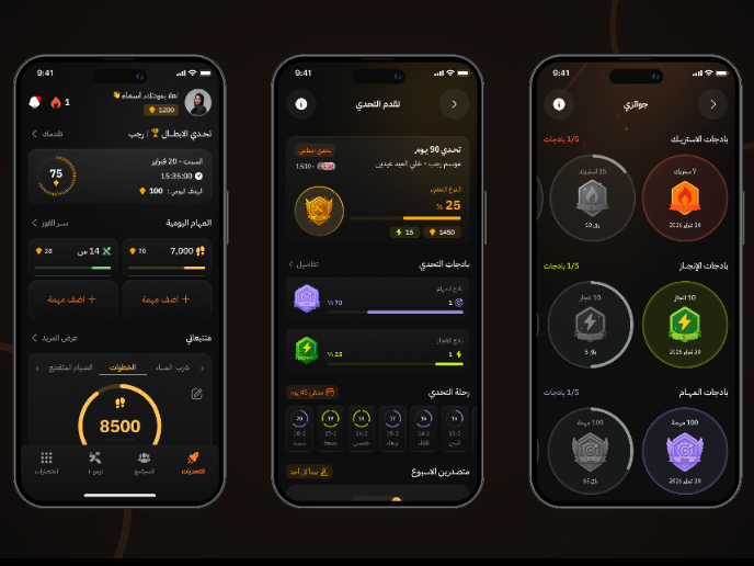
Fitness Challenges App

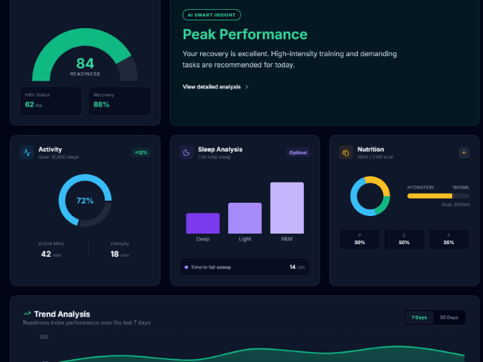
Personal Wellness Dashboard

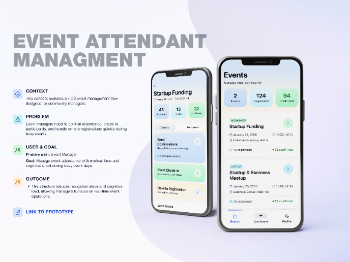
Events Managment App
Visual Design Courses

UX Design Foundations


Introduction to Figma

Design Terminology
