Color System - UXCEL challenge

The visual identity for this work management tool was guided by principles of clarity, balance, and emotional resonance. The main goal was to create a digital environment that supports focus, promotes productivity, and feels modern yet approachable.
The design process began with defining the brand’s core values, efficiency, reliability, and collaboration. These values shaped every decision, from typography and layout to the contrast hierarchy and overall visual rhythm. The interface needed to convey professionalism without feeling rigid, offering users a sense of structure while maintaining an inviting atmosphere.
Accessibility and inclusivity played a key role throughout the design. Each design element was tested to ensure readability and visual comfort across different devices and lighting conditions. The contrast ratios were carefully considered to maintain legibility and visual balance, especially for essential text and interface components.
The system also prioritizes visual hierarchy to guide user attention naturally. Primary elements stand out clearly against the background, while secondary and tertiary components provide subtle depth and variation, avoiding distraction. The use of consistent spacing, rounded edges, and modular card structures supports a cohesive experience that feels both human and organized.
Finally, the overall aesthetic reinforces a sense of calm confidence. It reflects a brand that values not just productivity, but also the well-being and focus of its users helping them navigate their tasks smoothly within an environment that feels trustworthy and thoughtfully designed.

Reviews
2 reviews

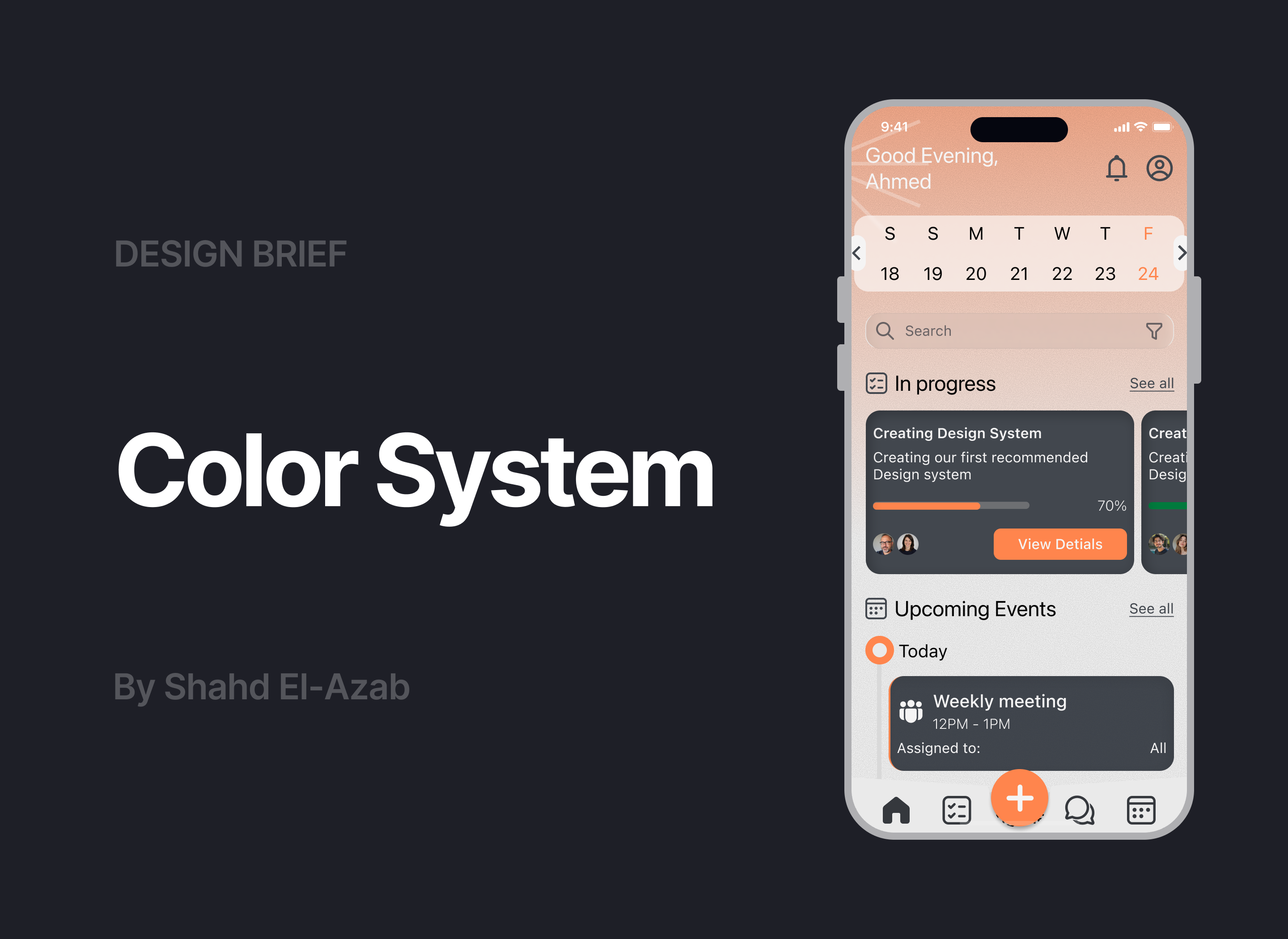
Hello Shahd, your color system is excellent and demonstrates thoughtful design thinking. The visual identity guided by principles of clarity, balance, and emotional resonance works well, and I appreciate your focus on efficiency, reliability, and collaboration as core values. The attention to accessibility with carefully considered contrast ratios is commendable. However, I'd suggest two improvements for the UI example: the "Good Evening, Ahmed" text at the top appears to have insufficient contrast against the peachy background, and the bottom navigation icons should include text labels to improve accessibility for all users. Overall, this is really strong, well-considered design system work.

Hey Shahd,
Thanks for a clearly presentation of your work and making all the effort.
Your choice is quite interesting and unusual for a work management platform, so I really applaud you for taking a chance with your exercise. The combination of orange and black & white shades is always visually pleasing. I feel like you could have really even gone further and made the primary orange more vibrant and the deep gray even deeper - giving a much more cleanly contrasted and energetic result.
When applying your color system to user interfaces be mindful of the combinations you choose, as I can spot some that are clearly problematic and do not respect the accessibility guidelines you already tested on your submission (for example, the white "good evening" heading against the light shade of orange or the vibrant orange left border against deep grey background on the events card are 2 instances where you did not respect your own work and misapplied the system).
Good work overall, thanks for sharing!
You might also like

Pulse — Music Streaming App with Accessible Light & Dark Mode


Islamic E-Learning Platfrom Dashboard

SiteScope - Progress Tracking App


Mobile Button System


FlexPay


CJM for Co-Working Space - WeWork

Visual Design Courses

UX Design Foundations


Introduction to Figma

Design Terminology
