Color System For Productivity Tool

Introduction
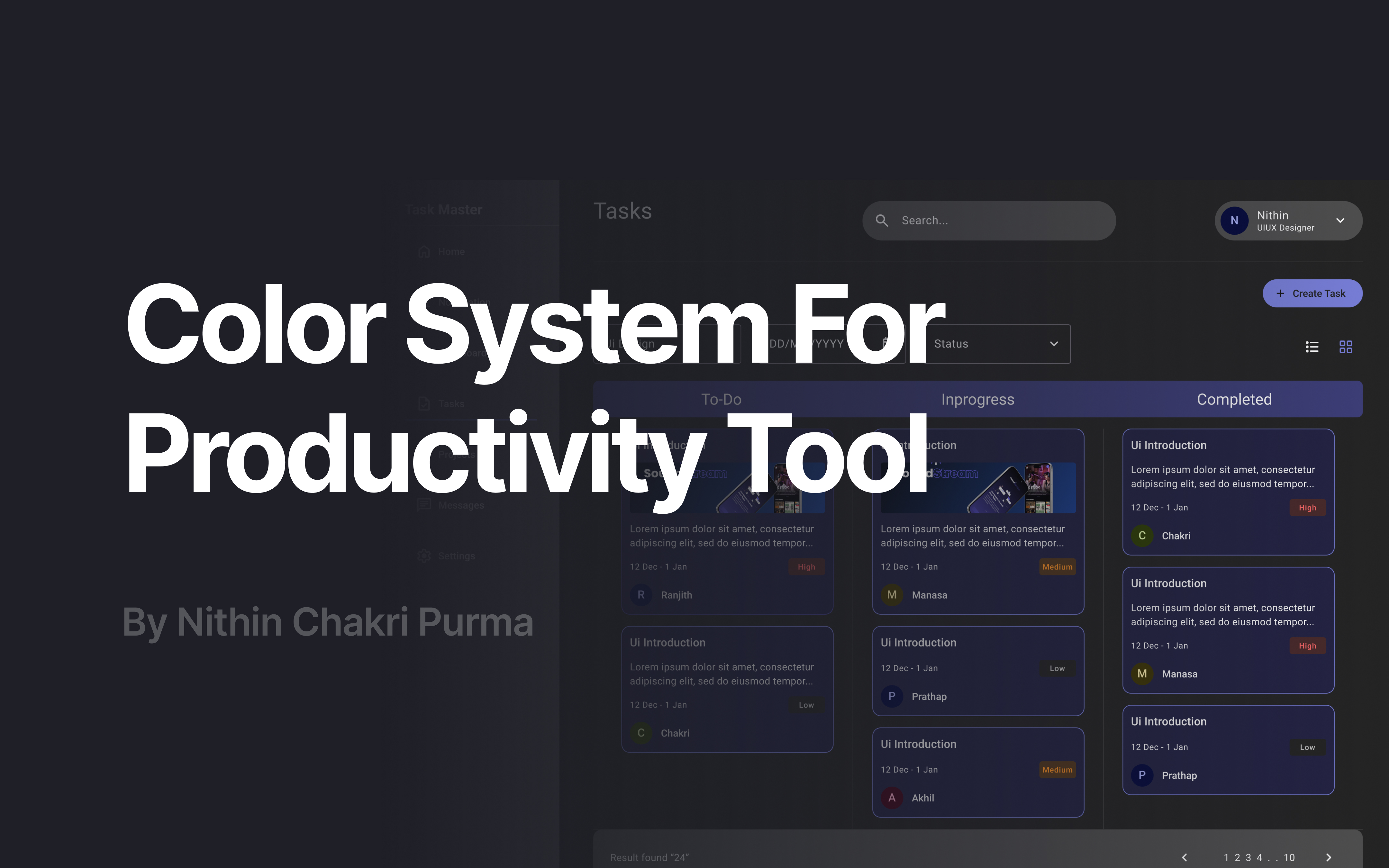
For this project, I took inspiration from Microsoft Teams to design a color system tailored for a productivity and collaboration tool. I focused on desktop devices and created sample screens to demonstrate how the color system functions in both light and dark modes.
In this presentation, I’ll walk you through why I chose these specific colors, how they enhance user interactions, and the overall look and feel of the interface. I’ll also explain how I tested the colors for accessibility using WCAG standards and share practical examples.
Here’s what I’ll be covering:
- Primary Colors
- Secondary Colors
- Tertiary Colors
- Neutral Colors
- System Colors
- WCAG Accessibility Testing
- UI Examples in Light & Dark Mode
Tools used
From brief

Topics
Share
Reviews
1 review

Love it! The brief is very nicely done, clean, clear, and easy to understand. You explained everything in a simple way that makes it enjoyable to read. It would be great to see more UI examples included. Adding those would help connect the brief to real visuals and give even more context to your ideas.
You might also like

Accessible Signup & Login Experience — Brainex


Accessible Signup Form


Auction


Entrant - Analytical Dashboard


Transit Cairo — Digital Mobility Redefined


Babylon Balance - Designing Financial Clarity Through Constraint

Visual Design Courses

UX Design Foundations


Introduction to Figma

Design Terminology
