Color System

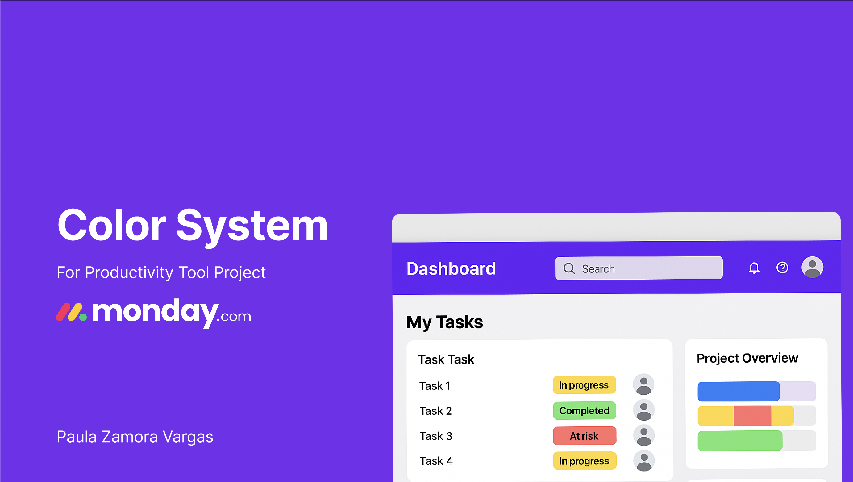
This project explores a refreshed visual identity for a digital work management tool through the development of a comprehensive color system.
The goal was to create a modern, accessible, and emotionally resonant interface that not only stands out in a competitive market but also enhances user experience and clarity across UI components.
Using a violet-based primary palette paired with vibrant supporting tones and thoughtful system colors, the design reflects principles of creativity, professionalism, and intuitive flow.
All colors were carefully tested for WCAG accessibility compliance, and applied consistently across branding, interface components, and user feedback states.
This color system aims to strengthen the platform’s personality while improving usability and user trust.

Reviews
1 review

Hi Paula Zamora Vargas,
Your presentation is really well done clear and detailed, and I especially liked that you included an example at the end. That was a great touch. I just have a couple of suggestions to make it even better:
- It would be great if you could include the full color palette range from 50 to 900. One tone is usually not enough, as different UI elements often require lighter or darker variations. Having the full palette for each color would make the system more complete.
- WCAG compliance is mentioned, but not in much detail. If you could show the contrast ratio directly on each color swatch, it would make things clearer and easier to understand. It would also provide a more thorough overview of accessibility across the palette.
Overall, the presentation is clean and well thought out. If you include these updates, it will become truly excellent. Wishing you success!🫰🚀
You might also like

Solar system Dashboard Utility


Signup page for a SaaS website


ASOS - Push Notifications


PLANTIST


Pulse - Inventory Management System Design

Uxcel Halloween Icon Pack

Visual Design Courses

UX Design Foundations


Introduction to Figma

Design Terminology
