Accessible sign up form for Circle In

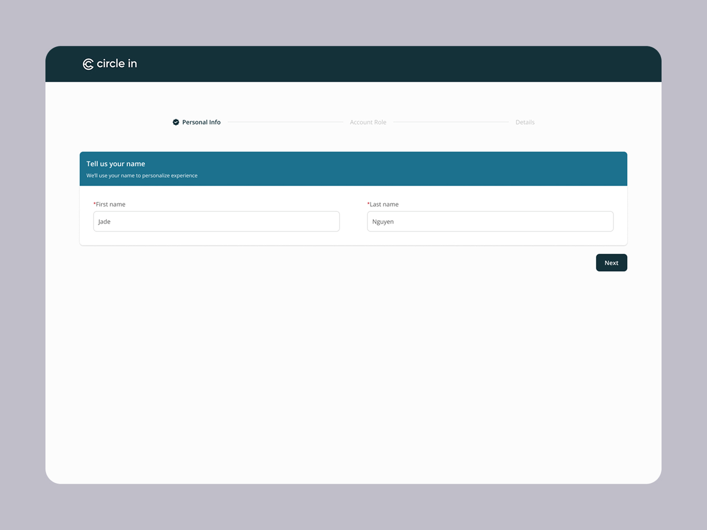
Circle In is an Australian SaaS web app that offers personalized content regarding wellbeing for employees, managers and their loved ones. Circle In helps connect employees and managers at work while managing other caregiving responsibilities.
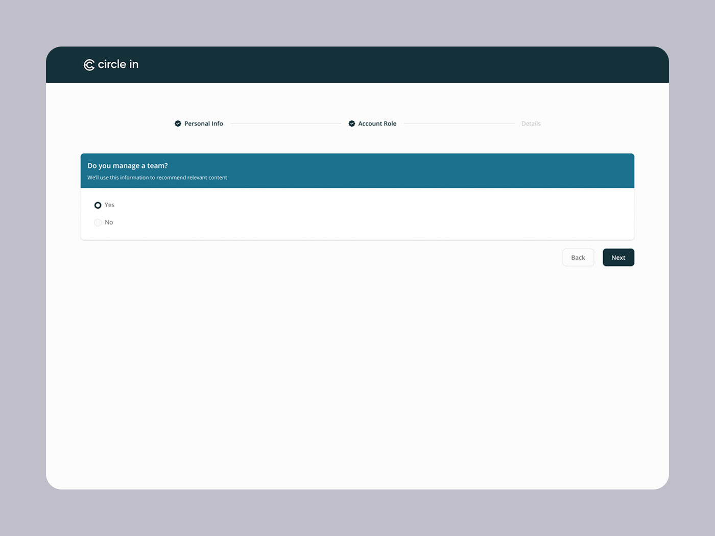
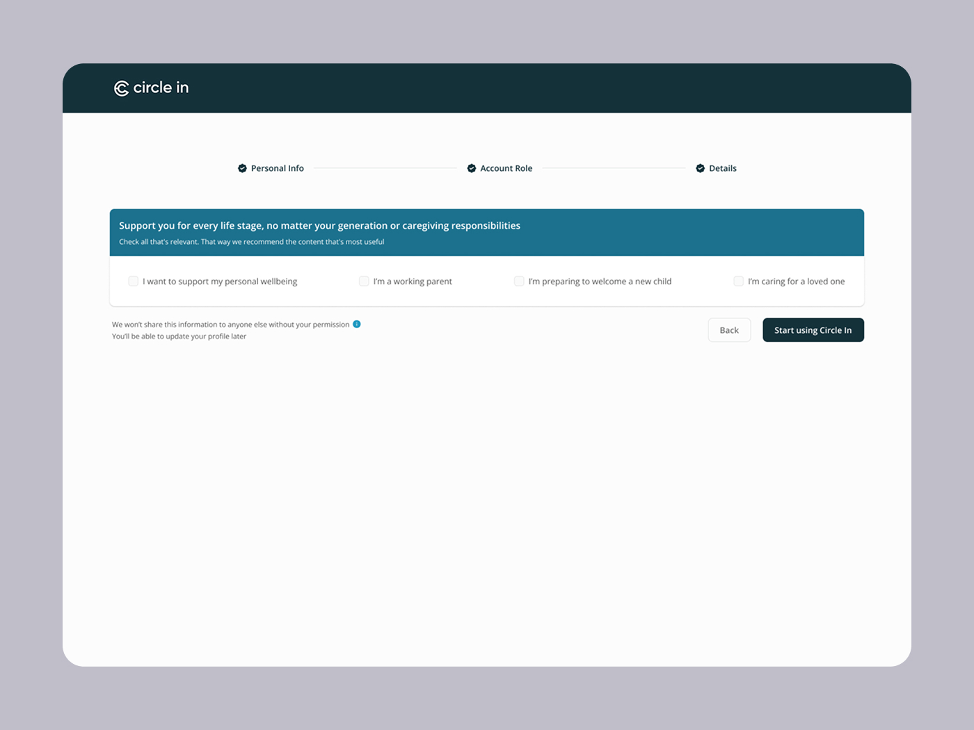
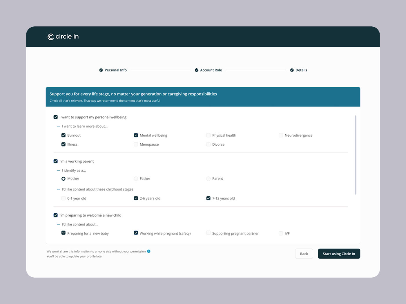
I redesigned the sign up flow to improve accessibility and readability.
The contrast WCAG is 5.53:1
Tools used
From brief

Topics
Share
Reviews
1 review

The redesign does a good job of focusing on accessibility and readability. I appreciate that the color contrast has been pushed to 5.53:1, which meets WCAG standards and makes the flow easier to read.
That said, there are two areas that could be improved further:
- Stepper contrast: The grayed-out stepper states have a contrast that feels too low, which can make it harder for users to track their progress, especially those with visual impairments or in bright light conditions. Slightly increasing contrast while keeping the “inactive” look would improve clarity.
- Checkbox design: While the checkbox approach works functionally, the label currently feels visually detached from the control. Treating the checkbox and label as a more unified component — for example with a shared background, border, or button-like treatment — could make it feel more cohesive and improve the click/tap target.
Overall, the work shows a strong awareness of accessibility, and with these refinements it could be even more inclusive and polished.
4 Claps
Average 4.0 by 1 person
You might also like

Project
Entrant Accessible Signup and Login Forms

Entrant was the internship-focused job-seeking app for college students and fresh graduates — built around lowering friction, making opportu
Project
A/B Testing for Bumble's Onboarding Process

This hypothesis project is made with the purpose of improving Bumble's onboarding process with gamification, early reward system, and intere

Project
CJM x Mindspace case study - Ester Cinelli

Mindspace was chosen for this customer journey map because it offers a premium, design-focused co-working experience aimed at people who nee
Project
Dark mode Main page
light mode
Project
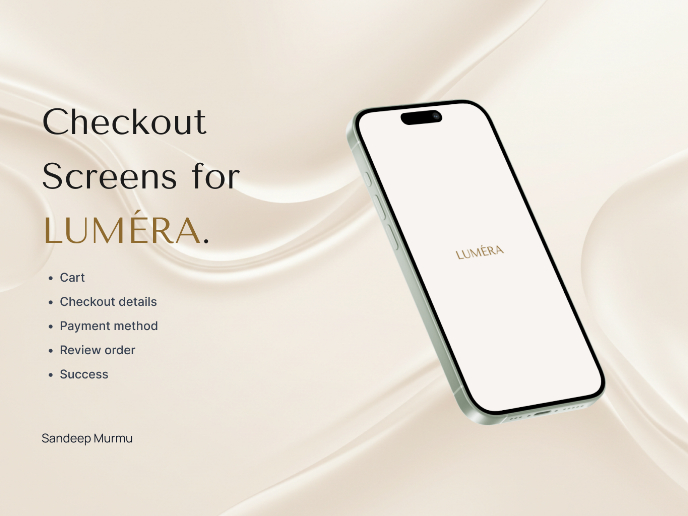
LUMÉRA - Checkout Flow

Cart abandonment is one of the biggest challenges for D2C brands, especially in categories like skincare, where trust and reassurance play a

Project
Tripit's Login and Sign Up Flow

Tripit is a travel planning and itinerary management app that I personally love using. For the most part Tripit's login and sign up flow are
Visual Design Courses

Course
UX Design Foundations

Learn the essentials of UX design to build a strong foundation in core principles. Gain practical skills to support product development and create better user experiences.

Course
Introduction to Figma
Learn essential Figma tools like layers, styling, typography, and images. Master the basics to create clean, user-friendly designs

Course
Design Terminology

Learn UX terminology and key UX/UI terms that boost collaboration between designers, developers, and stakeholders for smoother, clearer communication.