Chek out _ Mohadeseh

Here are some of the principles I adhered to during the design process:
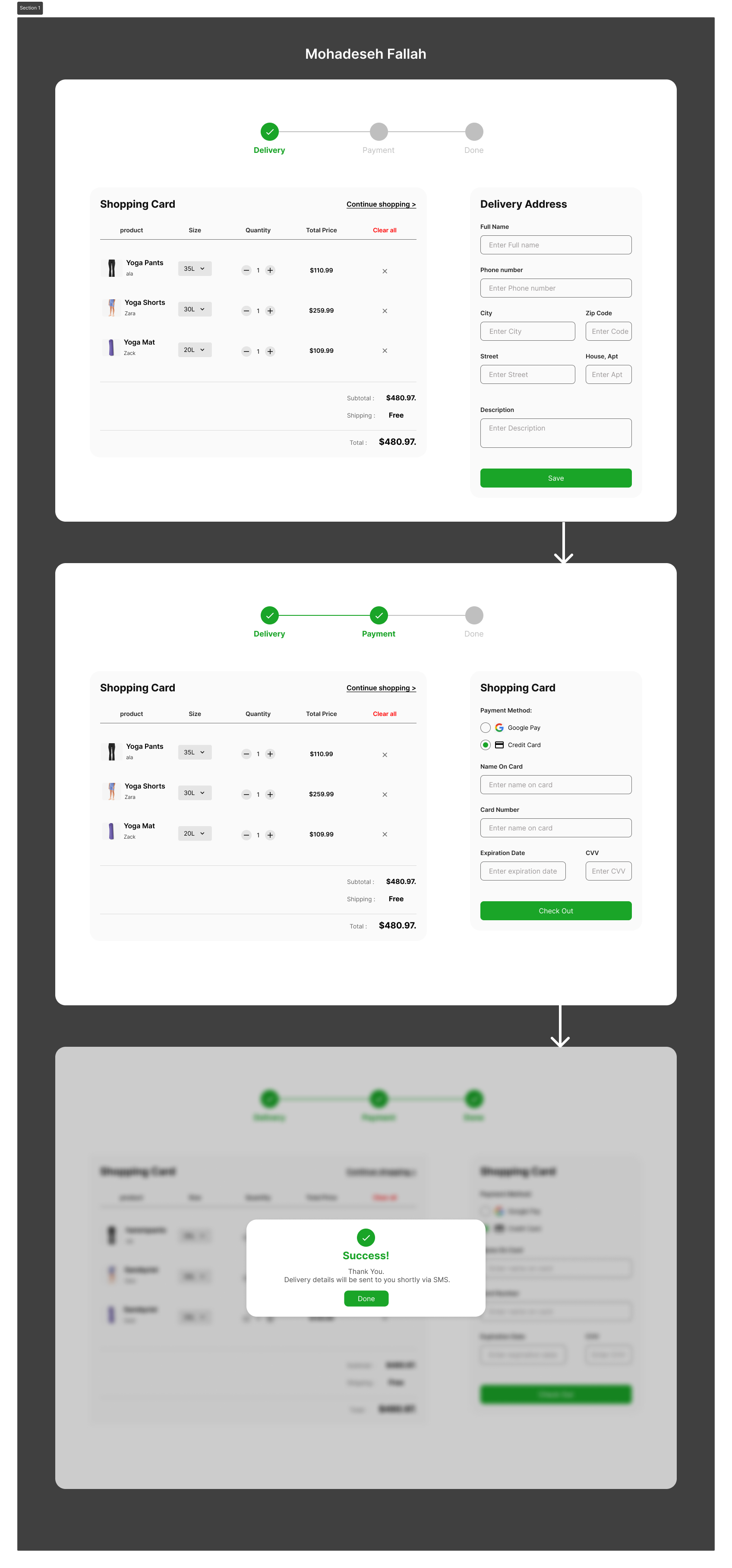
1- Progress Indicators:
The step indicators at the top ("Delivery," "Payment," "Done") are clear and effectively guide the user through the checkout process. This aids in understanding the sequence of actions and provides a sense of progression, which is reassuring for users.
2- Shopping Cart Overview:
listing product, size, quantity, and total price clearly. This transparency is crucial as it allows users to review their selections easily, make changes if necessary, and proceed with confidence.
3- Delivery Address Form:
The form fields for the delivery address are straightforward and cover all necessary information without being overwhelming. Placeholders within the fields offer subtle guidance on what information to enter, which enhances usability.
4- Payment Method Selection:
Offering a choice between Google Pay and credit card payments provides flexibility and caters to user preference, potentially reducing friction that might arise from a lack of payment options.
The microcopy, such as "Enter Full name," "Enter Phone number," "Enter expiration date," etc., is instructional without being overbearing. It ensures users have the necessary information at each step.

Reviews
1 review
The checkout flow is generally simple and clear. It’s commendable that you allow users to edit their purchases during the checkout process. However, I found it lacking a final screen to review my delivery address, final prices, and payment method after pressing "check out."
Additionally, repeating the same copy in both a label and placeholder may not be necessary. For example, instead of simply stating "enter name on card, consider showing an example of a name in the placeholder input.
There are inconsistencies in letter casing; some texts use title case, while others use sentence case. While this may seem minor, it creates visual clutter on the page and could disrupt user trust.
Overall, great work! One point of improvement for your presentation would be to use the provided templates for the submission's cover image. This could help attract more reviewers to your work.
You might also like

Pulse — Music Streaming App with Accessible Light & Dark Mode


Islamic E-Learning Platfrom Dashboard

SiteScope - Progress Tracking App


Mobile Button System


FlexPay


CJM for Co-Working Space - WeWork

Interaction Design Courses

UX Design Foundations


Introduction to Figma

Design Terminology
