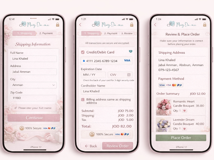
Checkout Page for e-commerce app
This project focuses on improving the mobile checkout experience for a clothing e-commerce platform, with the goal of reducing cart abandonment and enhancing user trust and satisfaction.
Key Design Approach: Breaking the Checkout into Small Steps
• Three-Step Checkout Process - The checkout is divided into three simple steps: Contact Information, Shipping Details, and Payment. This approach makes the process less overwhelming and easier to follow.
Why Divide the Checkout Process into Small Bites?
• Reduced Cognitive Load - Smaller steps allow users to focus on one thing at a time, preventing the checkout from feeling like a long, complex task. Each section is clear and straightforward, improving user comprehension.
• Progressive Disclosure - Information is revealed gradually, with only the most relevant details needed at each step. This keeps users from feeling distracted by unnecessary details and guides them toward completion.
• Improved Confidence - A clear step-by-step structure with visual indicators reassures users about the process. Users can always see how many steps remain, which helps them feel more in control.
• Increased Completion Rates - By breaking the process into smaller sections, users are more likely to complete their purchase, especially on mobile, where shorter, simpler interactions are preferred.
Design Elements:
• Step Indicator & Progress Diagram - A visual diagram shows users how many steps the checkout has and clearly indicates where they are in the process. This offers reassurance and motivates users to continue.
• Guest Checkout Option - Enabling users to proceed as guests eliminates unnecessary barriers and speeds up the process for those who prefer not to create an account.
• Helpful Microcopy- Clear and concise text guides users through each step, making form completion easy and reducing errors.
Tools used
From brief
Topics
Share
Reviews
3 reviews
Really smooth Checkout Page design! The layout is clean, and the flow feels intuitive. Love the clear hierarchy and spacing. Maybe a bit more emphasis on the payment section could improve focus, but overall, solid work!
Hi, Teodora! This is an excellent approach to a step-by-step checkout. I liked that you included as many possible situations, errors that the system could throw, and copies that solve the main objectives.
As a suggestion to continue exploring this type of experience, I would recommend one more instance of review or summary of the purchase before the last CTA to buy and to improve your prototype, a loader at the end of the purchase to imply that the purchase is processed. This last element usually helps people to associate the type of action they perform and is more associated with what normally happens in checkouts.
The checkout page design is well-executed and demonstrates a strong understanding of e-commerce usability principles. Its focus on simplicity, clarity, and trust-building elements makes it a solid foundation for driving conversions. By addressing the suggested improvements, the design can further enhance the user experience and cater to a wider range of customer needs.
You might also like

Islamic E-Learning Platfrom Dashboard

Pulse — Music Streaming App with Accessible Light & Dark Mode
SiteScope - Progress Tracking App

Mobile Button System

FlexPay

May.Da.Ma Candles & more
Interaction Design Courses

UX Design Foundations

Introduction to Figma


