Button System for a Design Tool


Here's a button system for an accessible design tool with a cool-toned color scheme. The main focus for the system was visual accessibility and contrast, along with states that vary depending on the user's interaction with the element.

Reviews
4 reviews

Great to see you've followed the WCAG accesibility guidance and it's really good to see the prototype of these buttons, it brings it to life! My one bit of advice would be to label each state and the difference in button size to make it clear which is which.
Excellent job on the button system! The demonstration of buttons' compliance with the color contrast requirements of WCAG is commendable.
The only recommendation I have is to include tertiary buttons. This addition would provide users with a broader range of options for interaction, enhancing accessibility and user experience.

Nicely done :)

Love it, good job!
You might also like
SiteScope - Progress Tracking App


FlexPay


CJM for Co-Working Space - WeWork

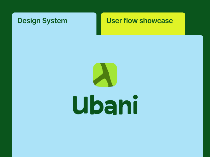
Ubani Design System

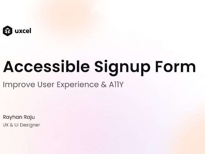
Accessible Signup Form for SaaS Platform
Loginino

Visual Design Courses

UX Design Foundations


Introduction to Figma

Design Terminology
