Button System Design - Tech web application
This Button System Design is for a tech web application, both for light mode and dark mode. There are three different hierarchical buttons : a primary button, a secondary button and a tertiary button. The primary button is the most important, and must be the most visible. The tertiary button is the least important, and can be used for hypertext links for example.
Each button has different action types such as neutral, success and destructive. Moreover, each button can be composed of an icon and a label, or only an icon (in this case, it is an icon button).
Finally, each button can have different states, such as a hover state, a disabled state, and a focused state.
Reviews
1 review
Marion, you've done a nice job fulfilling the brief's requirements! 👏 The structure is very clean and well thought out. The dark mode variant is also savvy addition.
In design, it's common to see interfaces overloaded with elements meant to convey different emotions. Yet, I find power in simplicity. Buttons are a fundamental yet versatile tool. I encourage you to embrace a bit of experimentation. Injecting brand personality into your buttons can effectively communicate various tones and feelings—whether it's fun, authoritative, or something entirely unique.
Also, don’t overlook the power of Figma when it comes to communicating with stakeholders. Taking the time to create an interactive demo can make your design much more engaging and memorable.
Keep up the excellent work! ✨🎉
You might also like

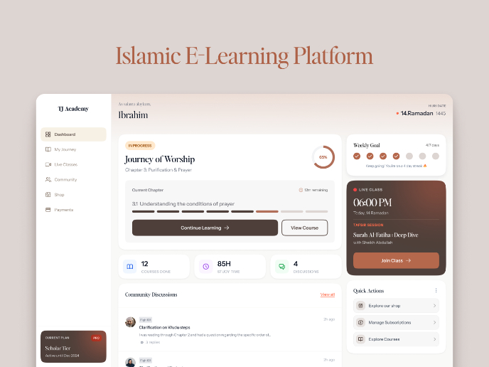
Islamic E-Learning Platfrom Dashboard

Pulse — Music Streaming App with Accessible Light & Dark Mode
SiteScope - Progress Tracking App

Mobile Button System

FlexPay

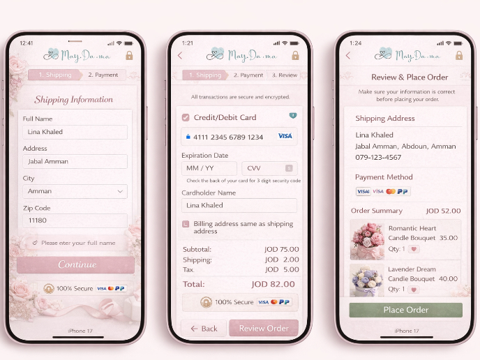
May.Da.Ma Candles & more
Visual Design Courses

UX Design Foundations

Introduction to Figma


