Button System Design

I have designed this button system for Tabiat Care, a remote patient monitoring platform, to ensure consistency, accessibility, and flexibility across the interface.
Background
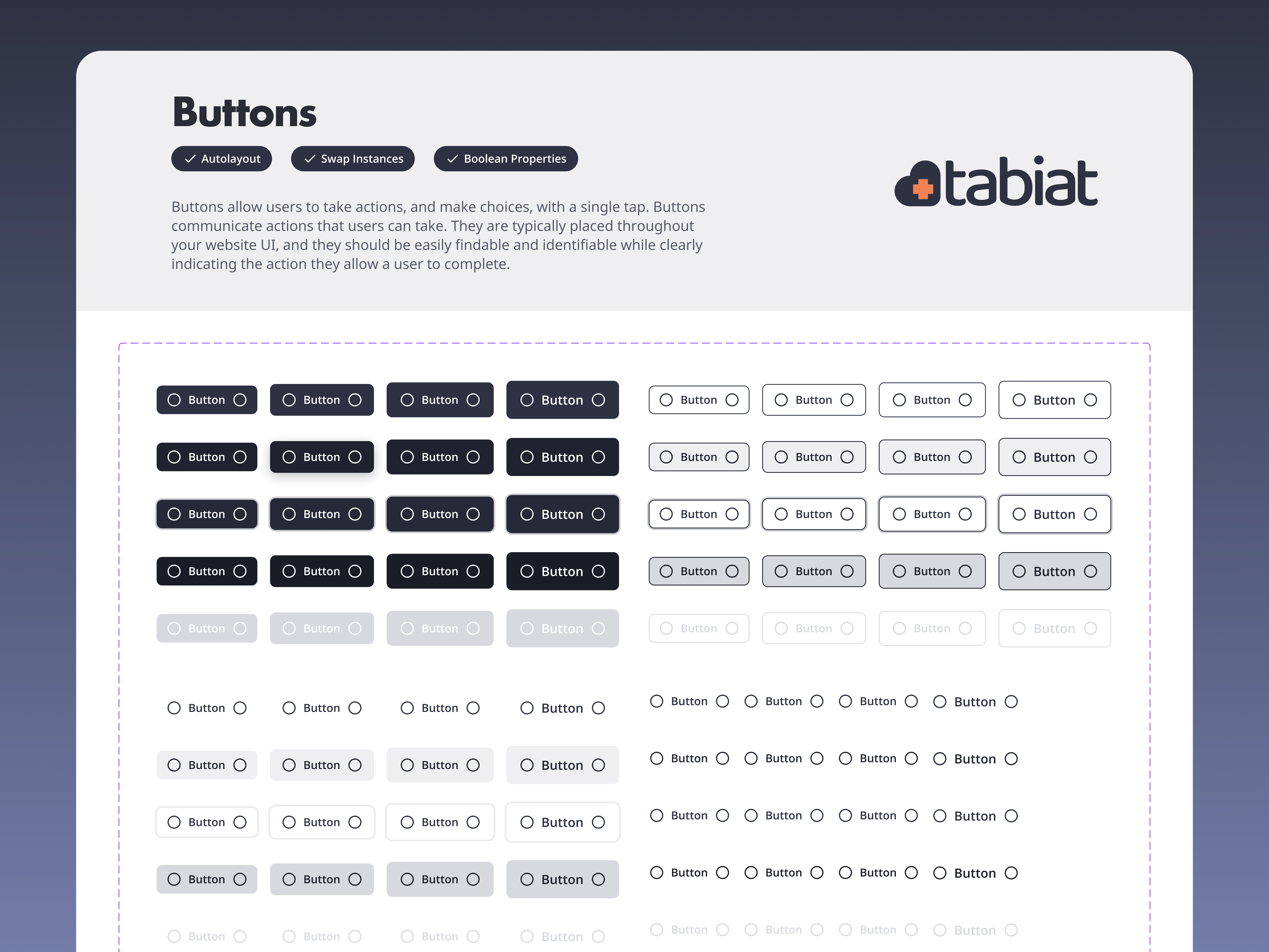
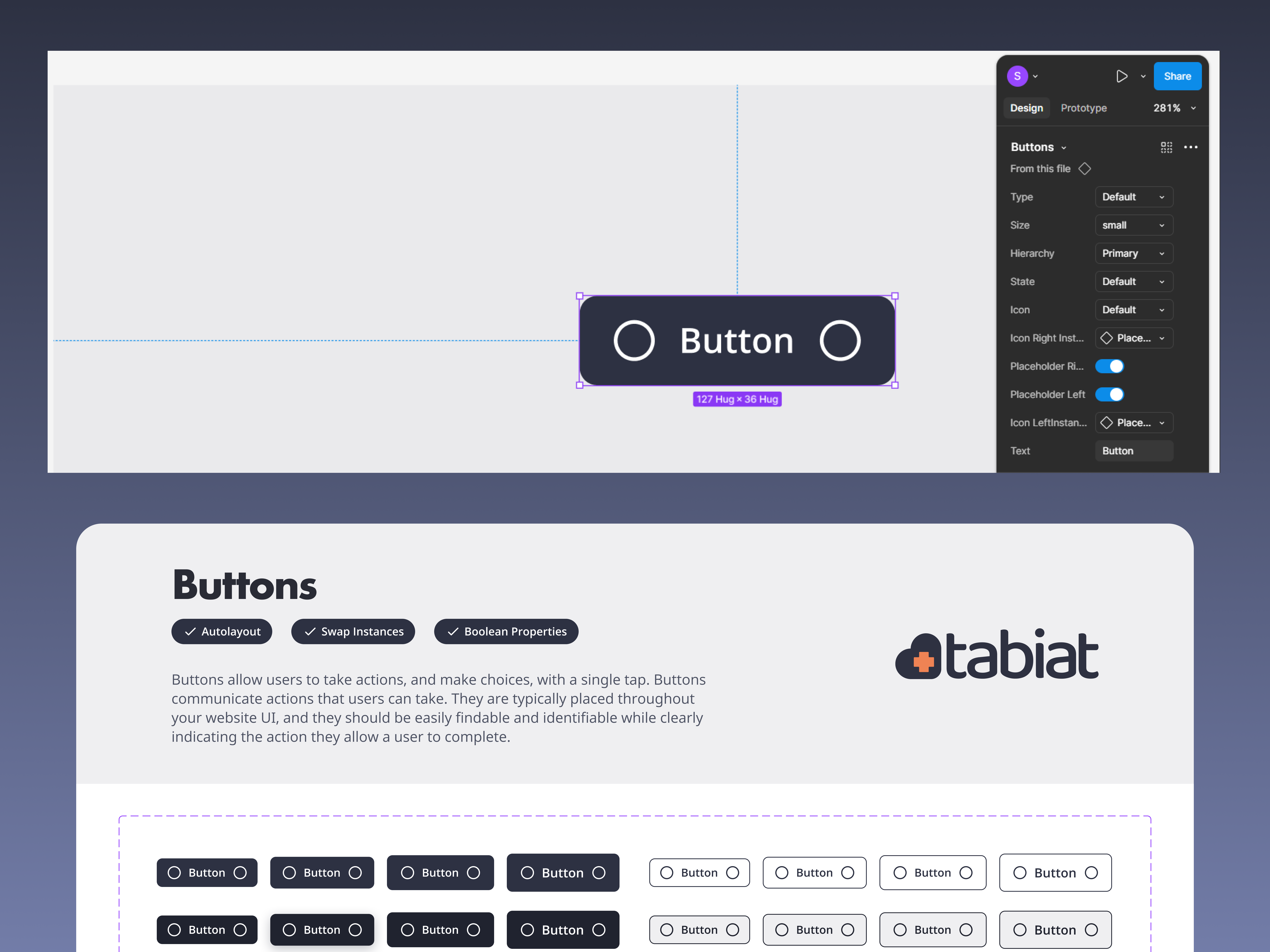
I have designed this button system for Tabiat Care, a remote patient monitoring platform, to ensure consistency, accessibility, and flexibility across the interface. The system includes four button types—primary, secondary, tertiary, and link—each tailored to specific interaction needs. It supports multiple sizes, including small, medium, large, and X-large, to accommodate various screen layouts. Each button features clearly defined states (default, hover, focused, pressed, and disabled) and optional icon support, making the system adaptable for diverse use cases across patient and provider workflows.
Overview
This button system for Tabiat Care was created to ensure consistency and clarity across the platform’s design. Primary buttons use the brand's primary color (#2D3142) to establish visual hierarchy and emphasis. The platform has two main brand colors: #2D3142 and #EF8353. However, the light orange color (#EF8353) does not meet the minimum contrast ratio on a white background. The dark navy color (#2D3142) was chosen for primary buttons because it meets accessibility standards and is easier to read on light backgrounds. The system includes four responsive sizes—X-Large, Large, Medium, and Small—to adapt across various layouts and screen sizes. It also supports multiple icon options, including left icon, right icon, and icon-only variations. These foundational elements contribute to a flexible, scalable design system that supports both patient and provider interactions.
Tools used
From brief

Topics
Share
Reviews
1 review

Hi Shaheryar Baig, great to see your showcase. Your work showed a button system that consists of variables suitable for using in different use cases. The black primary buttons look easy to read text and have good accessibility.
Some of my recommendations:
- The way you show your previews of the button system could be more easier to look. At the moment, the description text in the preview is too small to be read.
- Also in the preview image, the structure of the button in Figma should be a bit bigger so that the audience can learn how you build the component.
- The explanation for your choice is not clearly defined. I don't understand the reason why you chose black as primary color, is there any relation with the Brand Guidelines? The content in sections of "Background" and "Overview" also seems a bit the same.
Looking forward to hearing from you. Have a nice day, Shaheryar.
You might also like

PLANTIST


Lumen

NORTHSIDE - Coworking space Customer Journey Map


Accessible Signup Form for Monkey Survey


Crave Corner - Bakery App Design


Wealthsimple 404 Page

Visual Design Courses

UX Design Foundations


Introduction to Figma

Design Terminology
