NeuroFlow - Accessible Signup Flow


NeuroFlow is a desktop-first SaaS platform designed to help users manage focus and mental energy through calm, supportive experiences.
For this project, I designed an accessible login/signup form with a strong emphasis on cognitive, visual, and motor accessibility.
The form follows WCAG guidelines by using persistent labels and helper text, clear focus indicators, polite error messaging, and predictable system feedback.
Each interaction state — from empty form to error handling and submission — was intentionally designed to reduce cognitive load, prevent errors, and support keyboard and assistive-technology users.
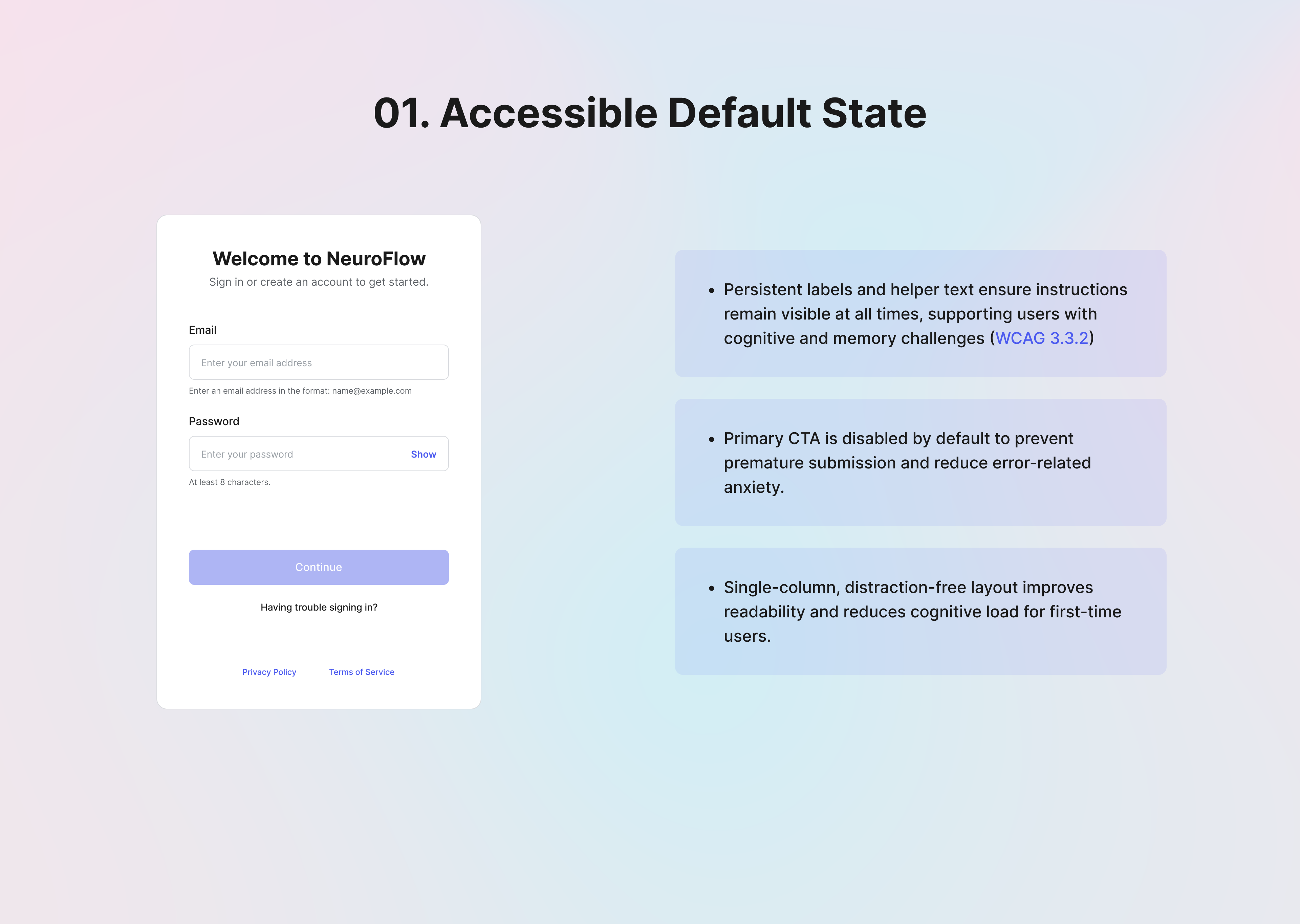
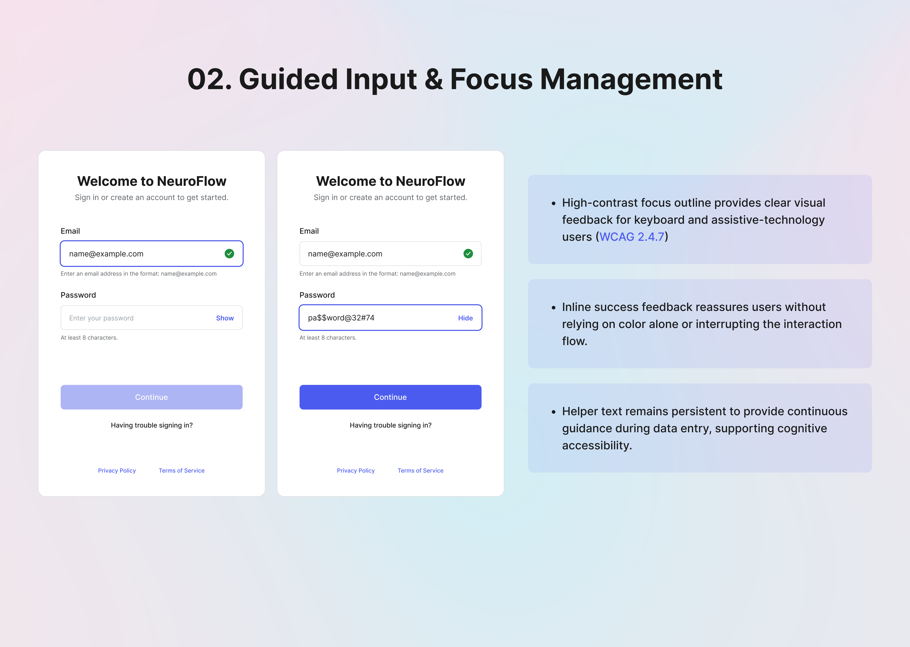
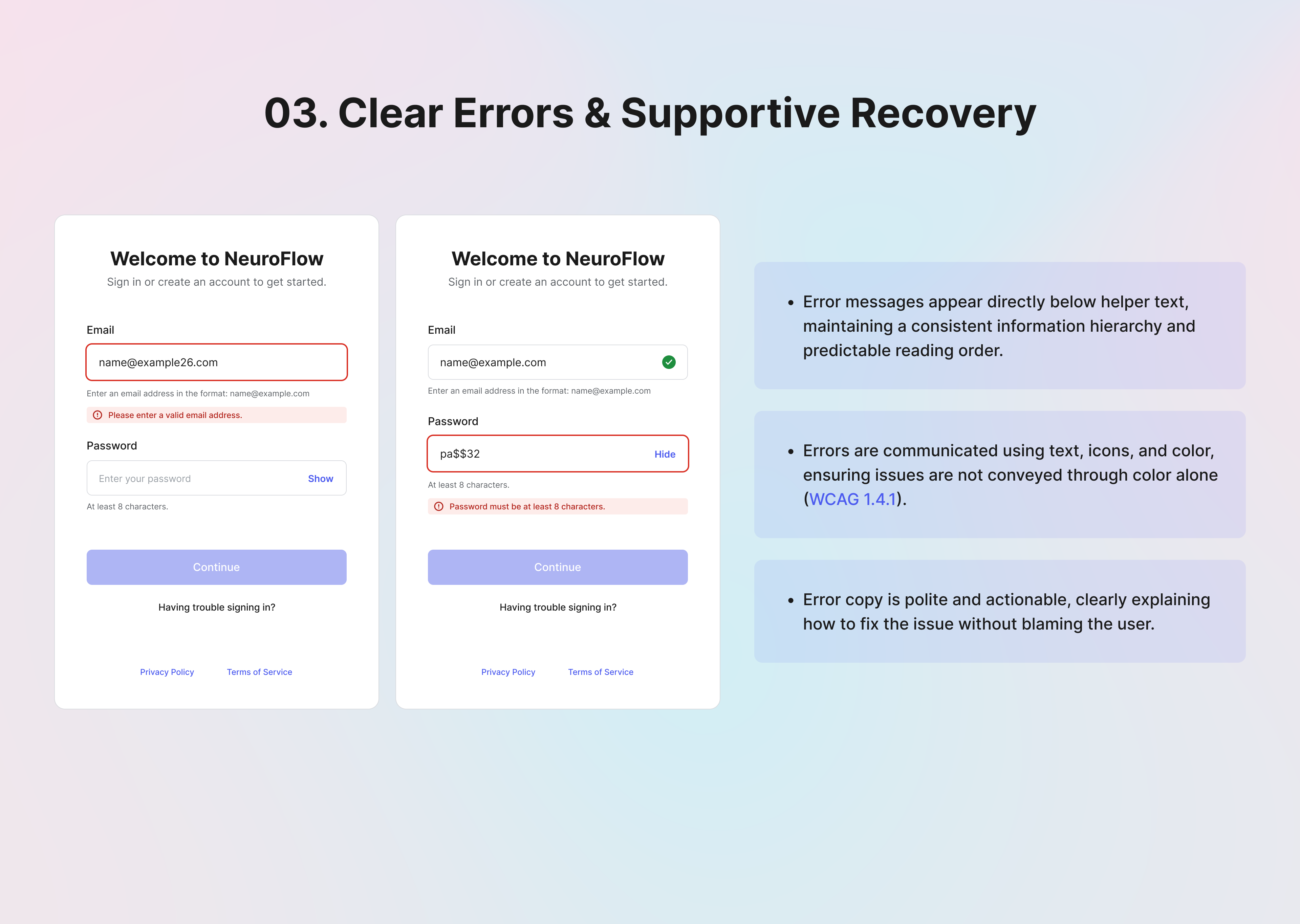
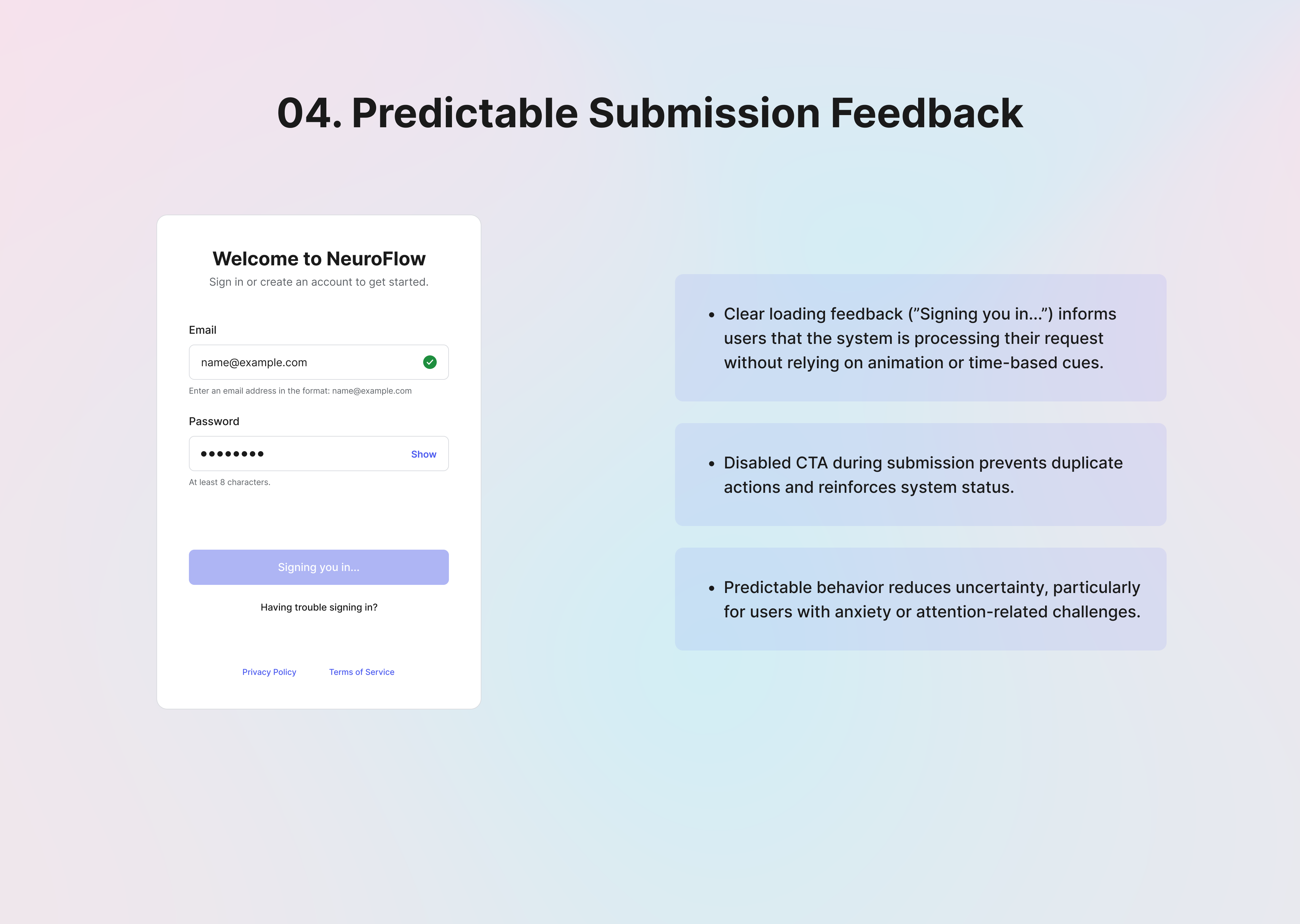
The result is a clear, inclusive authentication experience that prioritizes usability, accessibility, and emotional safety from the very first interaction.
-------------------------------------------------------------------------
Thank You
Tools used
From brief

Topics
Share
Reviews
3 reviews

Hi Sandeep!
From an accessibility perspective, this feels intentional rather than performative. You’re not just labeling it “accessible” the structure appears considered, which is a strong foundation. In signup flows, clarity and predictability are essential, and this seems aligned with that principle.
What I appreciate most is the restraint. It looks like you prioritized readability and focus instead of decorative elements. That decision signals maturity especially in authentication flows where cognitive load should be minimized.
If I were refining it further, I’d look closely at feedback states: error handling, focus indicators, and assistive navigation. Accessibility often lives in those micro-moments. Overall, this feels grounded and thoughtfully approached, with room to deepen the interaction details.

Great work! I would have personally loved to also see a user flow diagram and some other common patterns for user sign up / sign in like the ability to sign up with a Google account or the password recovery process. Keep it up!

You covered a lot of important accessibility considerations. The form feels clean and easy to scan, and I like that the error states don’t rely on color alone, which is a solid accessibility practice.
I’m curious about your decision to combine login and registration into a single form instead of separating them into two flows. What led you to that choice, and how did you evaluate whether it would be clear and intuitive for users?

I love the emphasis on cognitive and motor accessibility. I especially as a user appreciate seeing success feedback in real time when signing up.
Bonus to showing process right in Uxcel! Taking notes for my next project!
You might also like

Smartwatch Design for Messenger App


Bridge: UI/UX Rebrand of a Blockchain SCM Product


Pulse Music App - Light/Dark Mode


Monetization Strategy


Designing A Better Co-Working Experience Through CJM

Design a Settings Page for Mobile
Visual Design Courses

UX Design Foundations


Introduction to Figma

Design Terminology
